
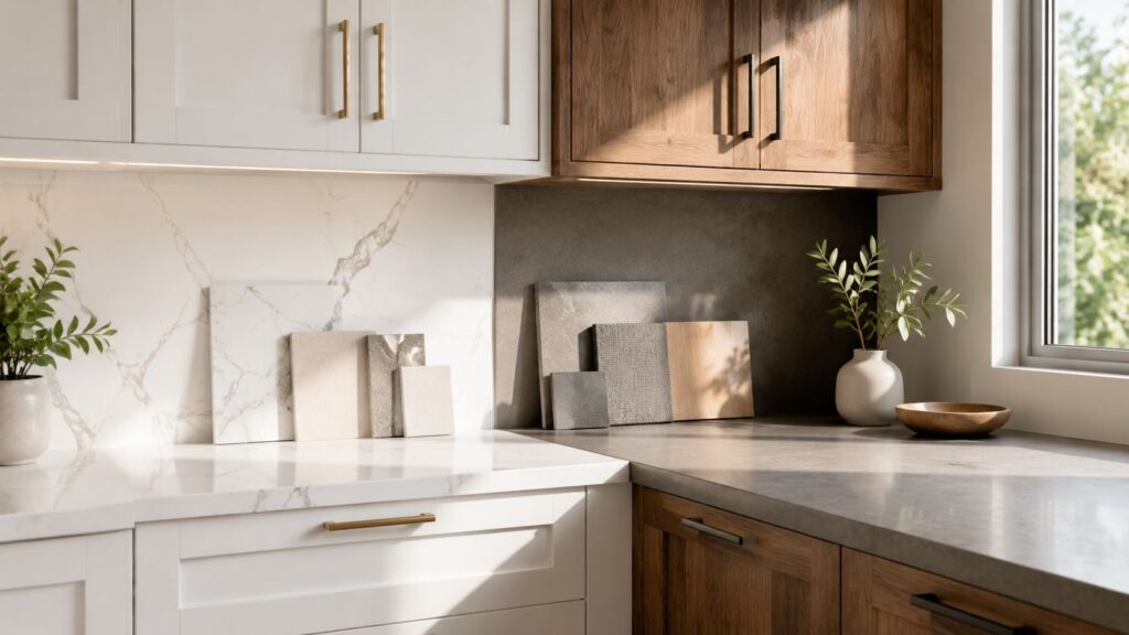
You're probably standing in your kitchen right now, looking at cabinet doors on your phone, quartz samples on Pinterest, and paint chips on the counter, trying to decide what goes together. That's the hard part. A beautiful kitchen usually doesn't come from one great choice. It comes from a sequence of choices that work together under real conditions, in a real home, with real light, real storage needs, and real daily wear.
Countertop and cabinet combinations carry most of the visual weight in a kitchen. They also determine whether the room feels calm or busy, bright or heavy, timeless or already dated. The challenge for South Jersey homeowners is that many homes in Cherry Hill, Haddonfield, Moorestown, and surrounding towns have lighting conditions that make showroom-perfect combinations look completely different once installed.
The broader design direction is clear. The NKBA 2026 Kitchen Trends Report projects quartz as the top choice for kitchen surfaces at 78%, while 72% of experts favor transitional design and neutral color schemes as the strongest framework for pairing cabinets and counters. That matters because it confirms what works in practice: durable surfaces, restrained palettes, and combinations that can bridge traditional architecture with current finishes. If you're also thinking about layout while planning materials, this guide on how to maximize kitchen efficiency is useful context before you lock in selections.
Table of Contents
- Starting Your Kitchen Renovation Journey
- The 3 Core Principles of Perfect Pairing
- Inspiring Combinations for Every South Jersey Style
- How to Select Your Cabinet and Countertop Materials
- Completing the Look with Hardware Backsplash and Flooring
- A Final Checklist to Avoid Costly Design Regrets
- Your South Jersey Design Partner The Cabinet Coach
Starting Your Kitchen Renovation Journey
Most homeowners start with a favorite color or a countertop photo. That's understandable, but it usually leads to a fragmented kitchen. A slab that looked dramatic online can overpower the room once it sits next to the wrong door style. A cabinet finish that seemed warm and inviting in a sample chip can turn muddy when paired with the wrong surface.
The better starting point is the relationship between the two largest finishes in the room. Cabinets usually define the kitchen's personality because they occupy the most visual space. Countertops then either calm that choice down, sharpen it, or compete with it. When the pairing is right, everything else becomes easier, including backsplash tile, hardware, wall color, and even flooring transitions.
Start with the room you actually have
South Jersey homes often come with design conditions that generic advice ignores.
- Older homes: Mixed natural and artificial light can shift cabinet stains and quartz undertones throughout the day.
- Open-concept remodels: Kitchen finishes need to work with adjacent flooring, dining furniture, and trim details.
- Busy family kitchens: The right pairing has to hold up to spills, fingerprints, school bags, and weeknight cooking.
Practical rule: If a combination only looks good under showroom lights, it isn't the right combination yet.
A strong renovation plan balances visual appeal with daily use. White oak and quartz may feel current, but they only work long term if they also suit the architecture of your home and the amount of maintenance you're willing to handle. Transitional kitchens do this especially well because they don't force a house to become more modern than it wants to be.
Think in layers not isolated products
A kitchen doesn't read as cabinets plus counters. It reads as one whole composition. That's why the most successful countertop and cabinet combinations have a clear hierarchy. One element leads. One supports. The accents finish the room.
If you're torn between several directions, narrow the decision by asking three questions:
Which surface do you want to notice first?
If the answer is cabinetry, keep the countertop quieter.Do you want warmth, contrast, or softness?
Each leads to different pairings.Will this still feel right on a cloudy January morning?
In South Jersey, that matters more than people think.
The 3 Core Principles of Perfect Pairing
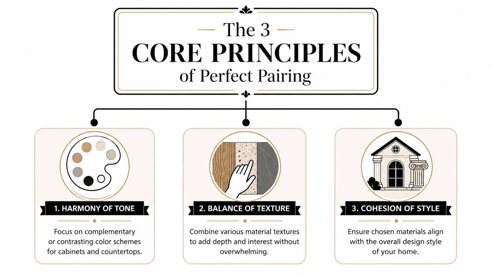
The best kitchens don't happen because every finish matches. They work because the finishes are organized. Good pairing comes down to three decisions: color hierarchy, undertone control, and style alignment.
Let cabinets lead
Professional designers still rely on the 60-30-10 rule, where cabinets typically carry the 60% dominant color, countertops handle the 30% secondary color, and hardware and accents make up the 10% accent layer, as outlined in this guide to cohesive pairings from CabinetIQ. That framework keeps the room from feeling split in half.
In practical terms, that means a deep cabinet color usually needs a lighter or calmer counter. A countertop with heavy movement usually needs cabinetry that doesn't fight for attention. Homeowners get into trouble when both selections are trying to be the focal point.
A simple way to pressure-test your palette is to lay it out like this:
| Element | Best role in the room | Common mistake |
|---|---|---|
| Cabinets | Set the dominant tone and style | Choosing a bold color, then adding a busy counter |
| Countertops | Support or highlight the cabinets | Treating the slab as a separate design decision |
| Hardware | Add finish contrast and detail | Trying to make hardware carry the whole style |
Read undertones before color names
“White,” “gray,” and “brown” aren't precise enough. Every finish carries undertones. Some whites lean creamy. Some read blue. Some grays feel taupe, while others go cool and steely. The same issue shows up in wood. White oak can read sandy, golden, muted, or almost driftwood depending on the finish.
That's why homeowners often think they're comparing neutrals when they're comparing warm and cool materials that don't belong together.
For years, the safe rule was to match warm with warm and cool with cool. That still works. But designers are also using contrast more deliberately now. CabinetIQ notes a 42% increase in designers pairing warm wood cabinets with cool-toned countertops to create depth in compact spaces. Done well, that contrast gives a smaller kitchen more air and definition instead of making it feel flat.
For help evaluating cabinet color families before you choose a stone, this guide on how to choose kitchen cabinet colors is a useful companion.
Match style before finish
A lot of combinations fail because the materials are individually attractive but stylistically disconnected.
- Transitional kitchens: Shaker or slim shaker doors, soft veining, balanced contrast
- Modern kitchens: Flat-panel or minimalist profiles, quieter patterns, sharper color breaks
- Traditional homes: More visible wood character, classic profiles, warmer pairings
The fastest way to make a kitchen feel off is to mix a very formal cabinet door with a countertop pattern that belongs in a different design language.
Texture matters too. Smooth painted cabinetry next to a polished quartz surface can feel sleek but slightly sterile unless wood, tile, or hardware brings tactile relief. Wood grain beside a simple quartz often feels more grounded because one surface carries texture and the other carries visual calm.
Inspiring Combinations for Every South Jersey Style
The combinations below work because each has a clear point of view. None depends on novelty. They depend on balance.
White shaker with marble look quartz
This is still one of the most dependable combinations for South Jersey homes, especially in neighborhoods where the house has traditional trim, older hardwood floors, or classic exterior architecture. White shaker cabinets give you structure without making the room feel formal. A marble-look quartz with soft gray or taupe veining adds movement without making the kitchen busy.
This pairing lands in the transitional sweet spot. It works with polished nickel, matte black, or softer brass finishes. It also handles resale well because the overall impression is clean and familiar.
What works:
- Soft veining: Enough pattern to avoid a flat look
- Warm whites: Better in homes with cream trim or warmer flooring
- Simple backsplash: Let the counter carry the pattern
What usually doesn't:
- Stark blue-white cabinets next to creamy quartz
- Heavy, dramatic veining in a modest-size kitchen
- Ornate hardware that pushes the look too traditional
White oak with concrete gray quartz
This combination feels current without trying too hard. White oak cabinetry brings warmth, grain, and visual softness. A concrete-gray quartz gives it restraint and a slightly architectural edge. In newer homes around Cherry Hill or Moorestown, this pairing often feels right because it bridges natural material warmth with a cleaner modern line.
The key is keeping the gray controlled. If the countertop leans too cold, the room starts to feel disconnected. If it stays muted, the cool counter and warm wood create depth.
Warm wood doesn't always need a warm countertop. Sometimes a cooler surface is what keeps the kitchen from looking too yellow or too heavy.
This is one of the clearest examples of strategic contrast working well in smaller kitchens or homes with limited daylight.
Navy or green with crisp white quartz
For homeowners who want color, this is usually the safer move. Put the color on the cabinets and keep the countertop crisp, simple, and bright. Navy and forest green both bring weight, so the quartz should act as visual relief.
A clean white quartz with minimal patterning gives the cabinet color room to breathe. If you add a backsplash, it should either repeat the clean tone of the counter or introduce a subtle handmade texture. Large competing patterns above and below the wall cabinets can make the room feel crowded fast.
This combination works especially well when:
- the island carries the darker color
- perimeter walls need brightness
- the kitchen opens into lighter living spaces
For more examples of high-contrast palettes that stay polished instead of harsh, take a look at these black white and gray kitchen ideas.
Walnut with soft white quartz
Walnut is richer and darker than white oak, so the room immediately feels more refined. Paired with a soft white quartz, it creates warmth without drifting rustic. This is a strong choice for homeowners who want wood cabinetry to feel distinguished rather than casual.
The quartz matters here. Bright, icy white can make walnut look redder than expected. A softer white usually gives the pairing better balance. Add understated hardware and the result feels expensive without being loud.
How to Select Your Cabinet and Countertop Materials
Looks matter, but material performance decides whether you still like the kitchen after a year of use.
Countertop choices that change the maintenance routine
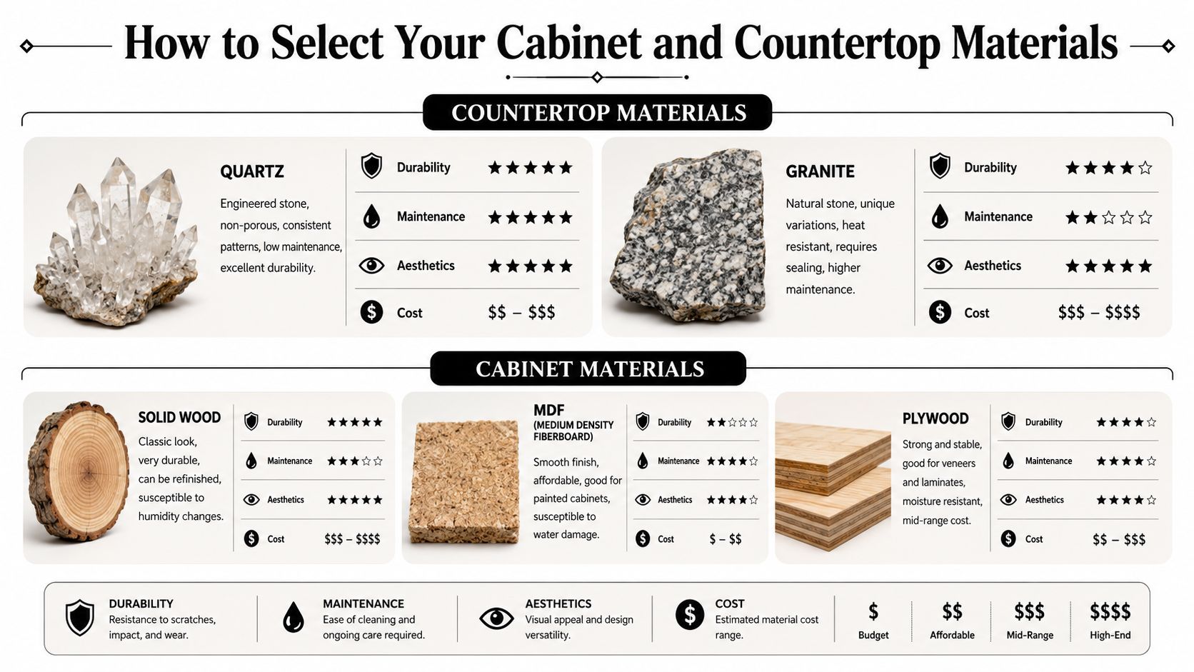
Quartz has become the default recommendation for many kitchens because it gives homeowners a broad range of looks with a simpler care routine. Granite still appeals to people who want a natural stone surface with more variation and stronger geological character. Quartzite attracts homeowners who like the presence of natural stone but want something that often reads more dramatic and organic.
Here's the practical difference:
| Material | Why homeowners choose it | Trade-off to think about |
|---|---|---|
| Quartz | Consistent look, low maintenance, broad style range | Some patterns can look too uniform if the cabinet selection is flat |
| Granite | Natural variation, strong visual character, heat-friendly reputation | Requires a homeowner who is comfortable with more upkeep |
| Quartzite | Distinctive stone movement, premium natural look | Often best when the rest of the kitchen stays restrained |
A good rule is to decide how much visual movement you want to clean around every day. Dramatic surfaces look beautiful. They also ask more from the rest of the design.
To compare surface categories in more detail, this article on how to choose kitchen countertops is worth reviewing before you commit to a slab.
A quick visual overview helps when you're comparing finishes side by side:
Cabinet construction matters more than most homeowners expect
A countertop isn't just a finish sitting on top of cabinetry. It's a structural load. According to RTI Cabinets, a 3cm quartz or granite countertop weighs about 18 to 25 pounds per square foot, which is why weak cabinet boxes, poor leveling, and inadequate reinforcement often lead to cracking or seam problems later.
That has two major consequences.
- Base cabinets must be built well: High-density cabinet materials hold up better under stone than moisture-sensitive, lower-grade construction.
- Install quality matters: If sink runs, overhangs, and seams aren't properly supported, the countertop pays the price.
Homeowners sometimes overspend on the visible finish and underspend on the structure beneath it.
A premium slab on a weak cabinet box is a mismatch. The expensive part won't perform better than the support under it.
If you're comparing cabinet box materials, this guide to compare kitchen cabinet wood options is a helpful primer before you review quotes.
How to compare materials without getting distracted by displays
Showrooms are built to flatter products. Your kitchen isn't.
When evaluating countertop and cabinet combinations, use this order:
Start with maintenance tolerance
Be honest about how much care you'll give the surfaces.Review cabinet construction before door finish
A pretty sample door doesn't tell you how the box is built.Check the pairing at full scale
Small chips hide movement, contrast, and grain direction.Study edge conditions and transitions
Countertop thickness, door profile, and hardware projection all affect the finished look.
If you do this in reverse, the process feels easier at first and more expensive later.
Completing the Look with Hardware Backsplash and Flooring
Cabinets and counters establish the relationship. Hardware, backsplash, and flooring decide whether that relationship feels finished.
Hardware should sharpen the design not compete with it
Hardware belongs in the accent layer. It shouldn't rescue a weak palette, and it shouldn't overwhelm a strong one. Matte black creates clean definition. Polished nickel stays versatile. Champagne bronze or brass can warm up cooler kitchens and add softness to painted cabinetry.
The mistake is overmatching. If every metal finish repeats too precisely across pulls, faucet, pendants, and stools, the room can feel staged instead of natural.
A better approach is selective consistency:
- Use one primary finish for cabinet hardware
- Let the faucet either match or coordinate
- Keep decorative lighting from introducing a completely unrelated metal
For a deeper look at scale, finish, and placement, this guide on how to choose cabinet hardware helps homeowners avoid the most common selection errors.
Backsplash and flooring should connect the room
Backsplash is where many kitchens get visually overloaded. If the countertop already has pattern, the backsplash usually needs restraint. If the counter is quiet, the backsplash can contribute more texture or shape. That doesn't mean it needs to become a mural. It means it can do a little more work.
Good backsplash choices typically do one of three things:
| Role | Best use |
|---|---|
| Unify | Pull cabinet and counter tones together |
| Soften | Add texture when both main finishes are smooth |
| Feature | Add personality when cabinets and counters are very restrained |
Flooring should support the whole composition, not compete with it. In practice, that means watching wood tone carefully. If the floor and cabinets are both wood, they don't need to match, but they do need to make sense together. One can be warmer, cooler, lighter, or darker. If both sit in the same tonal family but aren't quite aligned, the mismatch becomes more noticeable than a deliberate contrast would have been.
A Final Checklist to Avoid Costly Design Regrets
Most kitchen regret doesn't come from making a reckless choice. It comes from approving a reasonable choice under the wrong conditions.
Check samples at home not just in the showroom
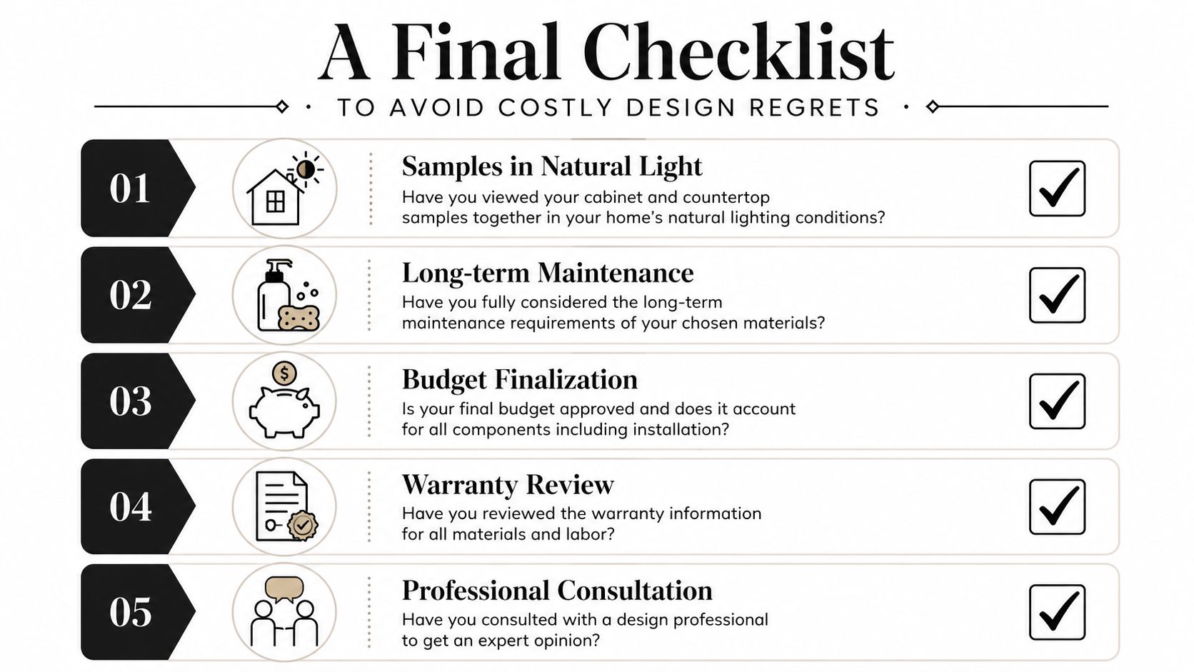
This is the issue that catches homeowners most often. A 2025 industry analysis from Wyoming Building Supply notes that 68% of homeowners who selected cabinet and countertop pairs in showrooms reported a color or undertone mismatch once installed, largely because the materials looked different under their home lighting.
That problem shows up all over South Jersey. Older homes often mix recessed LEDs, older fixtures, shaded windows, and directional sunlight. A creamy quartz can look fresh in a showroom and suddenly turn yellow beside your cabinets at home. A gray cabinet sample can look balanced under store lighting and then skew cold in a north-facing kitchen.
Check every sample in:
- Morning natural light
- Late afternoon light
- Your evening fixture lighting
- Directly beside flooring and wall color
Don't approve a pairing after seeing each sample separately. Put them together, vertically and horizontally, in the actual room.
Review the practical details before anything is ordered
Design regret also happens when beautiful selections ignore the room's constraints. Confirm how the finishes work with appliance clearances, sink placement, edge details, and the way your household uses the kitchen.
A final review should include:
Cabinet door and drawer function
Make sure pulls, appliance handles, and adjacent walls don't conflict.Countertop edge and overhang details
These affect both appearance and comfort at seating areas.Maintenance expectations
Know what the surface asks of you before installation day.Material approvals in writing
Final signoff should reflect the exact finish, not a close substitute.
If you want a broader pre-project gut check, these 7 remodelling mistakes are worth scanning before you place orders.
Your South Jersey Design Partner The Cabinet Coach
South Jersey homeowners run into a very specific problem during kitchen planning. The showroom gives them one answer, and their house gives them another. That disconnect is especially common in older homes, homes with mixed lighting, and remodels where the kitchen opens into existing finishes that aren't being replaced.
That's why an in-home selection process is so valuable. Seeing cabinet doors, countertop samples, hardware, and tile together in your own kitchen removes a lot of guesswork. You can judge undertones against your flooring, your wall color, your windows, and the actual light you live with every day.

For homeowners in Cherry Hill, Haddonfield, Moorestown, Camden County, and Burlington County, that kind of process makes countertop and cabinet combinations easier to judge with confidence. It also helps narrow choices faster because you're comparing curated options in context, not wandering through rows of disconnected displays.
A strong design partner should do more than show finishes. They should help you edit. They should point out when your cabinet tone is fighting your floor, when your quartz pattern is too busy for the room, or when your structure needs to be upgraded to support the surface you want. That's what keeps a kitchen from looking good only in samples and helps it feel right once it's built.
If you want help choosing countertop and cabinet combinations in your actual home lighting, The Cabinet Coach brings the showroom to you across South Jersey and guides the process from samples to final selections.