

If you're planning a kitchen remodel in South Jersey, there's a good chance you've saved a dozen versions of the same idea without realizing it. White cabinets, dark island. Gray lowers, white uppers. Matte black hardware on everything. The look keeps showing up because it works.
Black white and gray kitchens give you a stable design foundation, but they aren't foolproof. A beautiful photo doesn't tell you whether the gray will look muddy in your Cherry Hill kitchen at 6 p.m., whether black cabinets will drive you crazy with fingerprints, or whether your flooring will make the whole room feel colder than you expected.
That gap is where most first-time remodels go sideways. The palette is simple. The decisions around it aren't. What works in Haddonfield's older homes can need a different balance than what works in a newer open-plan kitchen in Moorestown or Mount Laurel.
Table of Contents
- Beyond the Trend Why This Timeless Trio Works
- Nailing the Balance Your Monochrome Color Recipe
- From Cabinets to Countertops Selecting Durable Surfaces
- The Supporting Cast Lighting Hardware and Flooring
- Common Pitfalls in Monochrome Kitchen Design
- Your South Jersey Remodel The Cabinet Coach Process
Beyond the Trend Why This Timeless Trio Works
Most homeowners don't choose black white and gray kitchens because they're trying to be trendy. They choose them because they want a kitchen that still feels right years from now.
That instinct is sound. This palette has range. It can lean modern farmhouse, transitional, minimal, or more architectural depending on cabinet style, countertop movement, flooring, and metal finishes.
The palette stays flexible
A white shaker kitchen with black pulls reads very differently from slab gray cabinetry with a black frame hood and waterfall island. The colors may be similar, but the room won't feel the same.
That's why copying one photo rarely works. The lasting kitchens are built on balance, not on one finish or one viral idea.
A few combinations tend to hold up well in South Jersey homes:
- White and charcoal for compact spaces because the room stays bright while the darker tone gives it structure.
- Gray and black with wood accents when the goal is a calmer, more refined look.
- White uppers with darker lowers for families who want contrast without making the room feel heavy.
Practical rule: Treat black, white, and gray as a framework. Texture, lighting, and warmth are what make the kitchen livable.
Why homeowners still keep coming back to it
This trio works because it solves common remodeling goals at once. It looks clean, pairs well with stainless appliances, and gives you room to shift the personality of the kitchen through tile, stools, lighting, and wood.
It also adapts well to changing preferences. Even as broader tastes shift, the core palette remains useful. If you're following what local homeowners are gravitating toward, this overview of top kitchen design trends South Jersey homeowners are choosing for 2026 is a helpful way to see how monochrome kitchens fit into the wider picture.
The true test isn't whether the palette is timeless. It is. The true test is whether the room feels warm enough, bright enough, and practical enough for the way you live.
Nailing the Balance Your Monochrome Color Recipe
A black white and gray kitchen often fails for one of two reasons. Either everything is the same visual weight, or the contrast is so aggressive that the room feels chopped apart.
The fix is simple in concept. You need one dominant color, one supporting color, and one accent. Most homeowners know this instinctively. The challenge is applying it to cabinets, walls, counters, and hardware without overloading the room.
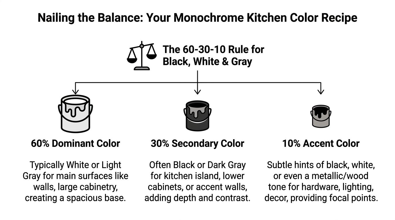
A workable version of the 60 30 10 rule
In practice, the breakdown often looks like this:
| Share | What it typically covers | Good monochrome choices |
|---|---|---|
| 60% dominant | Main cabinetry, wall color, larger visual fields | white, soft white, pale gray |
| 30% secondary | island, lower cabinets, hood detail, tall pantry wall | charcoal, graphite, mid gray, black |
| 10% accent | hardware, faucet, pendants, stools, shelving details | matte black, polished chrome, brushed brass |
This isn't math for math's sake. It's a way to avoid a kitchen where every surface competes.
A common example in South Jersey is white perimeter cabinetry, a dark island, and black accents. Another is light uppers with deeper gray lowers, especially in smaller homes where keeping the upper half of the room brighter matters.
What designers notice first
Undertones decide whether the palette feels polished or off. A cool white next to a warm greige can look accidental fast. A blue-based gray next to a creamy countertop can feel disconnected even if both colors look fine on their own.
Homeowners often get tripped up by this, when samples are viewed one at a time. The combination matters more than the individual color.
According to Leicht Queens' write-up on gray kitchen cabinetry, dark gray bases with light white uppers reached a 92% "spacious feel" score, while 18% of similar projects reported dissatisfaction because the grays looked flat, a problem tied to insufficient lighting and solved with recessed LEDs at 4000 lumens/m².
A gray that looks rich in a showroom can fall flat in a kitchen that gets weak afternoon light. Always judge your palette in the room it will live in.
A simple recipe that often works
If you want a reliable starting point, use this order of decisions:
- Choose the lightest large surface first. Typically that's your main cabinet color or wall color.
- Pick the darkest element second. Island, lowers, or a built-in hutch are common places to add weight.
- Select the gray last. Gray is the mediator. It should connect the white and black, not fight with either one.
- Test metals after the colors are locked. Black hardware sharpens the scheme. Brass warms it. Chrome keeps it crisp.
The strongest black white and gray kitchens don't use all three colors equally. They let one lead, one support, and one finish the room.
From Cabinets to Countertops Selecting Durable Surfaces
A family in Cherry Hill can love a black, white, and gray kitchen on a sample board, then get frustrated six months later because the white paint chips near the trash pullout or the black island shows every fingerprint after soccer practice. Durability decisions show up in daily use, not in the showroom.
Cabinets and countertops do most of the work in this palette. They set the style, but they also absorb moisture, grease, hand traffic, pet bowls, school bags, and the occasional dropped pan.
Cabinet finish matters more than most homeowners expect
Color gets the attention first. Finish determines how that color lives.
A painted white door can keep the room bright and clean, but lower-grade paint systems tend to chip at corners and around knobs faster than homeowners expect. Matte black cabinetry brings strong contrast and a polished look, but it often shows skin oils, dust, and smudges more readily. Mid-tone and darker gray finishes often land in the practical middle. They still give contrast, but they are often easier to live with in a busy kitchen.
Super-matte finishes are worth a close look if glare bothers you or the kitchen gets a lot of direct sun. Some advanced matte materials can also handle light wear better than standard painted surfaces, but product performance depends on the line, the fabricator, and how the cabinets are used.
Existing cabinetry deserves an honest inspection before anyone talks about paint. If the boxes are solid, the doors are in good shape, and the layout still works, refinishing can make sense. If the hinges are worn out, the door profiles are dated, or the finish is already failing in multiple spots, repainting only delays replacement. This guide on how to paint kitchen cabinets does a good job explaining the prep and finish issues that separate a lasting job from a short-term cosmetic fix.
Countertops should solve a daily problem
Homeowners often choose a slab because it looks right under showroom lights. A better approach is to start with use. Do you want the easiest cleanup possible? Do you bake often? Will the island get used for homework, takeout, and meal prep every day?
For black white and gray kitchens, the usual shortlist is quartz, porcelain, granite, or quartzite. Each one fits a different household.
| Surface | Usually works well for | Watch-outs |
|---|---|---|
| Quartz | busy family kitchens, clean monochrome palettes, low-maintenance use | pattern can feel repetitive if the slab selection is weak |
| Porcelain | sleek modern looks, backsplash integration, moisture-prone areas | edge treatment and installer skill matter a lot |
| Granite | natural variation, durability, less uniform look | some patterns compete with a strict monochrome palette |
| Quartzite | natural stone fans who want a brighter upscale look | selection and fabrication decisions need more care |
In South Jersey, I often ask homeowners one more question. Do you want the countertop to be the feature, or the backdrop? In a black, white, and gray kitchen, quieter slabs often age better because they support the cabinetry instead of fighting it. Strong veining can look beautiful, but it needs to coordinate with the cabinet finish, backsplash, and floor at the same time.
For a deeper side-by-side on stone choices, this local comparison of quartz granite quartzite countertops in Cherry Hill NJ is worth reading before you lock in samples.
Current preference data still supports contrast, with restraint
Analysts cited in the National Association of Realtors summary of Houzz's 2026 Kitchen Trends Study found that wood cabinetry slightly edged out white overall, while white remained a leading choice for upper cabinets in tuxedo kitchens. That same NAR summary reports Zillow found that white or light upper cabinets paired with dark navy or black lower cabinets brought an average resale premium of $1,547.
That tracks with what works in real kitchens around Haddonfield, Moorestown, and Medford. White uppers help the room stay open. Darker lowers ground the space and hide everyday wear better. Gray often works best as the connector, through the countertop, backsplash, or a secondary cabinet finish.
Before final approval, lay out the whole stack in person. Cabinet door, countertop sample, flooring, tile, and hardware need to be viewed together in the actual room, especially if the kitchen gets mixed natural light through the day. A black white and gray kitchen succeeds when the materials hold up and the finish choices still look right on an ordinary Tuesday, not just on install day.
The Supporting Cast Lighting Hardware and Flooring
A monochrome kitchen can look expensive on paper and still feel flat in person. That's often not a cabinet problem. It's a support-element problem.
Lighting, hardware, and flooring decide whether the room feels crisp, warm, moody, or sterile.
Lighting gives gray its personality
Gray changes more than homeowners expect. Morning light can make it feel soft. A rainy afternoon can make the same cabinet look dull. Poor artificial lighting makes the problem worse.
Use layered lighting, not one ceiling plan that tries to do everything.
- Ambient lighting handles the overall room. Recessed lighting is often the backbone.
- Task lighting belongs under the cabinets and over prep zones.
- Accent lighting brings shape and warmth through pendants, glass cabinets, or toe-kick glow when the design calls for it.
Warm white under-cabinet light often helps black white and gray kitchens feel less cold, especially when the room already has a lot of stone, metal, or painted cabinetry.
If you're also thinking about airflow, especially in kitchens that open into family rooms, this guide to the best ceiling fans for kitchens is useful for sorting through what makes sense in a cooking space.
Hardware should change the temperature of the room
Hardware isn't garnish. It shifts the whole read of the palette.
Matte black hardware keeps the scheme tight and modern. Brushed brass adds warmth to gray cabinetry. Polished nickel or chrome tends to work well when you want a cleaner, more classic edge.
Fixture finish should be coordinated, not necessarily matched piece for piece. Faucet, cabinet hardware, and decorative lighting need to look intentional together. This local guide to choosing the perfect kitchen or bathroom fixture can help you sort through finish compatibility before ordering.
Don't choose hardware from a thumbnail image. The shape feels different in your hand than it does on a screen, and that matters in a kitchen you use every day.
Flooring and backsplash carry the warmth
Many black white and gray kitchens either recover their warmth here or lose it entirely.
According to Homestyler's article on black white and gray kitchen designs, 35% of owners cite cleaning as a top complaint, especially with dark glossy finishes. The same source states that in humid New Jersey conditions, greige cabinets paired with porcelain slab backsplashes can reduce visible water spots by 40% compared with high-gloss black alternatives.
That lines up with what many homeowners notice in real life. High-gloss dark surfaces can look dramatic, but they ask more from you.
For flooring, the strongest supporting choices are often:
- Natural-look wood flooring when the room needs softness and contrast relief.
- LVP when moisture resistance and family wear matter most.
- Porcelain tile when durability and easy cleanup come first.
The point isn't to break the monochrome palette. It's to keep it from becoming hard-edged everywhere at once.
Common Pitfalls in Monochrome Kitchen Design
A South Jersey kitchen can look polished in the showroom and still feel off once it is installed at home. I see that happen when homeowners choose black, white, and gray finishes one piece at a time instead of judging the whole room together. The result is often one of three problems. Too much visual weight, undertones that clash, or a space that reads cold and flat.

Problem one Too much dark color in a small room
Dark base cabinets can look sharp. In a smaller kitchen, especially the compact layouts common in older Haddonfield and Collingswood homes, they can also make the room feel lower and tighter than it is.
The fix is often distribution, not abandonment. Keep the darkest finish on an island, a vanity wall, or lower cabinets with enough natural light around them. Let the uppers, countertop, or backsplash carry more of the brightness so the eye has somewhere to rest. In galley kitchens and U-shapes, that balance matters even more because every surface sits in your line of sight at once.
Black and charcoal still have a place. They just need restraint.
Problem two Whites and grays that fight each other
This is one of the costliest mistakes because every sample can seem right on its own.
A warm white cabinet next to a blue-gray tile or a cool quartz can make the whole kitchen look unsettled. Homeowners often catch this too late because they approved samples under store lighting, then brought them into a room with morning sun, recessed cans, under-cabinet lighting, and existing floors that shift the color again.
A better test is simple. Stack the cabinet sample, countertop sample, backsplash option, and flooring together in the actual kitchen. Review them in daylight, then again at night. If one piece suddenly looks pink, green, or icy, it is not a small issue. It will read stronger after installation, not weaker.
If the palette disagrees in your house, keep sampling until it settles down.
Problem three A kitchen that feels cold instead of calm
Monochrome kitchens need texture and temperature control. Without that, the room can feel more clinical than comfortable.
The correction often comes from materials, not a dramatic color change. Rift oak stools, a wood hood trim, a handmade-look tile, or a softer brushed metal finish can take the edge off a black white and gray palette. In many South Jersey homes, that balance is what keeps a remodeled kitchen from feeling disconnected from the rest of the house, especially when the adjoining rooms still have warmer flooring or traditional millwork.
A few reliable course corrections:
- Use one dominant neutral and let the other two support it
- Mix matte and low-sheen finishes so every surface does not reflect light the same way
- Add one natural material such as oak, walnut, linen-look tile, or leathered stone
- Check every finish in the room where it will live, not under retail lighting
Before final approvals, it also helps to review these kitchen remodelling mistakes homeowners often make. That kind of check catches avoidable problems early, which is exactly how a monochrome kitchen stays disciplined instead of feeling stark.
Your South Jersey Remodel The Cabinet Coach Process
A well-designed monochrome kitchen isn't built from isolated product picks. It comes from a sequence. Measure the room correctly. Understand the light. Narrow the style direction. Test materials together. Resolve the layout before anyone orders cabinetry.
That process matters even more for busy homeowners in Cherry Hill, Haddonfield, Moorestown, Mount Laurel, Voorhees, and nearby towns because homeowners often don't have time to run between cabinet dealers, stone yards, tile shops, and hardware displays trying to build a coherent palette.
What the workflow looks like
For homeowners who want a guided, in-home approach, The Cabinet Coach offers a mobile showroom model with cabinetry, countertops, hardware, and tile brought into the decision process together. Details of that workflow are outlined on The Cabinet Coach experience.
The practical advantage is straightforward. You review selections where the kitchen exists, with your lighting, flooring, wall color, and sightlines in front of you.
The Cabinet Coach 4-Step Remodel Journey
| Phase | What Happens | Your Benefit |
|---|---|---|
| Video consultation | Initial conversation about goals, style, scope, and budget direction | You find out quickly whether the project path fits your needs |
| In-home discovery | Site review, measurements, and material discussions in your space | Selections are judged in real lighting, not showroom lighting |
| Design development | Layout refinement and 3D design work | You can see how black, white, and gray elements balance before ordering |
| Project coordination | Final selections, trade coordination, and construction oversight | The remodel moves through a clearer, more organized process |
Why this matters for black white and gray kitchens
This palette looks simple. In practice, it asks for discipline.
A white can turn yellow against the wrong quartz. A gray can die under weak recessed lighting. A black island can feel elegant in a large open kitchen and overpowering in a tighter one. When all those choices are made separately, problems show up late.
When selections are reviewed together and in sequence, homeowners can catch issues earlier:
- Layout problems before cabinetry is ordered.
- Undertone conflicts before materials are locked.
- Finish maintenance concerns before the household lives with them.
- Budget trade-offs while there is still room to adjust.
That kind of workflow is especially useful for first major remodels. Most homeowners don't need more options. They need fewer, better-coordinated decisions.
The strongest kitchens in this palette don't feel like a collection of black, white, and gray products. They feel settled. The room has enough light, enough contrast, enough warmth, and enough durability for the people using it every day.
If you're ready to sort through black white and gray kitchens with real material guidance, local context, and a process that happens in your home, The Cabinet Coach is a practical next step for South Jersey homeowners planning a remodel.