
You're probably doing what a lot of South Jersey homeowners do right before a kitchen remodel. You open Instagram, save a moody green backsplash, then a glossy handmade tile wall, then a slab splash, then something your neighbor just installed in Cherry Hill. By the time you're done scrolling, you don't have a plan. You have a folder full of kitchens that don't even look like your house.
That's usually the moment to stop chasing trends and start asking a better question. What will still look right in your kitchen years from now, with your cabinets, your light, your countertops, and the way your family uses the space? In Haddonfield, that might mean respecting the character of an older home. In Moorestown, it might mean adding polish without making the kitchen feel too precious. In Cherry Hill, it often means landing that clean transitional balance that won't feel dated the minute the next trend wave hits.
A timeless backsplash isn't the safe choice. It's the smart one. It gives your kitchen staying power, keeps maintenance reasonable, and makes future updates easier instead of boxing you into one very specific moment in design.
Table of Contents
- Beyond the Trends The Quest for a Lasting Kitchen Style
- What Makes a Kitchen Backsplash Truly Timeless
- The Best Backsplash Materials for Enduring Style and Durability
- Choosing Your Timeless Palette and Pattern
- How to Perfectly Pair Backsplashes with Cabinets and Countertops
- Timeless Backsplash Inspiration for South Jersey Homes
- Start Your Timeless Kitchen Journey with The Cabinet Coach
Beyond the Trends The Quest for a Lasting Kitchen Style
I've seen this happen over and over. A homeowner starts with one simple goal, update the kitchen. Then the options pile up. Reels, Pinterest boards, showroom photos, renovation shows. Suddenly every backsplash feels exciting for five minutes and questionable by the end of the week.
That pressure to look current pushes people toward choices that photograph well but don't age well. In a real kitchen, especially in South Jersey homes where architecture often has more character than a brand-new build, that approach usually backfires. A backsplash should work with the house, not fight it.
In Haddonfield, older homes often carry details that deserve restraint. In Cherry Hill, many kitchens sit in that transitional sweet spot where homeowners want fresh finishes without going stark or trendy. In Moorestown, I often see people trying to blend warmth, practicality, and a little refinement. Those are different goals. They all need the same discipline.
Timeless means you stop designing for the algorithm
A timeless kitchen backsplash does three things well:
- It supports the room: It doesn't hijack the whole kitchen.
- It handles daily messes: Grease, splashes, and wipe-downs are part of the job.
- It stays flexible: If you repaint cabinets or swap hardware later, the backsplash still works.
Timeless design isn't boring. It's what happens when you make choices that still feel right after the excitement wears off.
A lot of people hear “timeless” and think plain. I don't. I think controlled. I think edited. I think you chose materials and colors because they belong there, not because they were all over your feed last month.
The better investment for South Jersey homeowners
Kitchen remodels aren't casual purchases. Even when you're keeping the footprint and making disciplined updates, every finish decision matters. The backsplash is one of those surfaces you see every day, at eye level, in natural light, under task lighting, against painted cabinetry, next to stone counters. It's not a place for design panic.
If you want a kitchen you'll still like years from now, don't ask what's hot. Ask what still looks good after the trend cycle moves on. That's how you build a kitchen with staying power.
What Makes a Kitchen Backsplash Truly Timeless
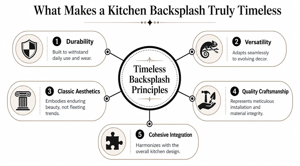
Timeless kitchen backsplashes don't happen by accident. They follow a simple logic. The material performs well. The pattern stays clean. The color doesn't boss the room around.
Start there and you're already ahead of most remodeling mistakes.
Function comes first
The biggest misconception in kitchen design is that timelessness is mostly about looks. It isn't. The backsplash lasts when it solves a practical problem well enough that people keep choosing it, decade after decade.
That's why subway tile still matters. A widely cited historical reason it reads as timeless is that it originated in the New York City subway system in 1904, where designers chose a simple, durable glazed ceramic tile for public transit stations. That origin tied it to cleanliness, easy maintenance, and durability, and the format has remained in active use for more than 120 years, a rare benchmark in home design according to this subway tile history reference.
That's not nostalgia. That's proof of concept.
Practical rule: If a backsplash is hard to clean, overly busy, or married to one short-lived look, it isn't timeless no matter how expensive it is.
A kitchen is a working room. South Jersey families cook, host, rush through school mornings, unload groceries, and wipe counters in a hurry. The backsplash has to survive all of it. If it can't, it's decoration pretending to be design.
Here's a useful visual explainer before you choose a layout or material:
The visual formula that lasts
Once function is handled, the look should stay disciplined. Timeless backsplashes usually share a few traits:
Simple geometry
Rectangles, squares, and clean field tiles hold up better than hyper-specific novelty shapes.Restrained color
White, cream, soft gray, and muted natural tones give you room to evolve the rest of the kitchen.Low visual clutter
You want texture and character, not chaos.Strong integration
The backsplash should make the cabinets and counters look better, not compete with them.
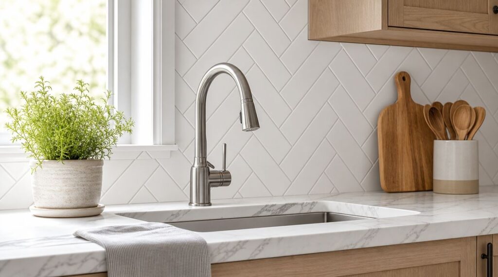
A timeless backsplash doesn't have to be basic white subway tile in a brick pattern. It can be honed stone, soft glass, stacked tile, or subtle herringbone. But the guiding principle stays the same. Keep the design clear enough that the rest of the kitchen can breathe.
The Best Backsplash Materials for Enduring Style and Durability
Material choice matters more than people think. If you pick the wrong one, you'll either baby it, fight with it, or replace it mentally every time you walk into the room. If you pick the right one, it settles into the kitchen and does its job without drama.
A durability-first approach is the right one. KSI Cabinetry's backsplash guide identifies porcelain, ceramic, natural stone, glass, granite, quartzite, and engineered quartz as long-life options because they resist wear and are easier to maintain than trend-heavy surfaces. I agree with that hierarchy. In real kitchens, performance should lead.
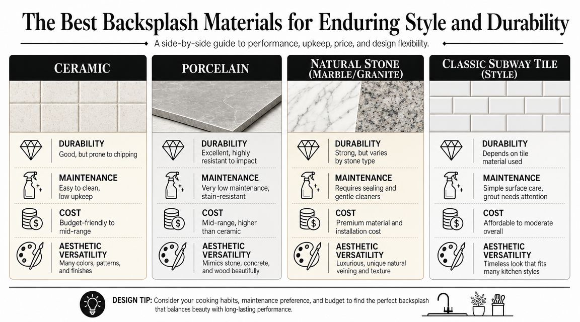
My short list for real-life kitchens
Ceramic tile is the dependable classic. It gives you a huge range of finishes, sizes, and price points. For homeowners in Cherry Hill doing a practical refresh, ceramic often lands in the sweet spot. It's approachable, familiar, and easy to make look polished if the install is tight and the grout choice is smart.
Porcelain tile is what I recommend when you want the look of classic tile with a little more toughness. It's a strong choice for busy households, heavy-use kitchens, and homeowners who don't want to fuss. It also works well in full-height applications because it can look crisp and architectural without feeling cold.
Natural stone brings depth that factory-made products can't fully fake. Marble, granite, and quartzite each have their own personality. In Haddonfield, stone often makes sense because it complements the age and detail of older homes. The tradeoff is maintenance. If you love stone, choose it because you want that natural variation and you're comfortable caring for it.
Glass tile can be excellent when used with restraint. It reflects light, feels clean, and can brighten kitchens that don't get a ton of natural daylight. I like it best in simple shapes and soft neutrals. Once glass gets too flashy or too iridescent, it stops being timeless and starts becoming a timestamp.
If you're narrowing down layouts and tile types, this guide on how to select tile backsplash is a useful companion to the material decision.
Timeless Backsplash Material Comparison
| Material | Durability | Maintenance | Typical Cost | Best For |
|---|---|---|---|---|
| Ceramic | Reliable for daily kitchen use | Easy to clean | Budget-friendly to mid-range | Practical remodels, classic looks |
| Porcelain | Excellent for wear and moisture resistance | Low maintenance | Mid-range to higher depending on style | Busy households, clean transitional kitchens |
| Natural Stone | Long-lasting with proper care | Requires more attention than ceramic or porcelain | Mid-range to premium | Historic homes, elevated traditional or transitional kitchens |
| Glass | Durable in backsplash applications | Easy surface cleaning | Varies widely by style | Smaller kitchens, darker kitchens, reflective finishes |
Choose the material based on how you live, not how a styled photo looks. A backsplash behind a range has a different job than one in a vacation-house inspiration image.
My opinion is simple. If you want the safest long-term choice, start with ceramic or porcelain. If you want warmth and natural character, consider stone. If your kitchen needs bounce and brightness, use glass carefully. Most homeowners don't need exotic. They need durable, cleanable, and easy to live with.
Choosing Your Timeless Palette and Pattern
Color and pattern are where good projects go sideways. The material may be solid, but then someone picks a harsh white, a trendy grout contrast, or a layout that starts screaming from across the room. The fix is restraint.
Pick a color family you can live with
Neutral palettes last because they cooperate. White, cream, soft gray, greige, and muted earth tones all play well with changing cabinet colors, countertop materials, and hardware finishes. That matters in South Jersey homes, where people often renovate in phases instead of gutting everything at once.
Not all whites are the same, though. A cool white next to a warm quartz top can look wrong fast. A creamy tile next to bright-white cabinets can look dingy. You need the undertones to agree.
Here's the easy filter I use:
- Warm kitchens: cream, soft ivory, warm greige, mellow taupe
- Cool kitchens: crisp white, pale gray, soft blue-gray
- Mixed-material kitchens: soft off-white or balanced greige that won't lean too hard either way
If you're still deciding on cabinetry, this guide on how to choose kitchen cabinet colors helps prevent the common mismatch between tile and paint.
Use pattern to add interest without noise
Pattern should create rhythm, not clutter. The most dependable options are classic for a reason.
Subway or running bond works almost anywhere. It feels familiar, orderly, and easy to dress up or down depending on tile size and grout.
Stacked bond reads cleaner and more modern. It's a good move in Cherry Hill transitional kitchens where you want simplicity without looking too traditional.
Herringbone adds motion, but keep it selective. I like it best as a focal area behind a range or as a subtle full-wall treatment in a quiet color.
Matte versus glossy matters too. Glossy tile reflects light and often feels a bit more traditional or polished. Matte tile softens the room and hides visual noise better. In older Haddonfield homes with lots of texture already in the architecture, matte can feel more grounded. In smaller kitchens, glossy often helps bounce light around.
The pattern should be the whisper, not the speech. If you notice the layout before you notice the whole kitchen, it's probably too much.
My advice is blunt here. Don't combine a dramatic tile color, a strong pattern, and a contrasting grout unless you want the backsplash to dominate the room. Most timeless kitchens pick one move and keep the rest quiet.
How to Perfectly Pair Backsplashes with Cabinets and Countertops
Most backsplash mistakes aren't really backsplash mistakes. They're pairing mistakes. The tile might be perfectly nice on its own, but next to the wrong cabinet color or the wrong countertop movement, it falls apart.
Use the Rule of Three
I tell homeowners to think in roles. In every kitchen, one surface gets to be the star, one supports it, and one fades into the background.
If you already have a busy granite countertop with strong movement, the backsplash should calm things down. Plain ceramic, soft porcelain, or a low-variation stone usually wins. Don't put a patterned backsplash behind an already active counter unless you enjoy visual tension.
If your countertop is quiet, like a simple quartz with minimal movement, you've got more freedom. That's where a gentle herringbone, a stacked vertical layout, or a slightly textured tile can add personality without tipping the room into noise.
For countertop planning, this article on how to choose kitchen countertops is worth reviewing before you lock in tile.
Match undertones before you match style
People often focus on whether a kitchen looks modern, farmhouse, traditional, or transitional. Undertones matter more. A warm backsplash with cool cabinets can feel off even if both are “classic.”
Use this quick pairing guide:
- White cabinets + warm counters: choose creamy white or soft greige tile
- White cabinets + cool counters: use crisp white or pale gray tile
- Gray cabinets: avoid stark yellow-cream tile unless you want obvious contrast
- Wood cabinets: lean into warm stone, soft off-whites, or earthy neutrals
- Black or deep navy cabinets: keep the backsplash quiet unless the whole design is deliberately high contrast
If you're repainting cabinetry instead of replacing it, getting the finish right matters as much as choosing the tile. This guide on the best paint for kitchen cabinets is helpful for understanding how sheen, durability, and color choice affect the final pairing.
A backsplash should either echo the countertop, soften it, or frame it. It should never argue with it.
One more opinionated note. Don't try to make all three surfaces interesting in the same volume. That's where kitchens start looking restless. Controlled contrast always beats random contrast.
Timeless Backsplash Inspiration for South Jersey Homes
Generic kitchen advice misses the point. South Jersey homes aren't all cut from the same template, and the right backsplash in Moorestown may feel wrong in Haddonfield. The house should lead the design.

The Haddonfield classic
Think white or softly painted inset-style cabinetry, polished nickel or unlacquered brass hardware, and a countertop with natural movement. The backsplash here should feel established, not flashy.
My pick is a marble-look or natural stone tile in a restrained layout. Straight-set or classic brick bond both work. Keep the color warm and slightly soft. In an older Haddonfield home, the goal is elegance that feels like it belongs to the house.
The Cherry Hill transitional
This is one of the most common South Jersey kitchen profiles. The homeowner wants clean lines, a fresh update, and something that still feels welcoming. Not too ornate. Not too stark.
A porcelain or ceramic backsplash in a soft white, pale gray, or greige usually lands well here. Stacked tile can sharpen the look. Traditional subway can relax it. If you want more contrast, use grout carefully. Too much contrast and the kitchen starts looking trend-led instead of classic.
For homeowners considering a darker focal tile, this look at black kitchen backsplash tile is useful, especially if you're weighing drama against longevity.
The Moorestown modern farmhouse
This one gets overdone fast, so discipline matters. You want warmth, not a themed kitchen. Skip anything that looks overly rustic or artificially distressed.
A creamy ceramic subway tile, a subtle herringbone behind the range, or a textured handmade-look porcelain in a quiet neutral all fit. Pair it with warm wood accents, painted cabinets, and counters that don't compete. The best version of this style feels settled and clean, not staged.
What makes these kitchens work is editing. The architecture in South Jersey gives you enough personality already. The backsplash doesn't need to perform for attention. It needs to connect the room.
Start Your Timeless Kitchen Journey with The Cabinet Coach
A good backsplash choice usually comes down to this. Pick a material that holds up, a color that won't trap you, and a pattern that adds structure without stealing the room. Do that, and your kitchen has a much better chance of feeling current now and appropriate later.
That's especially important if you're balancing multiple decisions at once. Cabinets, counters, hardware, flooring, paint, and tile all affect each other. Looking at tiny samples under showroom lighting isn't enough. You need to see options in the context of your actual home.
One practical option for South Jersey homeowners is The Cabinet Coach experience, which brings a mobile showroom approach to cabinetry, countertops, hardware, and tile selection. That kind of process is useful when you want to compare finishes against your lighting, wall color, and existing architecture instead of guessing from a display board.
If you're still deciding whether to repaint cabinets, reface, or replace them as part of the project, understanding the broader cost to paint kitchen cabinets can help frame the budget conversation, even if your final scope goes beyond paint.
My advice is simple. Don't let the backsplash become a rushed last-minute pick. It sits in the center of the room, and it has to work hard every day. Slow down, compare samples at home, and choose the option that still feels right after the initial excitement fades.
If you're ready to sort through timeless kitchen backsplashes with real guidance instead of endless tabs and mixed opinions, talk to The Cabinet Coach. A complimentary video consultation is a practical first step for homeowners in Cherry Hill, Haddonfield, Moorestown, and nearby South Jersey communities who want a kitchen that looks right, works hard, and lasts.