

Most advice about a light grey painted kitchen is too simple. It usually goes one of two ways. Either grey is declared “timeless,” or it gets dismissed as already dated.
Neither answer is useful if you own a South Jersey home.
In Cherry Hill, Haddonfield, Moorestown, and Mount Laurel, I see kitchens with very different challenges. Some are tight, older layouts with limited daylight. Some are open plans where the kitchen has to relate to nearby flooring, trim, and family room finishes. In those homes, light grey can still work beautifully, but only when it’s treated as a design tool rather than a default cabinet color.
The problem isn’t light grey itself. The problem is the flat, cold, builder-grade version that took over the market for a few years. If you want a kitchen that feels current and holds up, the details matter more than the label.
Table of Contents
- Why Light Grey is Still a Smart Choice If Done Right
- Choosing Your Perfect Shade of Light Grey
- Creating a Cohesive High-Value Kitchen Palette
- Common Pitfalls of the Light Grey Kitchen
- Designing Your Kitchen with The Cabinet Coach in South Jersey
Why Light Grey is Still a Smart Choice If Done Right
Light grey is not automatically dated. Generic grey is.
That distinction matters in South Jersey, where I see plenty of kitchens that need a color with some restraint. In Collingswood bungalows, Cherry Hill colonials, and older shore-area homes, the kitchen often has mixed fixed elements that are staying put. Warm oak floors, beige tile, older trim profiles, or limited daylight can make bright white cabinets feel harsh and dark cabinets feel heavy. A well-chosen light grey sits in the middle and solves more problems than it creates.

Light grey works best when the room needs help from color
Cabinet color should do a job. In many South Jersey kitchens, that job is to keep the room feeling open without washing it out.
Light grey reflects light better than deep cabinet colors, but it also carries more depth than plain white. That balance helps in kitchens with short wall runs, soffits, or awkward transitions into dining spaces. It gives the eye a softer stopping point. Homeowners usually notice that effect right away when samples are viewed in the actual room instead of under store lighting.
I tell clients to judge grey by performance first. Does it calm down a busy floor? Does it make the room feel brighter at 5 p.m.? Does it work with the counters you already paid for? Those questions matter more than whether the color is trending on social media.
A lot of dated grey kitchens failed because every surface was cold, flat, and the same value.
A good light grey kitchen has contrast, warmth, and context
The better versions use light grey as a supporting color, not the whole story. That means wood stools, warmer metal finishes, handmade-looking tile, or a paint color on the walls that keeps the room from reading silver. Homeowners who have been following South Jersey kitchen design trends for 2026 are already seeing that shift toward layered kitchens with more texture and less showroom sameness.
That approach holds up better in real homes. It also keeps a remodel from slipping into the flipper-grade look that makes buyers assume the cheapest safe option won.
If you want a second opinion on how undertones and surrounding finishes affect cabinet color, this expert guide to kitchen paint choices gives useful general guidance. In practice, the final call still needs to happen in your kitchen, with your light, your floors, and your countertops.
That is one reason The Cabinet Coach’s mobile service makes sense for this kind of project. Light grey can look balanced in one South Jersey home and completely wrong in another a few miles away. Done with intention, it still feels current, calm, and expensive. Done from a tiny paint chip under bad retail lighting, it can go sideways fast.
Choosing Your Perfect Shade of Light Grey
“Light grey” sounds precise until you put five samples side by side. Then you realize one looks blue, one looks lavender, one looks taupe, one looks flat, and one suddenly turns green against your countertop.
That’s normal.
Choosing cabinet paint is a lot like choosing a suit fabric. The broad color family gets the attention, but the undertone, surface finish, and surrounding light decide whether it looks sharp or off.
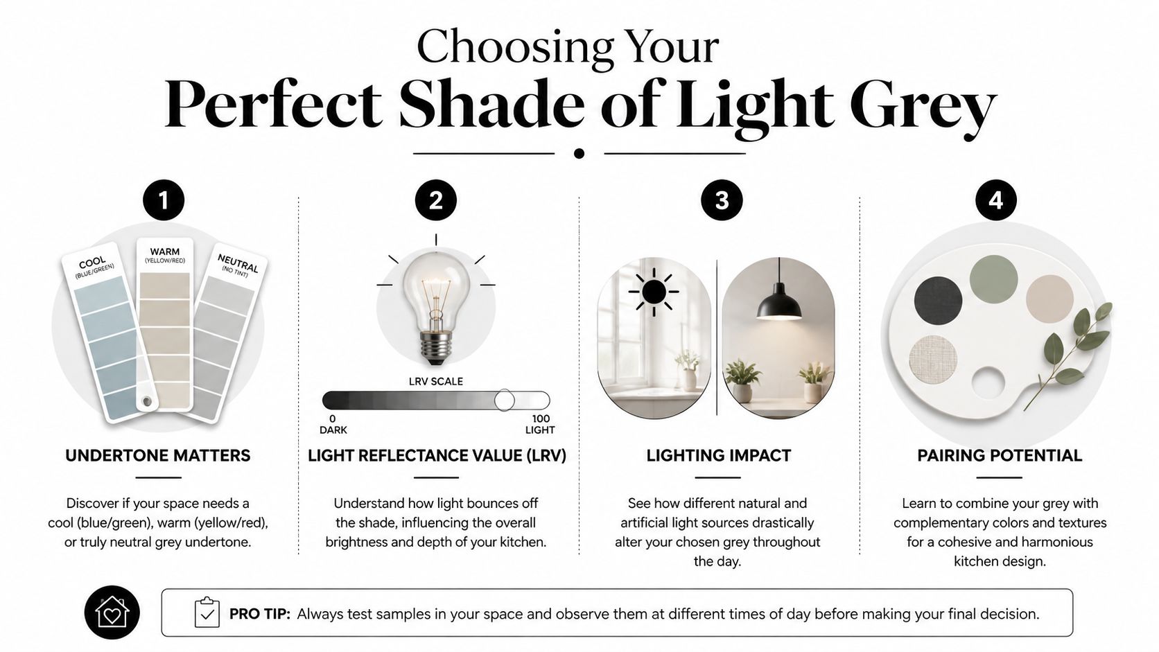
Undertone comes first
The undertone is the part homeowners miss most often. In South Jersey kitchens, that matters because our housing stock varies so much. A Haddonfield colonial with warm oak floors needs a different grey than a newer condo with cooler quartz and stainless finishes.
Here’s the quickest way to think about it.
| Undertone Type | Feels | Best Paired With | Ideal For |
|---|---|---|---|
| Cool light grey | Crisp, tailored, modern | White quartz, black accents, cleaner-lined cabinetry | Contemporary spaces with strong natural light |
| Warm light grey | Soft, grounded, more classic | Brass, wood tones, cream tile, warmer floors | Traditional homes and transitional kitchens |
| Neutral light grey | Balanced, flexible, restrained | Mixed metals, varied finishes, subtle stone movement | Open-plan kitchens that connect to several rooms |
A cool grey can look sleek in the right room, but it can also turn chilly fast under the wrong bulbs. A warmer grey, often drifting into greige, usually plays more nicely with existing hardwoods and older trim profiles.
Don’t judge a swatch in isolation. Put it next to your countertop sample, flooring sample, and backsplash option. That’s where the undertone tells the truth.
How to judge brightness without guessing
Most homeowners focus only on the name of the paint color. Brightness matters just as much.
A light grey painted kitchen should feel light, but not washed out. If the color is too pale for the room, the cabinetry can lose its shape and look blank. If it’s too dark, the whole reason for choosing light grey disappears.
The simplest way to test this is practical, not theoretical:
- Tape samples vertically on doors and end panels, not just walls.
- Check them in morning and evening because north light and late-day artificial light can pull different undertones.
- View from the adjacent room if you have an open layout. A cabinet color that looks fine up close can feel disconnected from the rest of the first floor.
If you want a good general resource on reading undertones and coordinating finishes, this expert guide to kitchen paint choices is useful for homeowners who want to understand the decision before committing.
A lot of sample mistakes happen because people are looking at paint chips under store lighting. That’s exactly why in-home review matters more than showroom confidence.
Sheen changes the whole read
The same grey can look softer or sharper depending on sheen. On cabinetry, sheen affects color perception and how flaws show.
For most painted cabinets, the conversation usually comes down to this:
- Matte or lower-sheen finishes mute reflection and can make a warm grey feel more relaxed.
- Satin or furniture-style cabinet finishes tend to show the color more clearly while still being practical.
- Higher-sheen surfaces bounce more light and can emphasize door profiles, edges, and any surface imperfections.
If you’re choosing between several greys, don’t stop at the color card. Ask how that specific finish will read on a shaker door, a slab door, or a more traditional recessed panel. The cabinet style changes the result.
That’s also why a gallery of paint color ideas for kitchen cabinets can be more helpful than a single sample chip. You need to see how color behaves on actual cabinetry, not just on paper.
Creating a Cohesive High-Value Kitchen Palette
A light grey painted kitchen succeeds or fails on what surrounds it. Cabinets alone won’t make the room feel current. The supporting materials do the heavy lifting.
When the palette is right, light grey feels intentional. When the palette is lazy, it feels like a leftover trend.

A useful reality check comes from home valuation data summarized in this discussion of kitchen color value trends. Those analyses found that standard grey kitchens now tend to read as neutral in value, while warmer palettes can improve appeal. The takeaway isn’t that you need to paint everything green. It’s that grey performs better when it supports richer, warmer elements rather than dominating the room.
Where light grey needs warmth
Most dated grey kitchens suffer from the same issue. Every finish sits in the same temperature range. Cool grey cabinets, bright white counters, pale grey floors, chrome hardware, and icy LEDs all stack together.
That combination makes the room feel sterile.
To avoid that, introduce warmth in at least two places. Often the best candidates are flooring, hardware, island contrast, or backsplash texture. A warm white tile, a natural oak hood detail, or aged brass pulls can shift the room from flat to layered without abandoning the cabinet color you like.
For homeowners sorting through options, this guide to kitchen renovation color choices offers a helpful way to think about balancing neutral cabinetry with more expressive supporting finishes.
The pairings that usually work
Some combinations consistently give light grey more depth and more resale appeal.
- Warm-veined quartz works better than stark, clinical white slabs when the goal is softness.
- Zellige-look tile or handmade-look ceramic adds movement that flat grey cabinets often need.
- Natural or medium wood flooring anchors the lower half of the room and keeps the cabinetry from floating.
- An island in wood, black, olive, or a deeper neutral can break up the perimeter and stop the space from feeling repetitive.
Here’s the test I use in design review. If every surface is smooth, pale, and cool, the room probably needs contrast. If you already have contrast in texture, shape, and finish, light grey becomes much more believable.
A lot of homeowners also want to see combinations in motion rather than static photos. This video is a useful reference point for how cabinet color, hardware, and surrounding materials change the feel of the whole room.
Hardware is not an afterthought
Hardware is where many otherwise solid kitchens lose momentum. Small round knobs from a big-box rack can make painted cabinets look cheaper than they are. Oversized pulls can feel just as awkward if they ignore the door style.
Think of hardware as the cabinet’s jewelry, but choose it with restraint.
- Brushed brass softens cooler greys and adds warmth.
- Aged bronze or darker iron tones give traditional or transitional kitchens more weight.
- Polished nickel works when you want refinement without the sharpness of chrome.
- Matte black can be clean and current, but it needs support elsewhere in the room so it doesn’t look isolated.
If you like black, white, and grey together, the mix can still work. It just has to be layered with texture and warmth, not treated as a strict three-color formula. That’s where examples of black white and gray kitchens can help clarify the difference between crisp and cold.
A high-value kitchen palette is rarely about more color. It’s about better contrast.
Common Pitfalls of the Light Grey Kitchen
Light grey did not become a problem. Predictable grey did.
Homeowners started pulling away from the all-grey formula because too many kitchens were built from the same script. Pale grey cabinets, white counters, grey floor, cool lighting, black hardware. The result was clean enough, but it often felt interchangeable with every quick resale renovation from the last decade.
That is the main pitfall. A light grey kitchen can still look current and expensive. It just needs contrast, restraint, and a color choice that responds to the house.
The flipper-grade version follows a familiar pattern
I see the same mistakes over and over in South Jersey kitchens, especially in 1990s colonials, townhomes, and older homes with warm existing finishes.
- One note color throughout the room. Cabinet paint, wall color, backsplash, and flooring all sit too close together, so nothing stands out.
- Grey chosen from a store chip instead of the house. A swatch that looks soft under retail lighting can turn dull, purple, or icy once it is next to oak floors or beige stone.
- Cold lighting exaggerates the wrong undertones. Many LED bulbs push light grey cabinets toward blue and make the room feel harder than intended.
- Low-detail finishes flatten the space. Plain shaker doors, basic pulls, thin splash pieces, and simple counters can read more builder package than custom update.
- No visual weight anywhere. If every surface is light and smooth, the kitchen loses depth.
Grey is only the backdrop. The dated look usually comes from how the surrounding materials were selected.
South Jersey homes make these mistakes more obvious
A lot of local kitchens have fixed elements that are not going anywhere. Red oak floors in Cherry Hill. Creamier trim in Moorestown. Busy granite in Mount Laurel. Strong tree-filtered light in older neighborhoods that shifts from warm to cool across the day.
Those conditions expose a weak grey choice fast.
A color that seems balanced at 11 a.m. can look muddy by dinner, especially if the room faces north or the recessed lighting runs too cool. That is why I tell homeowners to stop treating cabinet paint like an isolated decision. In most kitchens, the floor, countertop, and lighting have more control over the final result than the paint chip does.
Repainting can help, but only with the right sequence
If you are keeping part of the kitchen, choose the fixed materials first and the cabinet color second. That order prevents expensive misses.
Homeowners comparing replacement versus repainting often start with professional cabinet painting services because the budget is lower and the disruption is smaller. That can be a smart move. It only works well when the new grey is selected against the actual countertop, flooring, trim, and light in the room.
A good light grey kitchen looks deliberate. A weak one looks like it was assembled from safe choices. That difference is usually decided before the first cabinet door gets painted.
Designing Your Kitchen with The Cabinet Coach in South Jersey
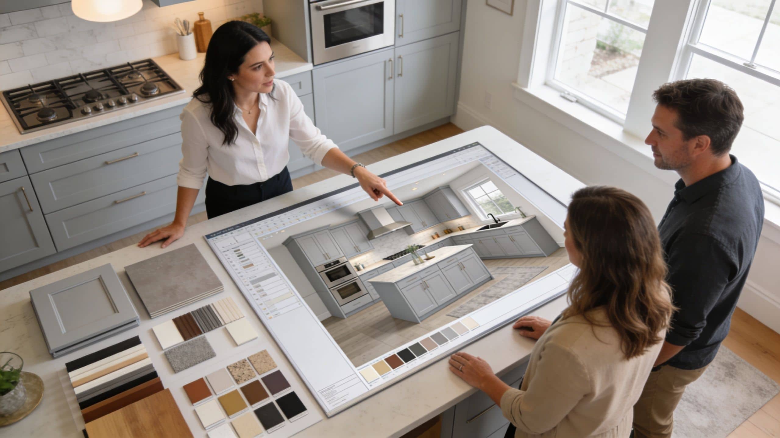
The hardest part of choosing a light grey painted kitchen isn’t finding a grey. It’s confirming that the grey still works once it’s in your house, under your lights, next to your floor, with your countertop samples.
That’s why in-home selection matters so much more than a quick retail browse.
For South Jersey homeowners, especially in towns like Voorhees, Moorestown, Mount Laurel, and Cherry Hill, a mobile showroom approach solves a real problem. You can review cabinetry, hardware, tile, and countertop options in the actual environment where they’ll live, instead of guessing from a display wall that has completely different lighting.
Why in-home selection matters
A light grey with a soft warm undertone can look balanced in one kitchen and slightly purple in another. A sample door that feels perfect at noon can look colder after sunset when overhead lighting takes over.
Reviewing materials at home helps you make better calls on things like:
- Cabinet undertone against existing flooring and trim
- Countertop movement so the room doesn’t become visually busy
- Hardware finish in relation to appliances and faucet selections
- Backsplash texture so the palette doesn’t go flat
A service model like The Cabinet Coach experience fits naturally. It brings cabinetry and finish selections into the home, which makes it easier to judge undertones, scale, and coordination in real conditions.
How the local process becomes easier
Good kitchen design isn’t just about style. It’s about decision order.
In practice, the smoothest projects usually move like this:
- Start with the constraints. Keep or replace cabinets, floors, and counters. Those choices narrow the paint direction fast.
- Review the fixed light conditions. A kitchen in an older Collingswood or Haddon Township home won’t behave like a brighter new-construction space.
- Build the palette around one anchor. Sometimes that’s the countertop slab. Sometimes it’s the flooring you’re not changing. Sometimes it’s the cabinet color.
- Coordinate trades and timing early. Paint, countertops, tile, electrical, and hardware installation affect one another more than homeowners expect.
That process matters even more for busy homeowners who don’t have time to run between cabinet dealers, stone yards, tile shops, and paint stores. Mobile selection and project guidance reduce a lot of that friction.
A light grey kitchen can still be smart in South Jersey. It just needs to be selected with more discipline than it did a few years ago. If the color supports the room, if the palette includes warmth and texture, and if the choices are tested in your actual home, grey stops looking like a shortcut and starts looking considered.
If you're planning a kitchen update in Cherry Hill or anywhere nearby and want help deciding whether a light grey painted kitchen is the right fit for your space, The Cabinet Coach offers a straightforward next step. Schedule a complimentary video consultation to review your layout, your goals, and the finishes that will work in your home’s actual lighting.