
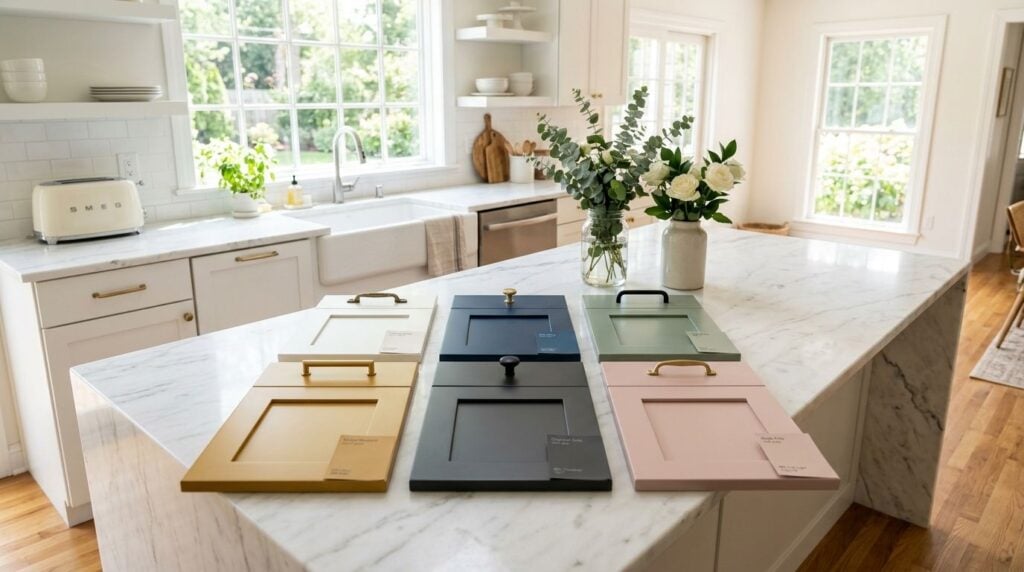
The cabinet color that looks best on Instagram often isn't the one that works best in a real South Jersey kitchen. That's the gap most trend roundups miss. They show pretty palettes, but they don't help you decide what still feels right in January light, what works with an existing oak floor in Cherry Hill, or what a buyer in Moorestown is likely to see as fresh instead of risky.
Your 2024 South Jersey Kitchen: Finding the Perfect Color
Planning a kitchen remodel in South Jersey and wondering which cabinet color will perfect your space? The choices can feel endless. This year, kitchen cabinet color trends for 2024 are all about creating personalized, inviting environments, blending timeless appeal with fresh personality. From the warm, creamy whites popping up in Haddonfield to the bold, moody blues making statements in Moorestown, the right color can transform your kitchen from a simple workspace into the true heart of your home.
This guide breaks down the top 9 trends, complete with practical advice on pairings, lighting, and what works best for resale value right here in Camden and Burlington Counties. White still led U.S. cabinet preferences in 2024 at about 33% in Statista's survey, but the same dataset also showed strong interest in non-white options, which tells you the market isn't locked into a single safe choice anymore. If you've been collecting inspiration, you may also enjoy these kitchen painting ideas for Melbourne homes for another perspective on color and finish. Let's find the perfect palette for you.
Table of Contents
- 1. Warm White & Creamy Ivory Cabinets
- 2. Deep Navy & Charcoal Blue Cabinets
- 3. Sage Green & Muted Botanical Cabinets
- 4. Black & Charcoal Matte Cabinets
- 5. Warm Gray & Greige Cabinets
- 6. Two-Tone & Contrast Cabinet Combinations
- 7. Warm Terracotta & Rust-Inspired Cabinetry
- 8. Rich Espresso & Mocha Brown Cabinets
- 9. Soft Blush & Warm Taupe Cabinets
- 2024 Kitchen Cabinet Color Trends, 9-Way Comparison
- Bring Your Vision to Life with The Cabinet Coach
1. Warm White & Creamy Ivory Cabinets
Warm white is still the easiest answer for many South Jersey homes, but 2024's version isn't the bright, cool white that made so many kitchens feel a little stark. Homeowners are leaning toward softer whites and creamy ivories that reflect light without looking clinical. In older Haddonfield and Collingswood homes, that shift matters because trim, floors, and wall colors often have natural warmth that pure white can fight.
Sherwin-Williams Alabaster and Benjamin Moore Ivory White are the kind of shades that usually sit comfortably with wood floors, brass hardware, and a marble-look quartz top. In Cherry Hill and Voorhees kitchens, I often see warm white work best when the room needs brightness but the homeowner still wants the space to feel relaxed, not showroom sharp.
Where warm white works best
Warm white earns its keep in resale-minded remodels. If you're updating a kitchen before a move, or you want broad appeal without making the room feel bland, this palette is still one of the safest choices. It also gives you room to add personality through the island, backsplash, stools, and lighting instead of forcing all the drama onto the cabinets.
A few combinations that usually land well:
- Brass pulls with a creamy door color: This keeps shaker cabinets from feeling flat.
- Light wood island with warm white perimeter cabinets: Great for open layouts that need definition.
- Soft zellige-look or handmade tile backsplash: Adds texture so the kitchen doesn't read as one large white block.
Practical rule: Always sample white paints in your actual kitchen morning, afternoon, and evening. A white that looks soft in a showroom can turn yellow, gray, or dull once it sits next to your countertop and backsplash.
If you're comparing whites and struggling with undertones, this guide on how to choose kitchen cabinet colors is a smart next step before you commit. Warm white doesn't mean boring. It means flexible, forgiving, and much easier to live with than trend-heavy colors that can wear you out fast.
2. Deep Navy & Charcoal Blue Cabinets
Navy is the color homeowners ask about when they want depth without jumping all the way to black. It has enough weight to feel custom, but it still reads classic in a South Jersey colonial, farmhouse, or newer open-concept home. In Moorestown and Haddonfield, navy works especially well when the kitchen opens into family space and needs a stronger visual anchor.
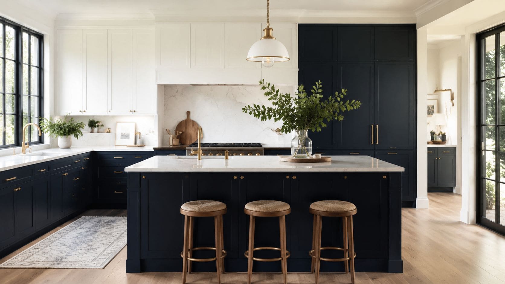
The mistake people make with navy is using too much of it in a room that doesn't have the light to support it. Full navy cabinetry can look rich in a large kitchen with generous windows. In a tighter kitchen in Audubon or Haddon Township, navy usually performs better on the island or lower cabinets, with lighter uppers to keep the room open.
Best pairings for navy
Navy needs warmth around it. Brass, aged gold, and even copper usually bring out its depth better than cold chrome. White quartz, marble-look surfaces, and lighter backsplashes stop the room from feeling heavy.
A few dependable applications:
- Navy island with warm white perimeter cabinets: Strong contrast, low risk.
- Charcoal blue lowers with white uppers: Good for smaller kitchens.
- Glass-front upper cabinets or open shelving nearby: Prevents a dark wall effect.
Navy should look intentional, not gloomy. If the room already has limited natural light, add under-cabinet lighting before you add a dark cabinet color.
For South Jersey resale, navy is often a better bet than more niche colors because buyers usually see it as polished rather than quirky. It gives a kitchen distinction without forcing the entire design around one unusual color choice.
3. Sage Green & Muted Botanical Cabinets
Green has become the color people choose when they want personality without noise. Sage, eucalyptus, and soft olive tones bring in color, but they don't shout. That's a big reason they fit the 2024 mood so well. They feel calmer and more natural than the sharper greens that trended years ago.
In Cherry Hill, Medford, and Collingswood homes, muted green cabinets tend to work best when the rest of the kitchen includes honest materials. White quartz, natural stone looks, oak shelving, walnut stools, woven shades, and unlacquered brass all help this palette feel grounded instead of themed.
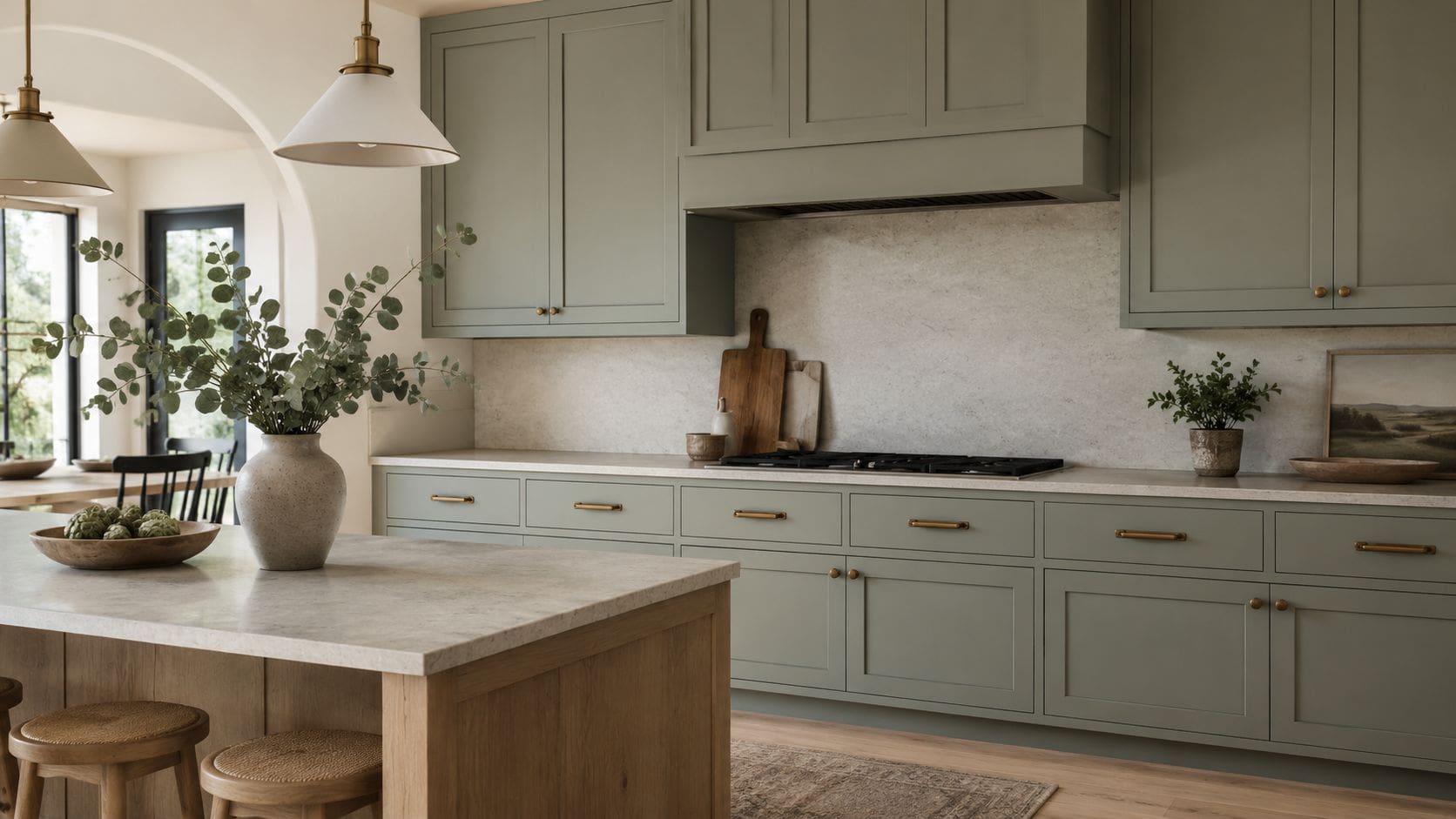
How to keep green from dating too fast
Green can age well if it stays muted and a little dusty. It starts to feel trendier when it goes too bright, too minty, or too blue. If you're concerned about longevity, keep the cabinet color soft and let bolder moments happen in accessories, paint, or textiles that are easier to change.
Good ways to use it:
- Pair sage with warm oak or walnut: The wood keeps the kitchen from feeling washed out.
- Choose simple tile: White subway, handmade-look neutrals, or soft stone visuals all work.
- Use bronze or brass hardware: It complements the earthiness.
This is one of the easiest color families to personalize, and it suits homeowners who want the kitchen to feel a little softer than standard gray or white. If you're gathering paint directions first, these paint color ideas for kitchen cabinets can help narrow down which greens look custom instead of trendy.
A muted green kitchen usually succeeds because the room still feels neutral at a glance. That's the sweet spot.
4. Black & Charcoal Matte Cabinets
Black cabinets aren't just a design magazine move anymore. One 2024 report cited by the National Association of Realtors said Magnet saw black cabinets become its fastest-growing color, with a 112% increase in sales year over year. That doesn't mean every South Jersey kitchen should go black. It does mean darker finishes are no longer a fringe choice.
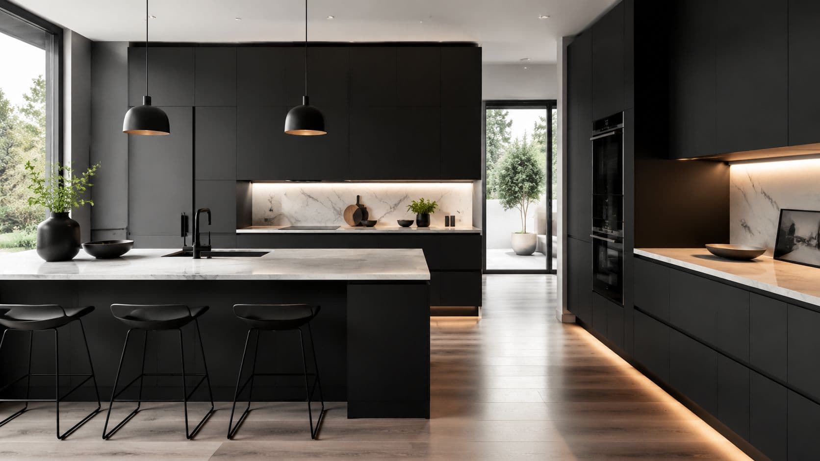
Black matte cabinets can look exceptional in Moorestown new builds, Haddon Township renovations, and modernized split-level homes where the architecture already supports a cleaner line. They usually struggle in kitchens with low ceilings, limited lighting, and too many competing finishes. Black needs room to breathe.
When black looks expensive and when it doesn't
It looks expensive when it's paired with contrast, texture, and warm accents. It looks flat when the whole room goes dark and the lighting plan is weak. I also prefer charcoal or softened black over the harshest true black when the homeowner wants something dramatic but still livable.
Use these guardrails:
- Bring in a light counter surface: White quartz and pale stone visuals are the easiest win.
- Choose a matte or low-sheen finish: It softens reflections and feels more refined.
- Add layered light: Pendant, under-cabinet, and ambient lighting all matter here.
If you're deciding between paint and stain or trying to understand which dark finish makes sense for your cabinet style, paint and stain cabinets is worth reviewing before you commit. Black isn't forgiving, but when the details are right, it can look striking and surprisingly timeless.
5. Warm Gray & Greige Cabinets
Greige isn't flashy, and that's exactly why it still works. For many South Jersey homeowners, especially in transitional homes around Voorhees, Mount Laurel, and Burlington Township, warm gray is the bridge between the cool grays people are moving away from and the beiges they don't want to fully embrace.
This color family is strong when a kitchen has mixed fixed elements. Maybe the floor has some honey tones, the countertop reads cooler, and the adjoining room has a warmer wall color. Greige can often connect those pieces better than pure white or a more assertive cabinet color.
Why greige still earns its place
The best greiges have enough warmth to avoid that flat, cement look. They also handle resale well because they don't ask buyers to accept a bold statement. In practical terms, this is often the answer for homeowners who want updated cabinets but don't want to redesign the whole room around a trendy color.
Try these combinations if you want the kitchen to feel current:
- Warm gray lowers with white uppers: Adds depth without going dark.
- Greige cabinets with a statement backsplash: Lets the tile do more of the visual work.
- Wood shelves or an oak island: Prevents the room from feeling too muted.
A lot of homeowners who think they want gray really want something softer and more layered. If that's you, take a look at these black white and gray kitchens and pay attention to which ones feel balanced versus cold.
Designer note: Greige changes more than people expect from daylight to evening light. If your kitchen faces north, the undertone check matters even more.
6. Two-Tone & Contrast Cabinet Combinations
If there's one kitchen cabinet color trend for 2024 that reflects how people want to live, it's two-tone cabinetry. One 2024 industry report said 46% of homeowners reported they would opt for color mixing in their kitchens. That makes sense. Mixing colors gives you freedom. You can keep the room bright and still add depth where it counts.
In South Jersey homes, two-tone cabinets solve a lot of common design problems. They help large kitchens feel less monotonous, small kitchens feel less boxed in, and open layouts feel more intentional. A navy island with creamy perimeter cabinets, greige lowers with warm white uppers, or a wood-toned island paired with painted cabinets can all work when the balance is right.
Smart ways to split the colors
The strongest two-tone kitchens usually keep one part simple. If every surface is trying to be the star, the room gets busy fast. I like the darker or richer color on the island or lowers because it grounds the space and hides everyday wear a little better.
Useful combinations for real homes:
- Warm white uppers and darker lowers: Keeps sightlines light.
- Painted perimeter with a wood island: Adds warmth without a third paint color.
- One hardware finish across both cabinet colors: Pulls the whole room together.
Here's a quick visual idea for contrast cabinetry in action.
Two-tone is also one of the best ways to satisfy both style and resale concerns. You can bring in navy, green, charcoal, or wood tone without giving up the brightness many buyers still prefer. That's a smart middle ground in towns like Cherry Hill and Moorestown, where homes often need to appeal to both current taste and future buyers.
7. Warm Terracotta & Rust-Inspired Cabinetry
Terracotta isn't for everyone, but it can be beautiful in the right kitchen. This trend speaks to homeowners who want warmth, craft, and a little more individuality than the standard white-and-brass formula. In the right South Jersey home, especially one with natural textures and a softer architectural style, rust-inspired cabinetry can feel collected and memorable.
The challenge is restraint. Terracotta can get heavy fast if the floor, backsplash, walls, and lighting all lean orange or red. It usually looks best when the cabinet color is balanced by cream, soft plaster tones, light counters, and natural materials that calm the palette down.
How to make earthy reds feel elevated
This color does best when the kitchen has texture. Handmade-look tile, warm plastery paint, wood beams, wicker stools, and bronze or copper details can all support it. Glossy white subway with cool undertones usually doesn't.
A few ways to keep it usable:
- Use terracotta on lower cabinets or the island first: Less commitment, strong effect.
- Stick to warm metals: Brass, bronze, and copper all fit better than polished chrome.
- Choose creamy counters and walls: They give the color room to breathe.
As South Jersey homeowners explore earthier palettes, this trend fits neatly alongside other regional preferences highlighted in top kitchen design trends South Jersey homeowners are choosing for 2026. Terracotta won't be the top resale play in every neighborhood, but for the right house, it creates a kitchen people remember.
8. Rich Espresso & Mocha Brown Cabinets
Brown is back, but not in the heavy, overly red cherry finish that dominated so many older kitchens. The 2024 version leans richer, softer, and more grounded. Think espresso, mocha, dark walnut, and cocoa-toned cabinetry that pairs with lighter counters and cleaner lines.
This is one of the most underrated directions in kitchen cabinet color trends 2024. It works especially well for South Jersey homeowners who are tired of gray but don't want painted color. In homes with traditional architecture, brown often feels more natural than black. In transitional spaces, it adds depth without the drama of a saturated paint color.
Where dark brown works best
Mocha and espresso shine in kitchens with enough light and enough contrast. Without those two things, brown cabinets can feel dense. With them, they feel layered and expensive.
Keep these pairings in mind:
- Light quartz or creamy stone-look tops: Necessary to break up the depth.
- Open shelving or glass-front accents: Helps a darker run of cabinetry feel lighter.
- Warm metals and soft wall colors: Bronze, antique brass, and warm white walls all support the look.
One underserved question in trend coverage is what happens after the novelty fades. The broader 2024 conversation has shifted from stark white toward warmer whites, greige, natural woods, and earthy tones, but the available coverage still doesn't give homeowners much lifecycle or resale guidance, as noted in this discussion of kitchen cabinet color trends 2024 and the limits of trend-only advice. That's exactly why brown deserves a serious look. It often ages better than bolder color statements because it reads as material and warmth, not just trend.
9. Soft Blush & Warm Taupe Cabinets
Blush and dusty mauve get attention online, but warm taupe is the more practical cousin and often the better real-world choice. These colors bring warmth and softness without pushing the kitchen into obvious beige. In Haddonfield, Voorhees, and Burlington Township homes, they can feel refined when the rest of the material palette stays quiet.
Soft blush is the riskier option. It can be beautiful in a curated, design-forward kitchen, especially on an island or lower cabinets, but it needs discipline. Warm taupe is easier. It plays well with oak, marble-look quartz, limestone tones, unlacquered brass, and creamy wall paint.
A subtle color family with more flexibility than people expect
The reason this palette works is that it behaves almost like a neutral. It doesn't read as loud color from across the room, but up close it adds more character than standard white or gray. That's useful for homeowners who want something personal without making the kitchen feel niche.
A few good applications:
- Taupe perimeter cabinets with a lighter backsplash: Soft, clean, easy to live with.
- Dusty mauve lowers with white uppers: More personality, still controlled.
- Blush island with neutral perimeter cabinets: Great for homeowners who want one special moment.
Recent trend language has moved toward muted, earthy, and more contextual neutrals, but homeowners still don't get enough scenario-based guidance on what works with existing light, countertops, and layout conditions, which is part of the gap discussed in this look at the most popular kitchen cabinet colors and real-home decision making. In practice, that's the test. If your kitchen already has warm floors, warm taupe usually fits more naturally than blush. If the room is bright, edited, and modern, a touch of blush can feel fresh without trying too hard.
2024 Kitchen Cabinet Color Trends, 9-Way Comparison
| Style | Implementation Complexity 🔄 | Resource Requirements ⚡ | Expected Outcomes ⭐📊 | Ideal Use Cases 💡 | Key Advantages ⭐ |
|---|---|---|---|---|---|
| Warm White & Creamy Ivory Cabinets | 🔄 Low | ⚡ Low–Moderate (paint, hardware) | ⭐📊 Timeless, bright, broadly appealing; high resale | 💡 Small–medium kitchens, transitional, resale-focused | ⭐ Warm, versatile, hides minor marks |
| Deep Navy & Charcoal Blue Cabinets | 🔄 Medium | ⚡ Moderate (quality paint, lighting, hardware) | ⭐📊 Dramatic, high-end look; very high appeal to trend buyers | 💡 Islands, focal points, large open-plan kitchens | ⭐ Sophisticated, standout aesthetic, conceals flaws |
| Sage Green & Muted Botanical Cabinets | 🔄 Medium | ⚡ Moderate (natural materials, coordinated finishes) | ⭐📊 Calming, biophilic appeal; high with wellness-minded buyers | 💡 Eco-conscious, farmhouse/modern, wellness-focused homes | ⭐ Nature-connected, distinctive, photogenic |
| Black & Charcoal Matte Cabinets | 🔄 Medium–High | ⚡ Moderate–High (premium matte finish, strong lighting) | ⭐📊 Ultra-modern, dramatic; high in contemporary markets | 💡 Minimalist, industrial, luxury kitchens | ⭐ Strong contrast, sleek, anchors open spaces |
| Warm Gray & Greige Cabinets | 🔄 Low–Medium | ⚡ Low–Moderate (sampling undertones) | ⭐📊 Extremely versatile; very high resale and broad appeal | 💡 Transitional, mainstream listings, adaptable interiors | ⭐ Safe yet sophisticated, coordinates widely |
| Two-Tone & Contrast Cabinet Combinations | 🔄 High | ⚡ Moderate–High (multiple finishes, planning) | ⭐📊 Custom, dimensional look; very high perceived value | 💡 Open-concept kitchens, islands, designer statements | ⭐ Allows bold accents with balanced composition |
| Warm Terracotta & Rust-Inspired Cabinetry | 🔄 Medium | ⚡ Moderate (specialty colors, warm metals, tile) | ⭐📊 Rich, warm and distinctive; market-dependent resale | 💡 Southwestern, Mediterranean, artisanal/curated spaces | ⭐ Warm, unique, textured and inviting |
| Rich Espresso & Mocha Brown Cabinets | 🔄 Low–Medium | ⚡ Moderate (stain/finish, lighting upgrades) | ⭐📊 Luxurious, timeless; high resale across demographics | 💡 Traditional, transitional, cozy kitchens | ⭐ Classic warmth, hides wear, high-end feel |
| Soft Blush & Warm Taupe Cabinets | 🔄 Medium | ⚡ Moderate (quality paint, warm hardware) | ⭐📊 Contemporary and photographed-friendly; moderate–high appeal | 💡 Trend-aware, modern eclectic, younger demographics | ⭐ Subtle personality, warm and inviting visuals |
Bring Your Vision to Life with The Cabinet Coach
Feeling inspired? Choosing a cabinet color is the fun part. Choosing the right cabinet color for your actual house is where most homeowners need help. That's especially true in South Jersey, where kitchens vary widely from older Haddonfield colonials and Collingswood foursquares to newer open layouts in Moorestown, Medford, and Mount Laurel.
A trend isn't automatically a good fit just because it's popular. A warm white that looks beautiful online might disappear against your countertop. A navy island might be the perfect focal point in one Cherry Hill kitchen and far too heavy in another. Black matte cabinets might feel stunning in a bright remodel with layered lighting, but they can drag down a room that already struggles for daylight.
That's why seeing samples in your own home matters so much. The undertone of your floor, the direction your windows face, the finish on your hardware, and even the adjacent paint colors all change how a cabinet color reads. South Jersey homeowners also tend to think beyond trend alone. They want a kitchen that looks current, handles family life, fits the budget, and still makes sense if they sell in a few years.
The Cabinet Coach makes that process easier because the showroom comes to you. Instead of guessing from a phone screen or trying to remember a sample you saw under store lighting, you can compare cabinetry, counters, hardware, and finishes where the project will live. For busy homeowners in Cherry Hill, Haddonfield, Moorestown, Voorhees, Medford, and nearby communities, that's a far more useful way to make decisions.
The other advantage is guidance. Good cabinet color selection isn't only about paint chips. It's about proportion, door style, countertop coordination, backsplash scale, maintenance, and what kind of visual weight your room can handle. Some homes need contrast. Some need softness. Some need a simple, resale-friendly palette with one custom element. Others can support a bolder move because the architecture and lighting are already doing a lot of the work.
The Cabinet Coach helps connect all of those pieces. You get practical design advice, curated product options, and a process built around your home, your timeline, and your priorities. That means fewer expensive missteps and a better chance of ending up with a kitchen that still feels right after the trend cycle moves on.
If you're narrowing down cabinet colors for a South Jersey remodel, the smartest next step isn't saving more photos. It's looking at real samples, in real light, with someone who knows how these choices play out in actual homes.
Ready to see which cabinet colors work in your kitchen, rather than just online? The Cabinet Coach brings a mobile showroom directly to South Jersey homeowners, so you can compare cabinetry, countertops, hardware, and finishes in your own lighting and with your home's existing materials. If you're planning a remodel in Cherry Hill, Haddonfield, Moorestown, Medford, Voorhees, or nearby, schedule a consultation and get expert guidance that turns inspiration into a kitchen you can live with and love.