
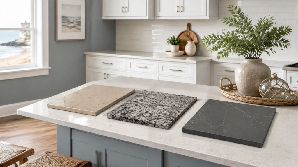
You're standing in a South Jersey showroom holding a cabinet door in one hand and a quartz sample in the other, trying to decide whether the whites match. Under bright store lighting, everything looks clean and coordinated. At home in Cherry Hill, the same countertop may turn blue beside north-facing windows, yellow beside warm oak flooring, or much darker beneath pendant lights.
The answer to what color countertop with white cabinets isn't “white, gray, or marble.” The right choice depends on the cabinet's undertone, the room's natural light, the flooring already in place, and how much contrast you want. My strongest recommendation for most South Jersey renovations is a soft white, warm greige, or mid-tone warm gray with restrained movement, selected beside the actual cabinet door and flooring.
Table of Contents
- Why White Cabinets Need the Right Countertop Match
- Understanding Undertones in White Cabinets and Countertops
- Best Countertop Colors to Pair With White Cabinets
- Coordinating Backsplashes Floors and Hardware
- Lighting Materials and Budget Considerations for South Jersey Homes
- Bringing Your Kitchen Vision to Life With Expert Guidance
Why White Cabinets Need the Right Countertop Match
A homeowner in Cherry Hill recently chose stark white cabinets with a cool gray quartz countertop because the combination looked crisp in the showroom. The finished kitchen told a different story. North-facing windows softened the daylight, the gray surface read colder than expected, and the white cabinets took on a clinical cast. The room was functional, but it didn't feel welcoming during morning coffee or evening cooking.
That result isn't unusual. White cabinets reflect surrounding colors, so the countertop, backsplash, floor, and lighting all influence how the cabinetry appears. A warm white can look creamy beside a blue-gray slab. A cool white can look dingy beside a yellow-beige surface. The mismatch may be subtle, but you'll notice it every day.
The countertop deserves particular attention because it covers the kitchen's largest working plane. It frames the sink, supports meal preparation, dominates the island, and catches light across the room. A cabinet color can look acceptable on a small door sample, while the wrong countertop can make the entire kitchen feel disconnected.
For a useful visual starting point, compare several countertop and cabinet combinations before narrowing the palette.
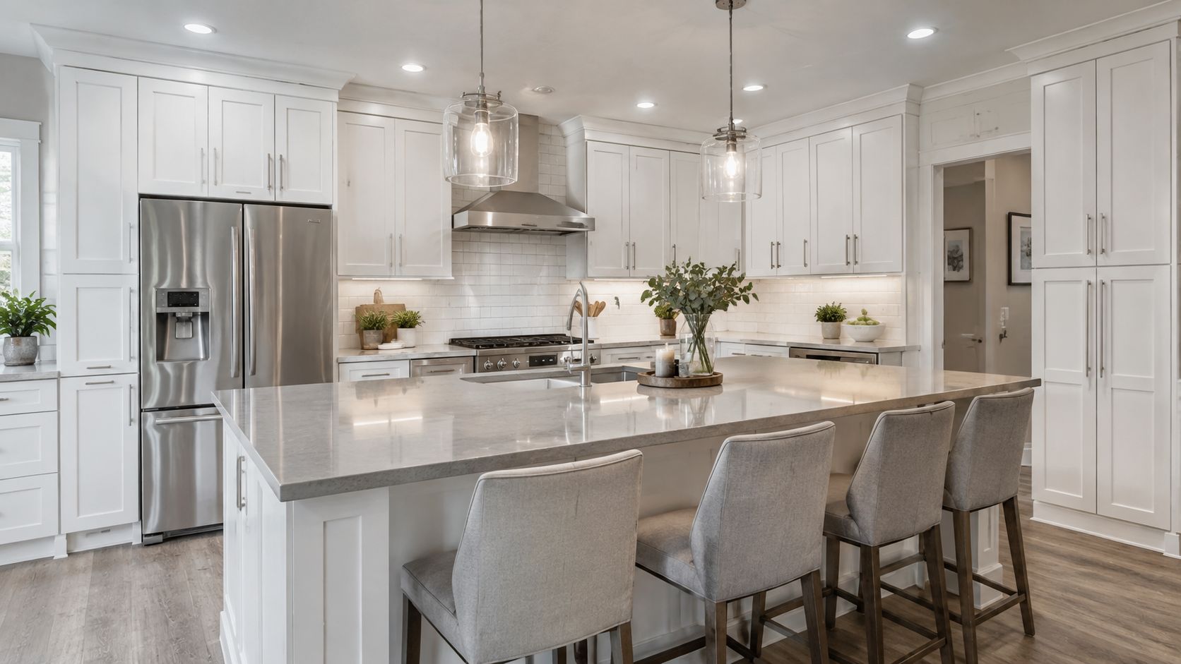
South Jersey homes create different starting points
An older colonial in Haddonfield or Moorestown may already have honey-toned oak floors, stained trim, or a warm adjoining dining room. In that setting, a cool gray countertop can create tension even when the cabinets are painted white. Newer construction in Voorhees, Mount Laurel, or a shore community may use gray-toned flooring, cooler tile, and brighter trim, which can support a cleaner white and a cooler surface.
The countertop should connect those existing conditions rather than fight them. You're not designing a photograph. You're choosing a surface that must work under changing daylight, task lighting, pendant fixtures, appliance reflections, and the visual demands of future resale.
Designer's rule: White cabinets give you flexibility, but they don't eliminate the need for color discipline.
White-on-white remains a strong direction, but it only succeeds when the countertop adds distinction through undertone, veining, flecks, or finish. A slab that's nearly identical to the cabinet door can make the room look flat unless hardware, flooring, backsplash texture, or lighting supplies the missing definition.
Understanding Undertones in White Cabinets and Countertops
The visible color is only half the decision. Undertone is the quiet color beneath the surface, and it often determines whether two “white” materials look coordinated or mismatched.
Warm whites usually carry yellow, cream, beige, or peach influence. Benjamin Moore White Dove and Sherwin-Williams Alabaster are familiar examples of whites that can feel softer and more welcoming. They work naturally with cream, beige, tan, taupe, warm greige, and stone with gold or caramel movement.
Cool whites lean blue, gray, or stark. Benjamin Moore Chantilly Lace and Sherwin-Williams Extra White are cleaner examples. They generally suit crisp white, cool gray, black, blue-gray, and stone with restrained silver or gray veining.
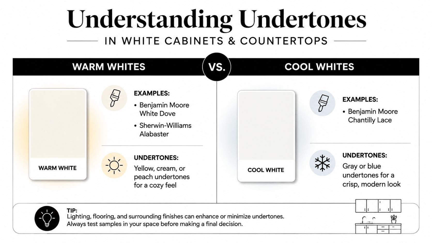
Countertops carry undertones too. Calacatta-style surfaces often include warmer gold or taupe veining, while Carrara-style patterns commonly lean blue-gray. Black granite may read warm when brown flecks dominate, or cooler when silver and charcoal details are more prominent. The name of the stone won't tell you enough. You need to inspect the actual slab or a representative full-size sample.
Use a simple paper test
Take a cabinet door or finish sample into natural light. Hold a sheet of pure white printer paper directly beside it.
- If the cabinet looks creamy or slightly yellow, treat it as warm.
- If it looks blue, gray, or especially crisp, treat it as cool.
- If it changes dramatically from morning to evening, consider it neutral but let the room's lighting guide the final choice.
Then place the countertop sample beside both the cabinet and the paper. Don't judge the slab alone. A beige surface may look neutral by itself but strongly yellow next to a cool cabinet. A gray quartz may look balanced in the showroom and icy beside warm oak flooring.
A common South Jersey mistake is pairing warm white cabinets and oak floors with a cool countertop because gray feels current. The floor reinforces the cabinet's warmth, while the counter pulls the eye in a colder direction. The kitchen may never look obviously wrong, but it won't feel settled either.
Paint sheen changes the reading. Glossy cabinet doors reflect windows, counters, and nearby walls, making surrounding colors more noticeable. Matte and satin finishes scatter light more softly, but they don't erase undertones. Check samples at breakfast, during afternoon daylight, and under the lights you'll use at night.
For broader cabinet color context, review this guide to choosing kitchen cabinet colors.
Best Countertop Colors to Pair With White Cabinets
A South Jersey kitchen with white cabinets can look settled or slightly off depending on one decision: whether the countertop repeats the cabinet's undertone. Start there, then decide how much contrast the room can support. For a dependable, resale-safe palette, choose soft white, warm greige, or mid-tone warm gray. Light surfaces remain a common choice. The Houzz U.S. kitchen trends data reports white countertops at 43% of renovating homeowners in 2024, compared with 11% for gray and 17% for multicolored countertops, as summarized in this Houzz countertop color overview.
White cabinets and light counters are established choices, not a narrow trend. The 2022 U.S. Houzz Kitchen Trends Study reported white as the leading cabinet color at 41% and the leading countertop color at 39%. Multicolored countertops reached 24%, while gray countertops represented 12%, down from 15% in 2020. Use those figures as context, not a rule. A continuous light palette gives a kitchen broad appeal, while a carefully chosen contrast can make the design feel more personal.
| Color Family | Best Cabinet Undertone | Ideal Style | Maintenance | Cost Range (per sq ft) |
|---|---|---|---|---|
| Bright white | Cool or neutral | Modern new build, minimalist kitchen | Shows crumbs and spills readily | Varies by material and supplier |
| Warm beige or cream | Warm | Colonial, farmhouse, traditional home | More forgiving visually than stark white | Varies by material and supplier |
| Soft to medium gray | Cool or neutral | Transitional, contemporary, newer construction | Depends on finish and material | Varies by material and supplier |
| Black or charcoal | Cool, or warm when flecked with brown | Modern, industrial, dramatic shore house | Dark polished surfaces show dust and spots | Varies by material and supplier |
| Natural stone with restrained movement | Matched to vein color | Luxury traditional, custom renovation | Natural stone may require material-specific care | Varies by material and supplier |
The safest light options
Bright white-on-white belongs with cool white cabinets. Add faint veining, fine flecks, or a honed finish so the counter does not look like a flat extension of the doors. The result feels clean and spacious in a newer home, though bright surfaces expose crumbs, flour, water spots, and everyday mess.
Warm beige, cream, and soft greige are the strongest choices for warm white cabinets, especially in colonials with oak floors. Select a stone-like beige instead of a strongly yellow beige. Soft greige can connect white cabinetry to natural wood while keeping the room current. A blue-gray counter beside those materials creates a competing temperature and often leaves the kitchen feeling unsettled.
Soft or medium gray works with cool white cabinets and contemporary rooms. Gray with a little warmth can also work beside oak, brass, or beige-adjacent flooring. Blue-gray delivers a sharper, more modern contrast, but reserve it for rooms whose other finishes can support that cooler direction.
For material guidance, Jennifer Gilmer Kitchen & Bath offers a useful practical guide to choosing countertops for your kitchen. Homeowners comparing granite can also review these popular granite countertop colors before narrowing samples.
When contrast earns its place
Black and charcoal countertops give white cabinets immediate structure. Choose them with crisp white doors, matte black hardware, and a light backsplash. Charcoal feels less severe than pure black. A black slab with brown flecks connects more comfortably to warm floors and stained wood.
The trade-off is visible maintenance. Dust, water spots, and fingerprints stand out on dark counters, particularly with polished finishes. Honed stone reduces glare and makes the contrast quieter, but care requirements still depend on the material.
Natural stone patterns, including marble-look quartz and quartzite-style surfaces, add movement without creating a solid block of color. Match the dominant vein to the cabinet temperature. Warm white cabinets pair with taupe, cream, or gold movement. Cool white cabinets suit gray or blue-gray veining. If the pattern is dramatic, keep the surrounding choices restrained so the counter remains the focal point.
Island contrast can work without disrupting the whole kitchen. The same Houzz overview found that 29% of homeowners adding or upgrading an island selected a white island countertop, while wood tones followed at 14% medium, 8% light, and 4% dark. Keep perimeter counters quiet and introduce a wood-toned island only when the flooring and adjoining rooms already support another material.
Coordinating Backsplashes Floors and Hardware
Once the slab and cabinet door work together, the surrounding finishes should support that relationship rather than introduce a new argument. Treat the countertop as the bridge between the vertical cabinets and the floor. The backsplash should usually echo the counter, while the hardware supplies controlled contrast.
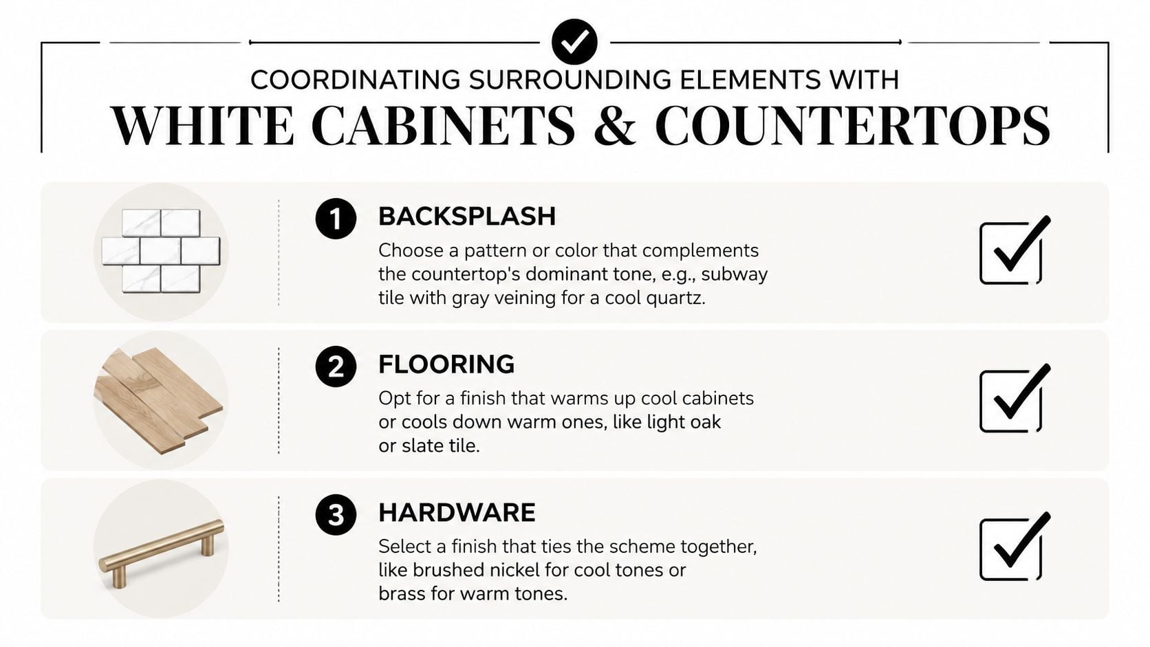
Start with the backsplash
A dark countertop can make the lower half of the kitchen feel visually heavy. A light subway tile, softly textured zellige, or quiet off-white backsplash keeps the wall open and lets the white cabinets retain their brightness. If the countertop has strong movement, don't add a competing mosaic or multicolor tile.
White-on-white needs texture. A honed stone backsplash, handmade-look tile, narrow grout contrast, or subtle vertical pattern can separate the cabinet from the counter without adding another dominant hue. The key is variation in surface and light reflection, not a random accent color.
Use the countertop's dominant tone as the backsplash guide:
- Cool gray veining: Choose white, pale gray, or softly blue-gray tile.
- Warm gold or taupe veining: Choose cream, warm white, beige, or muted taupe tile.
- Black or charcoal surface: Keep the backsplash light and textured.
- Quiet solid counter: Let the backsplash carry modest pattern or tactile interest.
More backsplash-specific guidance is available in this guide to timeless kitchen backsplashes.
Let the floor establish warmth
Match the floor to the countertop before matching it to the cabinets. White cabinetry is a reflective backdrop, but the floor usually occupies a broad, uninterrupted field that strongly affects the room's temperature.
Wide-plank oak can warm a cool white-and-gray kitchen. Slate or gray tile can steady a warm white palette when the countertop includes compatible gray or taupe notes. In an older South Jersey home, existing flooring may be the constraint. Don't choose a countertop that requires replacing a perfectly serviceable floor unless the entire renovation plan supports that expense.
Avoid introducing a collection of unrelated wood tones. If the floor is warm oak, use wood stools or an island accent only when they belong to the same visual family. One intentional wood connection is more effective than several near-matches.
Finish with hardware and lighting metals
Hardware should echo the faucet and, ideally, one nearby lighting finish. Brushed nickel and chrome support cool countertops. Brass, antique brass, and bronze reinforce warm white cabinets and gold-veined stone. Matte black can work with either direction when the room already has enough warmth or texture to prevent a stark result.
A kitchen in Medford with warm white cabinets, a quiet greige countertop, oak flooring, and brass pulls doesn't need another decorative metal. Repeating brass at the faucet and pendants creates cohesion without adding visual clutter.
Lighting Materials and Budget Considerations for South Jersey Homes
A countertop sample that looks balanced under showroom LEDs can change under your kitchen windows. North-facing light tends to make surfaces feel cooler, while stronger southern exposure can reveal warmth in cream, beige, gold, and taupe materials. Evening pendants and under-cabinet fixtures add another layer, especially when the bulbs cast a warm glow across glossy quartz or polished stone.
Never approve a slab from a small sample alone. Bring the cabinet door, countertop sample, backsplash, and flooring together in the actual kitchen. View them in the morning, afternoon, and evening, then photograph the grouping from the main doorway and work zones. Your eyes adapt quickly, but photographs often reveal whether the cabinet reads yellow, gray, or clean beside the counter.
Match material to the renovation purpose
A rental refresh, a resale-focused update, and a long-term family renovation shouldn't use the same material strategy. Choose the surface according to cooking habits, maintenance tolerance, property goals, and the visual standard of the surrounding home.
| Material | Price Tier | Maintenance Level | Best For |
|---|---|---|---|
| Laminate | Entry-level | Low routine care | Investment properties, rentals, quick updates |
| Entry-level quartz | Entry to mid-range | Generally straightforward routine care | Busy households seeking a consistent pattern |
| Granite | Mid-range | Material-specific care, including sealing where required | Family homes and varied natural movement |
| Quartzite | Mid-range to premium | Material-specific care | Long-term renovations seeking natural stone character |
| Marble | Premium | Higher attention to staining and etching | Custom homes and owners who accept patina |
| Exotic stone | Premium | Varies significantly by stone | Highly customized homes and statement spaces |
Material names don't determine the exact price. Slab availability, fabrication, sink cutouts, installation complexity, edge treatment, and local supplier selection all affect the final estimate. Ask for a complete installed proposal rather than comparing material labels in isolation.
Budget for use, not just appearance
Quartz offers consistent patterns and a broad range of white, gray, greige, and veined looks, which makes it practical for households that don't want sealing routines. Granite provides natural variation and durability, but its care requirements depend on the specific stone. Marble delivers classic movement, yet it's less forgiving around acids, stains, and careless handling. Porcelain and sintered surfaces can offer strong heat performance, but fabrication quality matters.
Edge profiles and thickness details also change the result. A simple eased edge keeps a modern slab quiet. A more substantial profile can make a traditional kitchen feel finished, but it may add fabrication complexity. Discuss those details before the countertop is ordered, not after the cabinet installation.
For homeowners coordinating cabinets, counters, tile, and construction decisions, a kitchen and bathroom remodeling consultation can help align material choices with the wider project.
Bringing Your Kitchen Vision to Life With Expert Guidance
Choosing a countertop for white cabinets involves more than selecting a color from a display wall. You need to compare cabinet undertones, inspect full-size slab movement, test the palette under real lighting, coordinate the backsplash, and decide whether the island should match or contrast. Each decision affects the next one.
A Victorian farmhouse in Haddonfield needs a different starting point from a contemporary waterfront build in Ocean City. Existing floors, window exposure, trim, appliance finishes, and the adjoining rooms all influence whether a warm white, crisp white, greige, or gray countertop feels intentional.
A mobile showroom visit makes that assessment more practical. Instead of judging tiny samples beneath fluorescent store lighting, you can compare cabinet doors, countertop options, hardware, and tile in the room where they'll live. The process should include:
- Undertone assessment: Identify whether the planned or existing white cabinetry is warm, cool, or changeable under different light.
- Live sample comparison: Place countertop and flooring samples together near windows, work areas, and adjoining rooms.
- Finish coordination: Review backsplash texture, faucet and hardware metals, edge profiles, and cabinet sheen as one composition.
- Project alignment: Connect the material choices to your renovation priorities, maintenance habits, budget, and timeline.
The Cabinet Coach provides a mobile cabinet showroom and design consultation for South Jersey homeowners, bringing curated cabinetry, countertops, hardware, and tile selections into the home. You can learn more about a kitchen design consultation before making a final countertop decision.
A confident selection usually feels quieter than the search process. The whites relate, the floor supports the slab, the backsplash doesn't compete, and the hardware gives the room enough definition to stay interesting.
The Cabinet Coach brings cabinet doors, countertop samples, hardware, and tile directly to South Jersey homes so you can judge undertones under your actual light. Schedule a no-pressure consultation by visiting The Cabinet Coach and take the guesswork out of choosing a countertop that works with your white cabinets.