
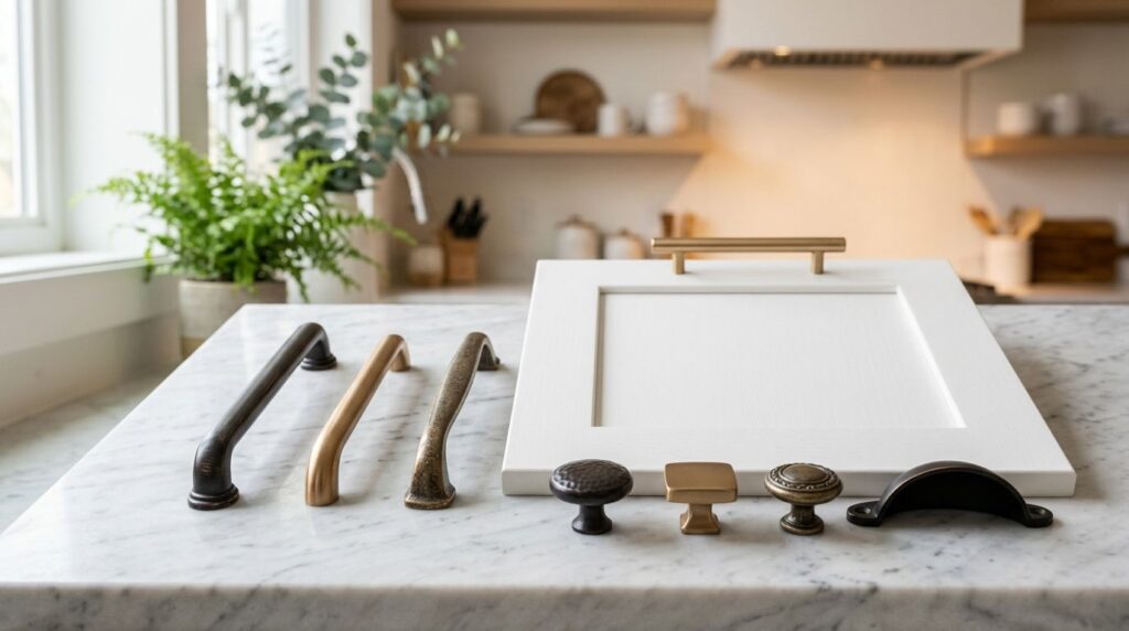
You're probably looking at a screen full of pulls and knobs that all say bronze, yet none of them look the same. One reads warm and golden. Another leans dark brown. A third has a copper cast that looked subtle online but feels much stronger in your kitchen lighting. That's where many South Jersey homeowners get stuck.
Bronze kitchen cabinet hardware is one of the safest finish families you can choose if you want warmth, depth, and a kitchen that doesn't feel tied to a short-lived trend. But choosing it well takes more than picking the word “bronze” from a filter menu. Finish variation, cabinet color, scale, and placement all matter. In older homes around Haddonfield, Collingswood, and Moorestown, bronze can add the kind of character that makes painted cabinetry feel grounded. In newer homes around Cherry Hill and Mount Laurel, it can keep a bright kitchen from feeling flat.
Table of Contents
- Why Choose Bronze for Your Kitchen Hardware
- Decoding the Different Bronze Finishes
- The Myth of a Perfect Bronze Match
- How to Pair Bronze Hardware with Your Kitchen Style
- A Practical Guide to Sizing and Placement
- Budgeting for Bronze Hardware and Ensuring Longevity
- Find Your Perfect Hardware with The Cabinet Coach
Why Choose Bronze for Your Kitchen Hardware
A lot of homeowners start with chrome, black, or brushed nickel because those finishes feel familiar. Then they hold a bronze sample against a white shaker door and the whole kitchen softens. That's the appeal. Bronze doesn't just add contrast. It adds atmosphere.
Bronze cabinet hardware, particularly in oil-rubbed and champagne bronze variants, has remained a go-to finish choice across over a decade of kitchen remodeling trends because of its rich, warm tonal properties, according to Liberty Hardware's bronze collection. That staying power matters if you're remodeling once and want the result to hold up visually for years.
In South Jersey, this works especially well in kitchens with white cabinets, creamy off-whites, soft grays, and natural wood accents. Bronze gives those palettes more depth than a cooler metal. It also plays nicely with the layered look many homeowners want now, especially when they're already incorporating metal accents through lighting, stools, or decorative details.
Practical rule: If your kitchen feels clean but a little flat, bronze usually warms it up faster than changing the cabinet color.
Bronze also tends to feel more forgiving than shinier finishes. It doesn't call attention to every fingerprint or every reflection. In a family kitchen where people are opening drawers all day, that matters.
If you're still deciding between knobs, cup pulls, bar pulls, or a mix, it helps to review a full decision framework before you buy. This guide on how to choose cabinet hardware is a smart companion if you're narrowing down style and function at the same time.
Decoding the Different Bronze Finishes
“Bronze” is not one look. It's a family of finishes. That's where confusion starts, especially online, where product photography can flatten the differences.
How each finish reads in a real kitchen
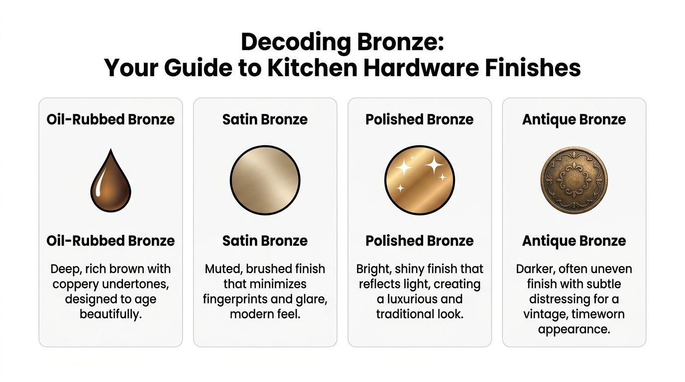
Oil-rubbed bronze usually reads as a deep brown with coppery undertones. It has weight. On white shaker cabinets, it creates a traditional or farmhouse lean. On stained wood, it can feel old-world or refined depending on the door style.
Satin bronze or champagne bronze is softer and lighter. It often feels cleaner, less rustic, and more transitional. If a homeowner wants warmth without the stronger contrast of dark hardware, this is usually where I'd point them first.
Polished bronze reflects more light and carries more formality. It suits kitchens that want a more dressed-up look. The caution is that a highly reflective finish asks the rest of the room to be consistent. In a casual kitchen, it can read too glossy.
Antique bronze tends to have a darker, timeworn look with subtle variation in the finish. This works well on furniture-style vanities, detailed cabinetry, and kitchens that already have character built in through molding, beadboard, or vintage-inspired lighting.
A helpful outside read on mixing and reading metals in furniture and interiors is Slone Brothers' insights on metal accents. It's useful because homeowners often choose hardware in isolation, when they should be viewing it as part of a larger material story.
For homeowners tracking current looks, this roundup of kitchen cabinet hardware trends can help place each bronze finish in a broader design context.
Comparing Bronze Cabinet Hardware Finishes
| Finish Type | Appearance | Best For Styles | Maintenance Level |
|---|---|---|---|
| Oil-Rubbed Bronze | Dark brown with warmer copper notes | Farmhouse, traditional, rustic transitional | Moderate |
| Satin Bronze | Muted, brushed, softer warmth | Transitional, modern classic, light kitchens | Moderate |
| Polished Bronze | Bright, reflective, more formal | Traditional, elevated classic kitchens | Higher |
| Antique Bronze | Darker, aged, sometimes distressed | Vintage-inspired, collected, furniture-style spaces | Moderate |
A simple way to test your instinct is to ask one question: do you want the hardware to blend, frame, or announce itself?
- Blend: satin bronze usually behaves best.
- Frame: oil-rubbed bronze creates clear definition.
- Announce itself: polished bronze does the most visual work.
- Add age and character: antique bronze brings texture and mood.
The Myth of a Perfect Bronze Match
A South Jersey homeowner picks an oil-rubbed bronze faucet online, then orders cabinet pulls labeled oil-rubbed bronze from another brand. On install day, the faucet reads rich brown, the pulls read almost black, and the pendants add a third bronze that looks coppery. The problem is not the style choice. The problem is assuming the finish name guarantees a match.
Why the label is not enough
Bronze finish names are loose categories, not fixed standards. Oil-rubbed bronze, champagne bronze, and antique bronze can shift a lot from one manufacturer to the next because each company uses different base metals, plating methods, lacquers, and color targets.
That false match catches homeowners all the time. A sample can look close under store lighting, then turn noticeably warmer, flatter, or grayer once it sits next to your faucet, your cabinet paint, and your countertop in real kitchen light.
I see this often in South Jersey kitchens, especially in transitional remodels where homeowners want warm metals without going too yellow. One brand's bronze may have soft copper notes that work beautifully with cream cabinets and honed quartz. Another can skew muddy against the same door style and suddenly make the room feel less intentional.
How to build coordination instead of chasing a match
Aim for a coordinated bronze story, not a perfect one-to-one match.
Start with undertone. That is what the eye reads first. If the faucet leans brown with a little copper warmth, pulls with the same general warmth usually work even if the sheen is different. If the faucet has a muted gold cast, pairing it with a dark gray-brown bronze often looks accidental.
Use this checklist before you place the order:
- Check the manufacturer's finish code: the finish name by itself is too broad to trust.
- Compare real samples in your kitchen: morning light, cloudy afternoons, and under-cabinet lighting can all change the read.
- Study the undertone: look for brown, copper, gray-brown, or soft gold.
- Pick one lead metal: usually the faucet, range top trim, or statement lighting.
- Repeat the same warmth elsewhere: barstool frames, sconces, or a mirror can help the finish feel intentional.
One practical trade-off matters here. Buying every metal piece from one brand can improve consistency, but it can also limit your style options and push the budget up fast. Mixing brands gives you better selection, but only if you compare samples side by side instead of trusting product photos.
If cabinet color is still in play, make that decision first. Bronze changes character against white, taupe, greige, navy, and stained wood, so your finish choice should follow the cabinetry, not fight it. Our guide on how to choose kitchen cabinet colors can help you narrow that down before you commit to a bronze family.
How to Pair Bronze Hardware with Your Kitchen Style
Pairing bronze well is less about rules and more about making the finish support the room. Cabinet color, countertop movement, and nearby metals all change the result.
With painted cabinets
On white cabinets, dark bronze creates a crisp outline around doors and drawers. This is one of the easiest ways to keep an all-light kitchen from washing out. If the white has a creamy undertone, warmer bronze finishes usually feel more natural than cooler metals.
On navy or deep green, satin or champagne-toned bronze can look especially refined because the warmth softens the cabinet color instead of fighting it. These pairings feel collected rather than stark.
On gray cabinets, caution helps. Gray can skew warm or cool, and bronze that leans too coppery can feel disconnected against a cooler gray. In those kitchens, I'd test the sample against the exact painted door, not a fan deck chip.
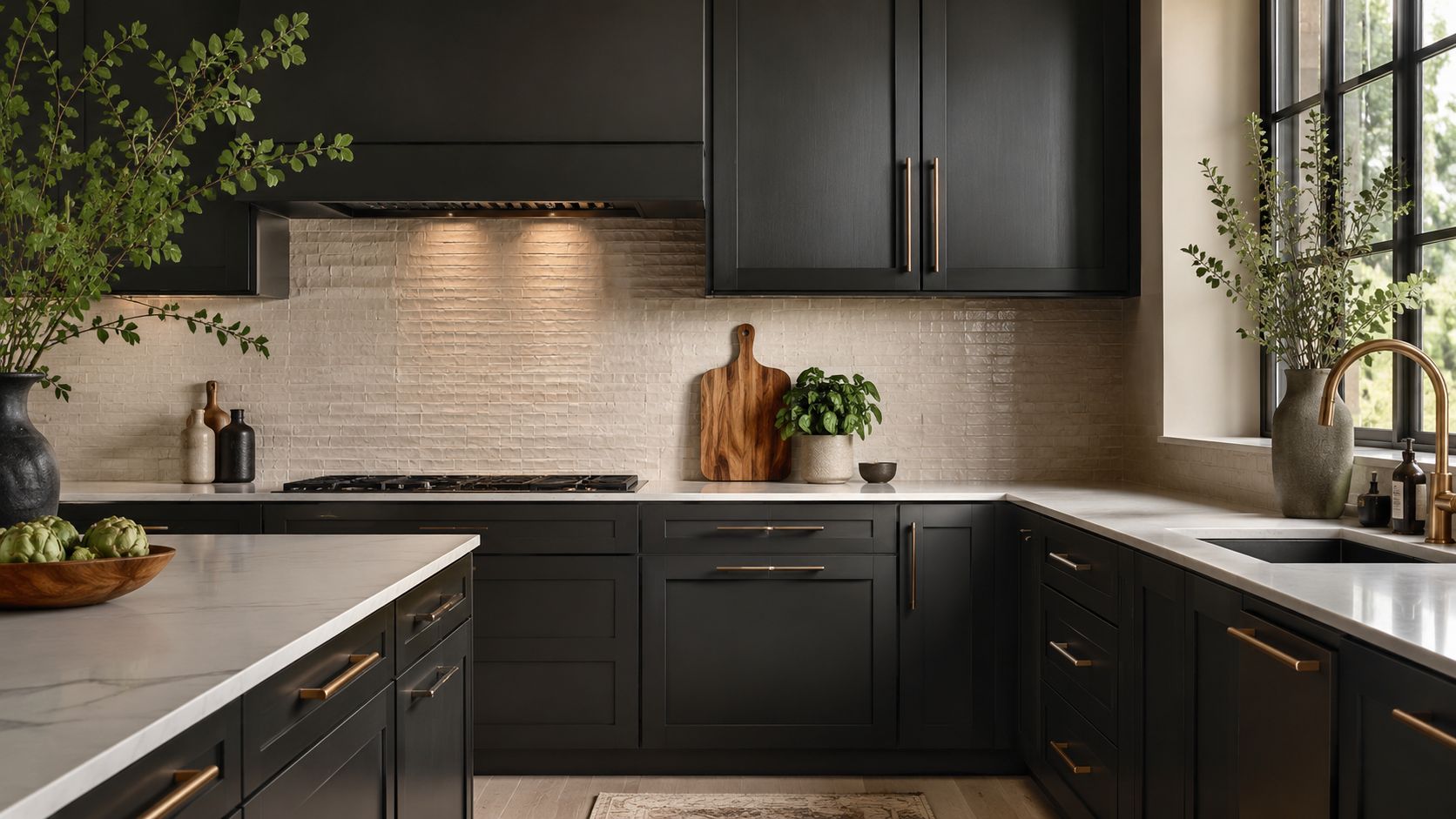
On black cabinets, bronze can look exceptional. Bronze cabinet hardware is often paired with matte black or flat black finishes in modern collections to create a bold, contrasting visual statement, as shown by Forge Hardware Studio's bronze and black hardware collections. The pairing has depth without feeling flashy.
A black cabinet with bronze hardware doesn't need much ornament. The contrast already does the work.
With countertops and other metals
Countertops decide whether bronze feels integrated or dropped in.
If your quartz or natural stone has warm veining, bronze often picks that up beautifully. If the top is bright white with very cool gray movement, you need to be more deliberate. In that setting, a softer bronze usually lands better than a dark, reddish one.
Use these pairings as a practical starting point:
- Warm white quartz: satin or champagne bronze often feels easiest.
- Marble-look tops with bold veining: choose bronze based on whether the veining reads warm or cool.
- Butcher block or walnut accents: darker bronze usually feels grounded and natural.
- Concrete-look surfaces: bronze can work, but cleaner silhouettes help keep it modern.
For metal fixtures, think in terms of a coordinated palette. A bronze pull doesn't need to copy the faucet exactly. It needs to belong in the same room. That usually means repeating tone and visual weight, not cloning finish names.
A kitchen with bronze hardware, black lighting, and a black faucet can look much more intentional than a kitchen where every metal is technically “bronze” but none of the undertones agree.
A Practical Guide to Sizing and Placement
A bronze pull that looked perfect on a sample board can feel clumsy once it's installed across a full kitchen. I see that a lot in South Jersey homes, especially when homeowners order hardware online from two or three brands and assume the finish and scale will read the same in person. They usually do not. Bronze already carries more visual presence than polished chrome or brushed nickel, so sizing and placement need to be tighter.
How to size pulls without guessing
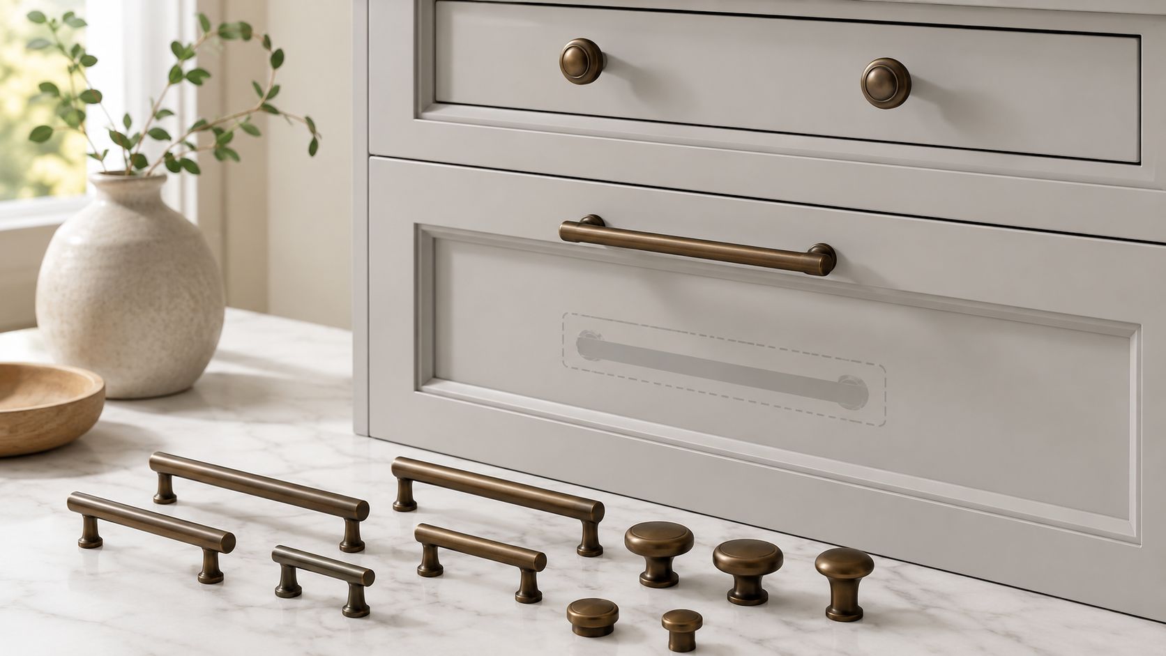
Start with proportion, then adjust for the way bronze reads on the cabinet. A common rule is to choose a pull that looks balanced on the drawer or door, often somewhere around one-third of the drawer width for many standard bases. That is a starting point, not a rule you force onto every cabinet.
Bronze changes the read.
A slim 5-inch pull in satin nickel can disappear nicely on a painted shaker door. The same length in a darker oil-rubbed or aged bronze can look heavier, more formal, and more dominant. That difference matters on narrow uppers and short vanity-height drawers, where an oversized pull can crowd the door style or make the whole run feel top-heavy.
In practice, these guidelines hold up well:
- Wide drawers: longer pulls usually feel right and work better in the hand.
- Standard base or wall doors: medium pulls or knobs often keep the proportions cleaner.
- Small upper cabinets: shorter pulls or knobs usually look better than statement hardware.
- Tall pantry doors and appliance panels: longer pulls can add the right amount of scale, but only if the profile is not bulky.
- Mixed-brand bronze hardware: compare pieces side by side before drilling. Two pulls with the same center-to-center size can still look different if one has thicker posts, a darker finish, or more backplate coverage.
That last point gets missed all the time. The false match problem is not only about finish color. It shows up in size perception too. One brand's “champagne bronze” bar pull may look lighter and thinner, while another brand's “brushed bronze” pull at the same nominal size reads darker and visually larger. On a full cabinet run, that inconsistency stands out.
If you are refreshing painted cabinets instead of replacing them, hardware scale should also make sense with the overall scope of the project. Homeowners comparing pull upgrades with kitchen cabinet painting cost often find that better-sized hardware gives more visible payoff than adding more pieces in the wrong proportion.
Where knobs and pulls should go
Placement affects comfort, symmetry, and how custom the kitchen feels. On upper doors, knobs usually sit on the lower corner opposite the hinge. On lower doors, they usually sit on the upper corner opposite the hinge. Pulls follow the same logic, but the exact height or setback needs to stay consistent across the whole run.
Consistency matters more than chasing a trend.
Drawer placement depends on drawer height. On shallow top drawers, a centered knob or pull usually looks right. On deeper drawers, especially wide ones, longer centered pulls often feel better and look more grounded. Some larger drawers can take two knobs or two pulls, but that choice should match the cabinet style and the width of the drawer front.
Here's a visual walkthrough that helps if you want to see common placement patterns before drilling:
If you want a more detailed reference for doors, drawers, pantry units, and appliance panels, keep this cabinet hardware placement guide nearby while laying out your template.
My practical advice is simple. Tape every piece in place first, then step back to the opposite side of the room. Bronze hardware that looks fine from 18 inches away can still read too small, too dark, or slightly off-line once you see the whole kitchen at once. That check catches a lot of expensive mistakes before the first hole gets drilled.
Budgeting for Bronze Hardware and Ensuring Longevity
Hardware pricing can feel random until you handle the pieces side by side. Some pulls look similar online but feel completely different in hand.
What you're paying for
The biggest cost drivers are material quality, finish quality, and manufacturing precision. A lightweight piece may work fine in a low-use area, but a heavier, better-made pull often feels more stable on everyday drawers.
There's also a reason solid pieces stand out. The solid brass range of bronze hardware is designed to enhance the home's design, offering a premium feel that is both visually and tactilely superior to standard hardware options, achieved through high-quality materials and precise manufacturing, as described in Lo & Co Interiors' bronze handle collection.
If you're balancing hardware cost against a broader cabinet refresh, it helps to compare the small-detail spend with bigger finish decisions. A practical example is this breakdown of kitchen cabinet painting cost, which helps frame where hardware fits in a renovation budget.
For the larger remodel picture, this kitchen remodeling cost breakdown helps homeowners decide where premium hardware makes sense and where they may want to stay simpler.
How to keep the finish looking right
Bronze doesn't need complicated care. It does need restraint.
- Use a soft cloth: aggressive scrubbing can wear on the finish.
- Skip harsh cleaners: they can damage patina or protective coating.
- Wipe kitchen residue early: oils and splatter are easier to remove before they build up.
- Test first on one piece: especially if the finish has variation or distressing.
Bronze usually ages best when homeowners let it look like metal, not plastic. A little softening over time often adds character. Damage from strong cleaners does not.
Find Your Perfect Hardware with The Cabinet Coach
Big-box hardware shopping usually breaks down the same way. You collect a few samples, hold them under fluorescent lighting, order what seems close, then realize at home that your cabinet color, countertop, and faucet changed the whole read of the finish.
That's exactly why bronze can be frustrating to buy in pieces. The false-match problem doesn't show up clearly on a product page. It shows up in your actual kitchen, under your actual lights, next to your actual materials.
For South Jersey homeowners in Cherry Hill, Haddonfield, Voorhees, Moorestown, and surrounding communities, the advantage of a mobile showroom is simple. You can compare curated bronze hardware options where the decision happens. In the room. Against the cabinetry. Next to the countertop. With someone who understands how finish, scale, and placement work together.

That kind of process is especially useful if you're trying to coordinate more than hardware alone. Cabinet color, tile, countertop edge, faucet finish, and lighting all influence whether bronze feels warm, muddy, elegant, or too heavy. Seeing those choices together keeps small mistakes from becoming expensive ones.
A good kitchen doesn't come from chasing a finish label. It comes from choosing materials that belong together.
If you want help choosing bronze kitchen cabinet hardware that works in your home, The Cabinet Coach makes the process easier with a mobile showroom, guided selections, and real-world finish comparisons for South Jersey homeowners planning a kitchen or bath update.