

Is your bathroom vanity color the problem, or is the core issue that most advice stops at “pick white, gray, or blue” and never explains what will still look good once your lighting, tile, hardware, and daily use enter the picture? That’s where homeowners get stuck. A cabinet color can look perfect on a sample card, then feel flat in a Cherry Hill hall bath, too dark in a Haddonfield powder room, or unexpectedly cold in a Voorhees primary bath.
Bathroom cabinet color ideas work best when they’re tied to the room around them. The cabinet finish has to cooperate with countertop veining, mirror shape, bulb warmth, wall color, and how much visual weight the vanity should carry. A color that works beautifully in a bright, airy bathroom can make a smaller room feel boxed in if the supporting materials aren’t right.
That’s why this guide gets straight to practical choices. You’ll find 10 cabinet color directions, what each one does well, where it can go wrong, and how to pair it with finishes that keep the whole bathroom cohesive. If you’re also exploring warmer palettes throughout the room, these top brown bathroom decorating ideas are a useful companion.
Table of Contents
- 1. Classic Crisp White Bathroom Cabinets
- 2. Soft Dove Gray Cabinets
- 3. Deep Navy Blue Cabinets
- 4. Matte Black Elegance
- 5. Forest Green Serenity
- 6. Two-Tone White and Natural Wood
- 7. Moody Charcoal Gray Cabinets
- 8. Powder Blue Pastels
- 9. Blush Pink Statement Cabinets
- 10. Deep Teal Emerald Jewel Tone
- Top 10 Bathroom Cabinet Color Comparison
- Ready to Find Your Perfect Color?
1. Classic Crisp White Bathroom Cabinets
Want a bathroom cabinet color that still looks clean five years from now and helps a tight room feel bigger today? Crisp white remains one of the safest choices for that job, especially in South Jersey homes where many hall baths and older primary baths do not get generous natural light. In Cherry Hill projects, I often use white cabinetry to brighten the room first, then build character through tile, metal finishes, and wall color.
White works best when the rest of the palette does some of the heavy lifting. Carrara-look counters, unlacquered brass, warm oak accents, or a patterned floor keep the vanity from feeling cold. In Haddonfield and Voorhees, that balance matters because many homeowners want a bathroom that feels classic, but not builder-basic.
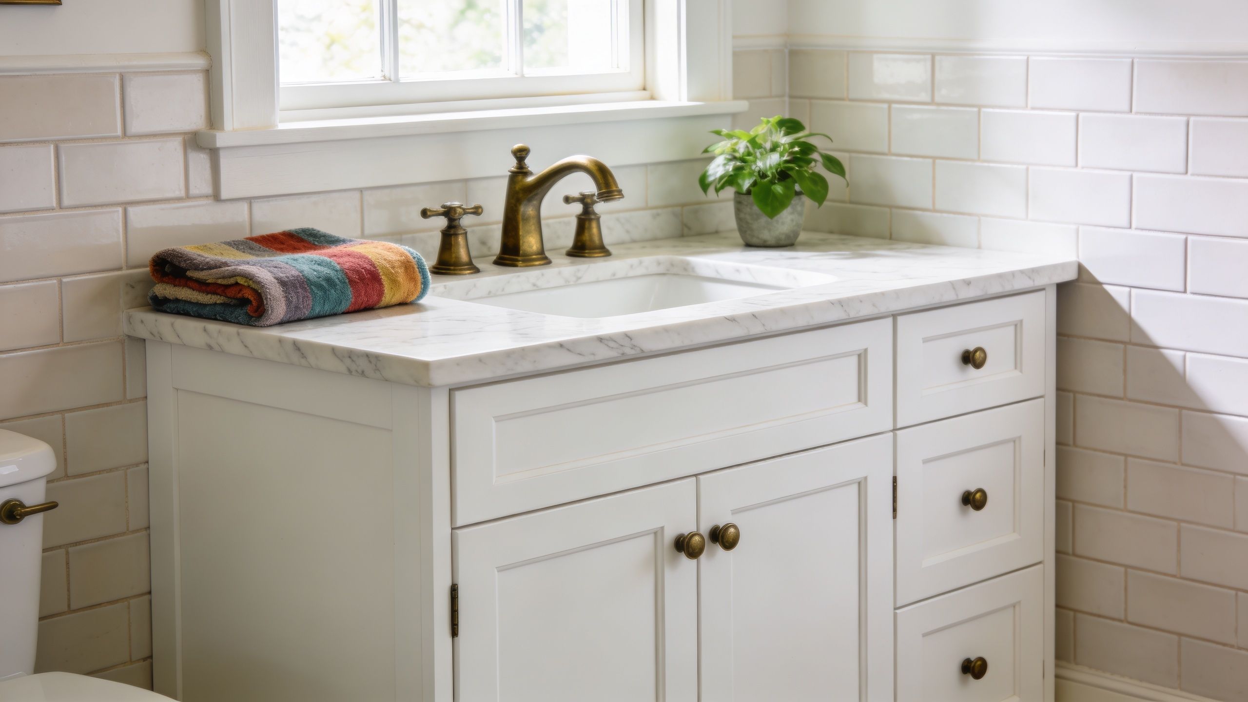
How to keep white from looking flat
The trade-off is maintenance and tone. White shows makeup dust, water spots, and scuffs faster than mid-tone paint colors. It can also read stark under cool LEDs, which is why I usually test the cabinet sample beside the countertop and under the actual vanity light before approving it.
A few decisions make a big difference:
- Choose the right white: Clean bright whites suit modern baths. Softer whites work better with cream tile, brass, or traditional millwork.
- Use a practical finish: Cabinet-grade satin or semi-gloss is easier to wipe than flatter finishes and holds up better around sinks.
- Add contrast on purpose: Wood shelving, textured tile, aged brass, or black mirrors give the eye somewhere to land.
- Scale the vanity correctly: In shared baths, the color will look better when the proportions are right. This guide to standard double vanity sizes helps prevent a white cabinet from feeling too bulky or too slight for the room.
Designer tip: White cabinets succeed when the room includes one warm finish and one textured finish nearby.
If you’re working with a compact layout, these small bathroom design ideas for Cherry Hill homes show how a lighter vanity color can help the room feel more open.
2. Soft Dove Gray Cabinets
Want a neutral that feels warmer than bright white but easier to live with than a darker painted vanity? Soft dove gray often lands in that sweet spot. It gives a bathroom some contrast without turning the cabinet into the main event.
In South Jersey projects, I reach for dove gray most often in homes where the fixed finishes are already doing a lot of work. In a Voorhees powder room, for example, a soft gray vanity with matte black fixtures and a white quartz top reads clean and refined without chasing a trend that may look dated in a few years. That balance is why gray continues to hold its place. Homeowners know what they are getting from it.
Where dove gray works best
Dove gray tends to perform best in transitional bathrooms and in older homes getting an update in stages. It works well with marble-look tops, simple ceramic wall tile, and both black and brushed brass hardware. In Haddonfield and Cherry Hill homes, that flexibility matters because many bathrooms mix original flooring, newer lighting, and replacement vanities instead of starting from a full gut renovation.
The trade-off is undertone. Some dove grays read soft and warm. Others go blue or slightly green once they sit under cool LEDs or next to a bright white countertop.
A paint chip will not tell you enough. Set the cabinet sample beside the countertop, tile, and vanity light, then check it in daylight and again at night. That step prevents the common mistake of choosing a gray that makes white finishes look dingy or too stark.
For homeowners who like the softness of gray but want more texture underfoot, a Handcrafted dove grey kilim can reinforce the palette without making the room feel monochromatic.
Soft gray is forgiving, but undertones decide whether the room feels calm or cold.
3. Deep Navy Blue Cabinets
Could your bathroom handle a darker vanity without feeling smaller? In many South Jersey homes, the answer is yes. Navy gives a bathroom structure and contrast that lighter colors cannot. It feels tailored, especially in guest baths and powder rooms where a vanity should carry some visual weight.
In a Collingswood guest bath, I would use navy to make a basic builder-grade layout feel more intentional. Flat-panel or simple Shaker doors keep the look controlled, while brass hardware and a white top sharpen the contrast. Navy also hides everyday smudges better than black, but it still needs enough light to show its depth.
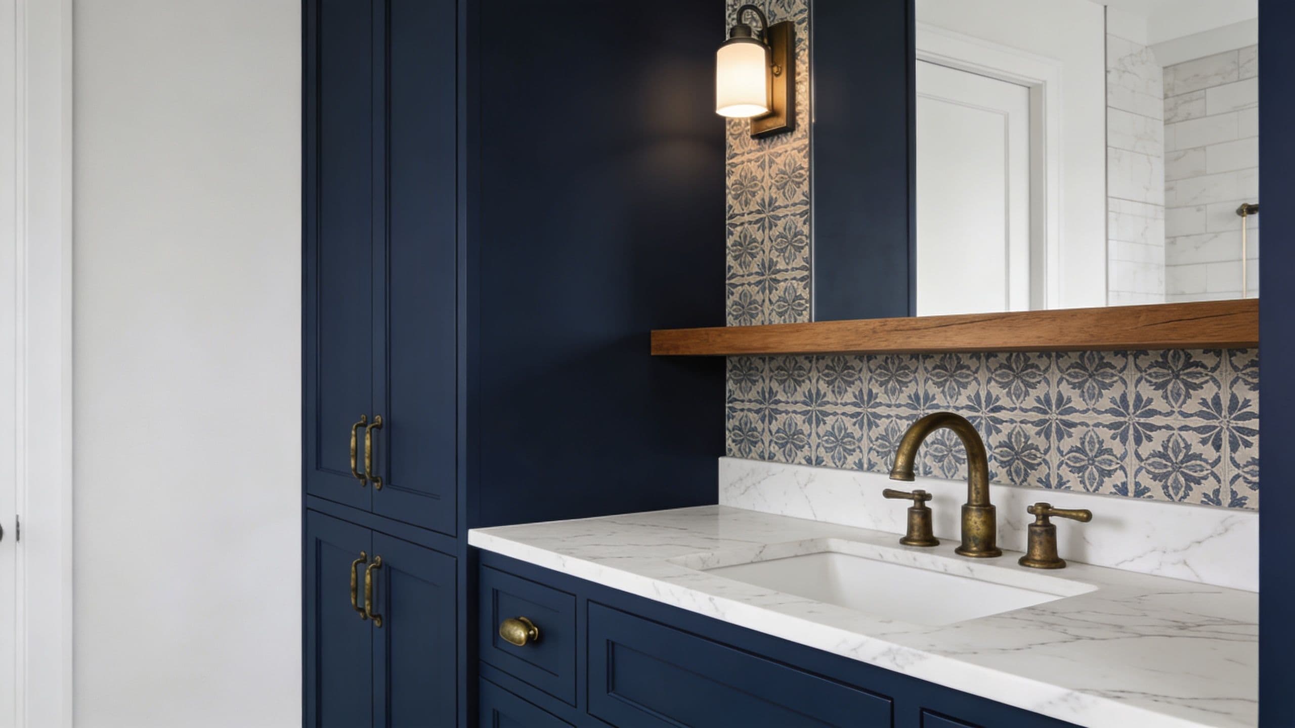
What navy needs around it
Navy works best when the surrounding finishes do some brightening. White quartz, marble-look tops, soft wall paint, and a mirror with presence usually give it the balance it needs. In Cherry Hill and Haddonfield bathrooms with limited natural light, I also recommend layered lighting so the color reads rich instead of dull by evening.
Material choice matters too. Dark painted doors show profile lines, joints, and surface texture more clearly than pale finishes do, which is one reason it helps to compare MDF vs. wood cabinet doors before choosing a painted bathroom vanity.
A few practical guidelines help navy look intentional:
- Use a light counter: White quartz or marble-look surfaces keep the vanity crisp.
- Add warmth with metal: Aged brass and brushed gold offset the coolness of blue.
- Watch the floor tone: Warm oak, white tile, or soft stone usually pair better than another dark surface.
- Layer the lighting: Overhead light alone rarely shows the full character of dark blue.
If you’re deciding between a single and double vanity before choosing a darker color, this guide to standard double vanity sizing can help you judge how much visual weight the room can handle.
4. Matte Black Elegance
Matte black cabinets are sharp, graphic, and unapologetically modern. In the right bathroom, they look intentional and expensive. In the wrong bathroom, they absorb light, show dust, and make the room feel tighter than it is.
That’s the trade-off. Black asks more from the rest of the space than almost any other vanity color. In a Haddonfield bath with tumbled marble tile, a lighter wall tone, and a strong mirror silhouette, matte black feels grounded and dramatic. In a narrow bathroom with weak lighting and too many dark surfaces, it can create a cave effect.
How to make black feel elevated
Black cabinetry needs contrast and breathing room. Light floors, pale wall tile, or a bright countertop are almost mandatory unless the room is large and intentionally moody.
Microfiber cleaning cloths matter here more than people expect. Matte black can telegraph dried splashes and powder residue faster than mid-tone colors.
Black works when the room has somewhere for the eye to rest. If every surrounding surface is dark, the vanity loses its shape.
Hardware choice changes the whole mood. Matte black-on-black looks sleek. Brass makes it warmer. Polished nickel adds a cleaner, more refined feel.
5. Forest Green Serenity
Could your bathroom use more warmth without losing that clean, settled feel? Forest green does that well. It brings depth, but it still feels calmer and softer than black, and it has more character than the safer gray choices many homeowners default to.
I see this color work especially well in South Jersey homes where the bathroom gets decent natural light but still needs some visual weight. In a Moorestown primary bath, a forest green vanity paired with creamy wall tile and a quiet white quartz top gave the room a polished aesthetic without making it feel formal. In older Haddonfield homes, it also helps bridge original architectural character with newer finishes.
The appeal is practical, too. Forest green hides daily smudges better than white, but it does not show dust and splash marks as aggressively as matte black. The trade-off is undertone sensitivity. Some greens read rich and grounded. Others turn muddy fast under warm vanity lighting, especially if the surrounding tile has a yellow or pink cast.
Best pairings for forest green
Forest green looks strongest next to materials that keep it balanced. Creamy whites, soft stone tones, oak or walnut accents, and brushed brass all give it warmth. Chrome sharpens it. Matte black hardware pushes it more modern, which can work, but the room usually needs enough light and contrast to keep the vanity from feeling heavy.
A few details make a big difference:
- Test the green under your actual bulbs: In Cherry Hill and Voorhees projects, I often see the sample door read completely different at night than it did in the showroom.
- Keep surrounding finishes quieter: Busy counters or heavily patterned tile can compete with green and make the room feel unsettled.
- Use a lower-sheen finish: Satin usually looks cleaner and more refined than gloss on darker painted cabinetry.
- Compare it against deeper neutrals: If green feels too specific for your home, these dark grey bathroom cabinet ideas show a close alternative with a little less color commitment.
If you like the idea of color but want something that still feels tied to the natural materials common in South Jersey homes, forest green is one of the safer bold choices. It has personality, but it usually ages better than trend-driven pastels or high-drama jewel tones.
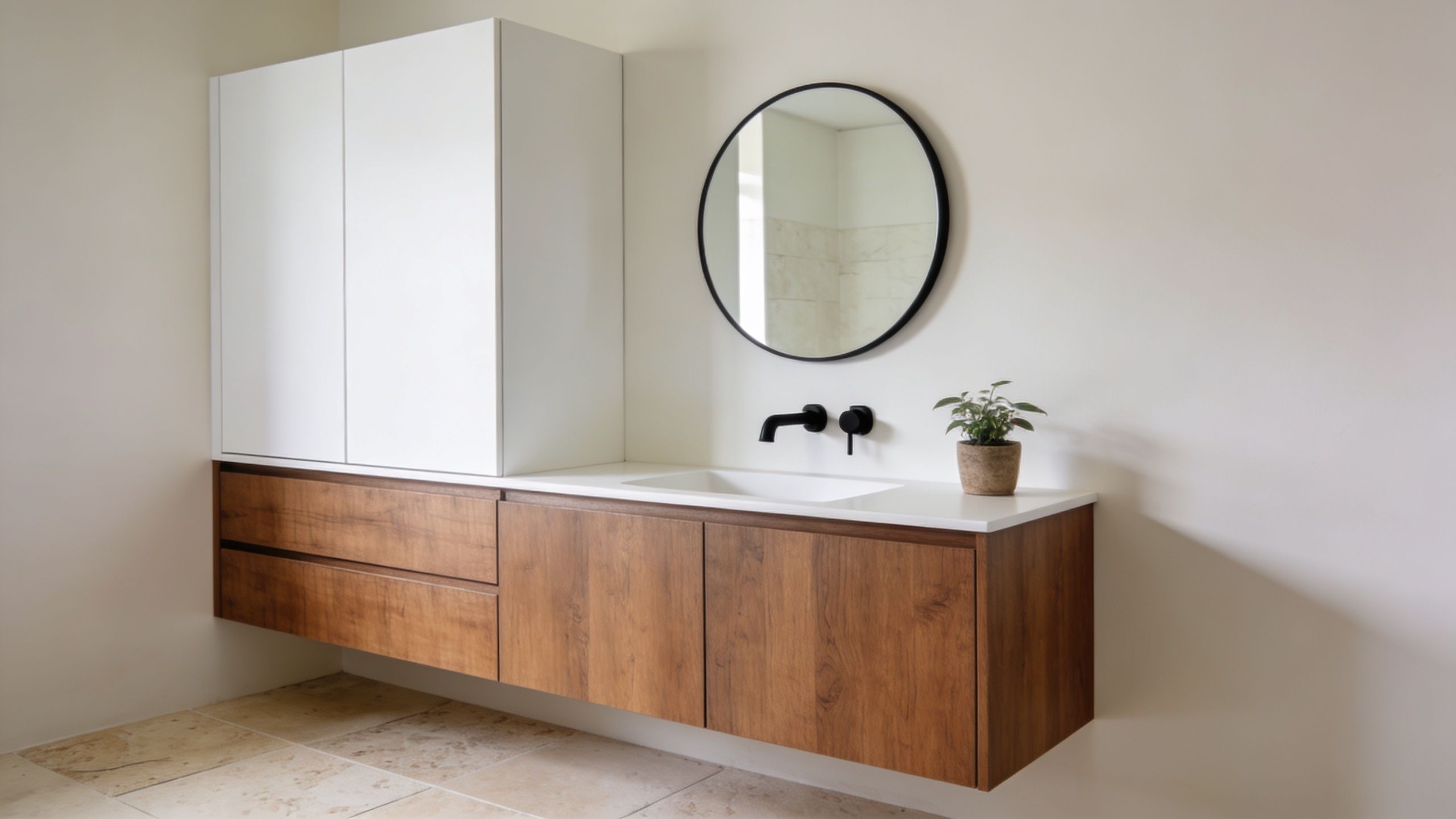
6. Two-Tone White and Natural Wood
Two-tone cabinetry solves a problem many homeowners have but don’t always name. They want the bathroom to feel bright, but they also want warmth. White and natural wood deliver both, especially in bathrooms where the vanity is a major visual element.
This look has become more aligned with current design direction as warm neutrals and wood textures continue to gain favor. Trend analysis heading into 2026 points toward warm palettes, natural wood tones, greige, off-whites with yellow or brown undertones, and deeper espresso finishes, according to this bathroom vanity trend overview. In practical terms, that means white uppers or surrounding finishes paired with walnut, oak, or stained wood lowers feel current without being loud.
Why the contrast works
A Burlington City bathroom with white lacquered uppers and walnut-stained oak lowers gets the best of both approaches. The white keeps the room open. The wood brings depth and hides everyday wear better than a fully painted cabinet run.
If you’re weighing materials as much as color, this breakdown of MDF vs. wood cabinet doors is worth reviewing before you finalize a bathroom vanity.
A short visual walkthrough helps show how mixed finishes can feel balanced rather than busy:
Wood in a bathroom does need proper sealing. The beauty of the look depends on the finish holding up, especially around sink splash zones and drawer fronts.
7. Moody Charcoal Gray Cabinets
Want a dark bathroom vanity that feels refined, not severe? Charcoal gray usually gets you there faster than black.
I use charcoal when a client wants contrast but the room does not have the natural light, ceiling height, or crisp architecture to support a true black finish. In a Pennsauken loft bath, charcoal cabinetry next to concrete-look counters and pale tile reads urban and polished. In a more traditional Haddonfield bath, the same color can feel quieter and more architectural with marble-look tops and warm brass hardware.
Dark bathroom palettes have moved well beyond niche status in recent years, as noted earlier. The practical takeaway is simple. Charcoal no longer feels risky if the rest of the room gives it enough balance.
When charcoal beats black
Charcoal works better than black in bathrooms that need depth without a hard outline. It is also more forgiving on day-to-day dust, water spotting, and soap residue. Homeowners in South Jersey notice that quickly, especially in busy hall baths and primary baths where morning light changes by the season.
A few details make the color work harder:
- Use lighting intentionally: Sconces at mirror height or under-vanity lighting keep charcoal from reading flat.
- Choose the right sheen: Matte and satin finishes hide fingerprints better than high gloss and suit this color more naturally.
- Warm up the supporting materials: White sinks, soft greige walls, oak accents, or brushed brass keep the room from feeling cold.
If you are considering this finish for an existing vanity, our bathroom cabinet painting services in South Jersey are often the fastest way to test whether charcoal fits your tile, lighting, and countertop instead of guessing from a paint chip.
For more inspiration in this palette family, take a look at these dark grey bathroom cabinet ideas.
8. Powder Blue Pastels
Could a soft blue vanity still work in a bathroom that needs to feel current, not dated? Yes, but the room needs the right supporting materials. Powder blue has a lighter, calmer feel than navy, and in the right setting it reads collected rather than cute. I’ve seen it land well in South Jersey homes, especially in Cherry Hill and Haddonfield baths with white tile, simple chrome fixtures, and plenty of natural light.
The trade-off is temperature. Pale blue can make a bathroom feel clean and open, but it can also turn chilly fast if every surrounding finish is cool. As noted earlier, bathroom color preferences have shifted warmer in recent years, so powder blue tends to perform best when it is treated as an accent color on the vanity, not the starting point for the whole room.
How to keep pastel blue from feeling juvenile
The biggest mistake is overcommitting to the coastal reference. Rope mirrors, shell decor, and stark bright white finishes usually make the vanity feel themed instead of designed. In practice, quieter materials hold up better. Pale limestone looks, warm whites, woven storage, and lightly grained wood keep the color grounded.
A few combinations work especially well:
- Choose crisp but not icy metals: Chrome and brushed nickel suit powder blue, especially with warmer bulbs at the mirror.
- Balance cool cabinetry with warmer surfaces: Off-white walls, creamy tile, or a soft greige paint color keep the vanity from reading cold.
- Use texture to add maturity: Linen, beadboard, and natural fiber baskets add depth without piling on more color.
Pastel blue works best with restraint. One blue vanity can carry the room. Repeating the shade in every accessory usually weakens the result.
9. Blush Pink Statement Cabinets
Can a pink vanity look tailored instead of trendy? Yes, if the color is muted and the rest of the room gives it some structure. In South Jersey projects, I see blush work best in smaller baths where homeowners want personality without committing the entire home to a bold palette. A Haddonfield powder room or a Cherry Hill guest bath can carry this look especially well.
Blush cabinets bring in warmth that white, gray, and blue vanities sometimes lack. They also soften common bathroom finishes such as porcelain tile, polished chrome, and stone tops. As noted earlier, warmer color directions have become more common. Blush fits that shift, but it needs better editing than a navy or green vanity to avoid feeling too sweet.
Where blush works best
Powder rooms and guest baths usually give blush the strongest result. These rooms are seen in short bursts, so a pink vanity reads as intentional rather than overwhelming. In a larger primary bath, I would use blush more carefully and pair it with stronger materials that keep the room grounded.
A few design choices make the difference:
- Keep the wall color quiet: Soft white, light taupe, or a chalky greige lets the vanity stay in focus.
- Add a firm counterpoint: Honed black, warm walnut, or unlacquered brass gives blush more maturity.
- Use pink once: The vanity can carry the color. Matching pink walls, rugs, and art usually makes the room feel overdone.
Finish quality matters here more than homeowners expect. Blush shows brush marks, uneven prep, and color inconsistency faster than deeper cabinet colors do. If you’re updating existing cabinetry rather than replacing it, professional prep and finish quality matter. This page on cabinet painting services is a helpful starting point for that route.
10. Deep Teal Emerald Jewel Tone
Jewel tones are for homeowners who want the vanity to carry real personality. Deep teal and emerald-inspired colors bring drama, but unlike black, they also bring visible richness. In a Voorhees powder room, a saturated teal vanity with white marble counters and gold hardware can feel tailored and memorable without needing much else.
There’s also a practical design reason these colors are having a moment. Bathrooms are becoming more style-driven product categories overall. The global bathroom cabinets market was valued at USD 72.98 billion in 2023 and is projected to reach USD 134.60 billion by 2030, with a 9.1% CAGR from 2024 to 2030, according to Grand View Research on the bathroom cabinets market. As homeowners invest more in cabinetry, they’re often willing to move beyond default finishes and use the vanity as a true design feature.
How to keep jewel tones controlled
Deep teal or emerald needs editing. Let the cabinet color do the talking, then simplify the tile and fixtures around it. Too many competing elements can make the room feel crowded fast.
A jewel-tone vanity should be the statement, not one statement among five.
Gold or brushed brass hardware usually makes these shades look richer. Simple white tile, a clean countertop edge, and a single statement light fixture are often enough to complete the room.
Top 10 Bathroom Cabinet Color Comparison
Which cabinet color gives you the look you want without creating extra maintenance, lighting, or resale problems? This side-by-side comparison helps narrow the field fast. In South Jersey projects, I use this kind of chart to guide homeowners past broad inspiration photos and toward a finish that fits the room, the house, and daily use.
| Style | 🔄 Implementation Complexity | ⚡ Resource Requirements | 📊 Expected Outcomes | Ideal Use Cases | ⭐ Key Advantages (💡 Tip) |
|---|---|---|---|---|---|
| Classic Crisp White Bathroom Cabinets | Low, simple paint or standard cabinetry | Low to medium. Paint or basic cabinets, plus optional hardware upgrades | Brightens the room, creates a neutral backdrop, supports resale | Small or windowless baths, modern, traditional, coastal | ⭐ Timeless and versatile. 💡 Use semi-gloss paint and warm accents so the room does not feel sterile |
| Soft Dove Gray Cabinets | Low, straightforward painting, undertone testing advised | Low to medium. Paint samples and moderate-cost finishes | Polished, spa-like feel, hides light dust and minor marks | Transitional, Scandinavian, minimalist bathrooms | ⭐ Versatile and forgiving. 💡 Test samples in morning and evening light before committing |
| Deep Navy Blue Cabinets | Medium, requires lighting and finish coordination | Medium. Quality paint, better lighting, upgraded hardware | Strong focal point, tailored look, can make a tight room feel smaller | Powder rooms, guest baths, modern, coastal, eclectic styles | ⭐ Makes a clear statement and pairs well with brass. 💡 Balance it with light counters and layered lighting |
| Matte Black Elegance | Medium to high, needs careful lighting and finish control | Medium. Matte-specific paint, strong fixtures, quality hardware | High-contrast focal point, dramatic look, can read heavy in dim baths | Modern, industrial, urban loft bathrooms | ⭐ Sleek and refined. 💡 Keep nearby surfaces light and wipe matte fronts regularly with microfiber |
| Forest Green Serenity | Medium, coordinate with natural materials and metal finishes | Medium. Quality paint, warm-metal hardware, wood accents | Calm, nature-driven feel, hides everyday wear better than white | Organic modern, traditional, transitional baths | ⭐ Rich, calming color with natural appeal. 💡 Pair with oak, walnut, or brass for warmth |
| Two-Tone White and Natural Wood | Medium, requires precise color matching and finish consistency | Medium to high. Two finishes, sealed wood, matched hardware | Adds warmth without losing brightness, gives the vanity more dimension | Scandinavian, farmhouse, modern open-concept baths | ⭐ Combines brightness with tactile warmth. 💡 Seal wood carefully in humid bathrooms |
| Moody Charcoal Gray Cabinets | Medium, benefits from accent lighting | Medium. Paint plus possible lighting upgrades | Dark depth without the full contrast of black, more flexible with mixed finishes | Industrial, contemporary, urban bathrooms | ⭐ Subtle depth without going full black. 💡 Use sconces or toe-kick lighting to keep the color readable |
| Powder Blue Pastels | Low, simple paint but needs restraint in surrounding finishes | Low. Paint and a few coordinating accessories | Light, airy look, gentle color statement, can skew childish if overdone | Coastal, cottage, vintage-inspired bathrooms | ⭐ Brightens the room with soft color. 💡 Pair with chrome, white tile, and natural textures |
| Blush Pink Statement Cabinets | Medium, trend-forward choice best used in smaller doses | Low to medium. Paint and coordinating hardware | Warm, playful look, strong personality, shorter trend life | Eclectic, modern, boutique-style powder rooms or accent vanities | ⭐ Adds softness and personality. 💡 Keep walls and counters neutral so the vanity stays intentional |
| Deep Teal Emerald Jewel Tone | Medium, bold color needs restraint elsewhere | Medium. High-quality paint, statement lighting, simple fixtures | Rich focal point, intimate feel, strong visual identity | Glam, Art Deco, eclectic powder rooms | ⭐ Memorable focal color that hides minor imperfections. 💡 Simplify tile and countertop choices around it |
In practice, the best choice usually comes down to three filters. Available light. How much upkeep the household will tolerate. Whether the vanity should blend in or carry the room. A white vanity in a Cherry Hill hall bath solves a different problem than a charcoal or teal vanity in a Voorhees powder room.
That local context matters more than trend lists suggest. Older Haddonfield homes often suit whites, grays, and painted wood combinations that feel connected to the architecture. Newer South Jersey bathrooms can often handle darker blues, greens, and charcoal because the layouts, ceiling height, and lighting give those colors room to work.
Ready to Find Your Perfect Color?
The best bathroom cabinet color ideas aren’t just about what’s trending. They’re about what fits your home, your light, and the way you want the room to feel every day. A color that looks timeless in one house can feel off in another if the countertop is too cool, the tile is too busy, or the vanity takes up more visual space than the room can handle.
That’s why cabinet color should never be chosen in isolation. White can brighten a compact hall bath, but it needs warmth nearby so it doesn’t feel sterile. Dove gray can be elegant, but only if the undertones cooperate with your tile and lighting. Navy, charcoal, forest green, and jewel tones can look exceptional, but they need contrast, proper scale, and enough light to show their depth.
In South Jersey homes, those details matter even more because many bathrooms have a mix of older architectural elements and newer finish goals. A Haddonfield bathroom may call for something more fitting and classic. A Voorhees primary bath can often support a darker, moodier vanity. A Cherry Hill family bathroom may need a finish that feels fresh but still practical on a busy weekday morning.
The smartest next step is always to see real cabinet samples in the actual room. Paint chips and online photos can only tell you so much. The same color changes depending on bulb temperature, wall color, mirror size, and the amount of daylight the bathroom gets.
That’s where The Cabinet Coach offers a real advantage for local homeowners. Instead of guessing in a showroom aisle, you can review curated cabinet door styles and color selections in your own home and compare them against your tile, top, fixtures, and flooring. That makes it much easier to spot whether a white feels too stark, a gray turns too cool, or a navy is exactly the right depth.
If you’re still narrowing your broader palette, a helpful companion read is this guide to home paint selection, especially for understanding how one room’s finish choices can influence another.
For homeowners in Cherry Hill, Moorestown, Haddonfield, Voorhees, and surrounding South Jersey communities, the goal isn’t to chase a trend. It’s to choose a bathroom vanity color that looks right now, still looks right later, and fits the way your home lives.
If you're planning a bathroom remodel and want help choosing cabinet colors, hardware, countertops, and finishes that work together, The Cabinet Coach brings the showroom to your home. Schedule a complimentary consultation to review samples in your space and get expert guidance specific to your bathroom, your lighting, and your South Jersey home.