

You’re probably doing what most homeowners do at the start of a kitchen remodel. You’ve saved a few cabinet colors, maybe pinned a warm white, a greige, and one moody blue you love on an island. Then you hold a paint chip in the kitchen and realize everything changes once it’s next to your floor, your counters, and the light coming through the window at 4 p.m.
That confusion is normal. Cabinet color looks simple until you’re trying to make it work with oak floors, stainless appliances, a busy quartz slab, and the way your South Jersey kitchen shifts from gray morning light to warm evening bulbs. The good news is that there’s a reliable way to make this decision without guessing.
The biggest mistake I see is choosing cabinet color too early. Homeowners fall in love with a painted door first, then try to force the rest of the kitchen to match it. A better process starts with the fixed parts of the room, and most important, with the countertop before the final cabinet color decision. That sequence gives you a kitchen that feels pulled together instead of pieced together.
Table of Contents
- Start with Your Kitchen's Permanent Features
- Use Color Theory to Create a Cohesive Palette
- Adopt the Countertop-First Selection Method
- Balance Timeless Choices with Modern Trends
- Test Your Finalists with In-Home Sampling
- Finalize Your Choice with The Cabinet Coach
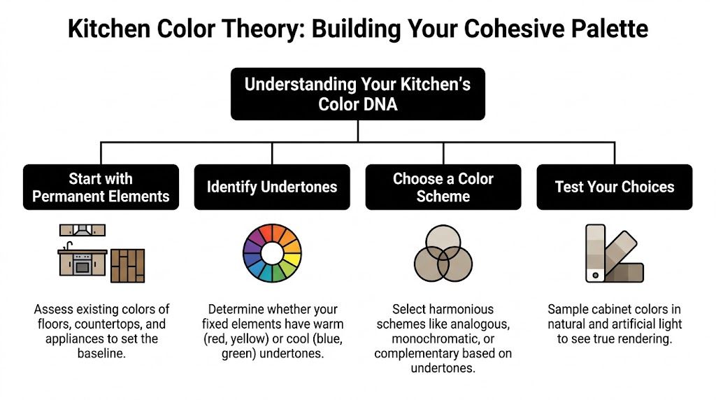
Start with Your Kitchen's Permanent Features
Before you look at paint decks, audit the parts of the kitchen that aren’t easy to change. Flooring comes first. If you have orange-toned hardwood, a cool gray cabinet can look flat or even slightly muddy next to it. If you have a cooler tile floor, creamy cabinets may read more yellow than you expected.
Next, check your architecture. A 1920s bungalow in Collingswood usually wants a different cabinet color story than a newer home in Marlton or a condo in Cherry Hill. The best kitchens don’t fight the house. They feel like they belong there.
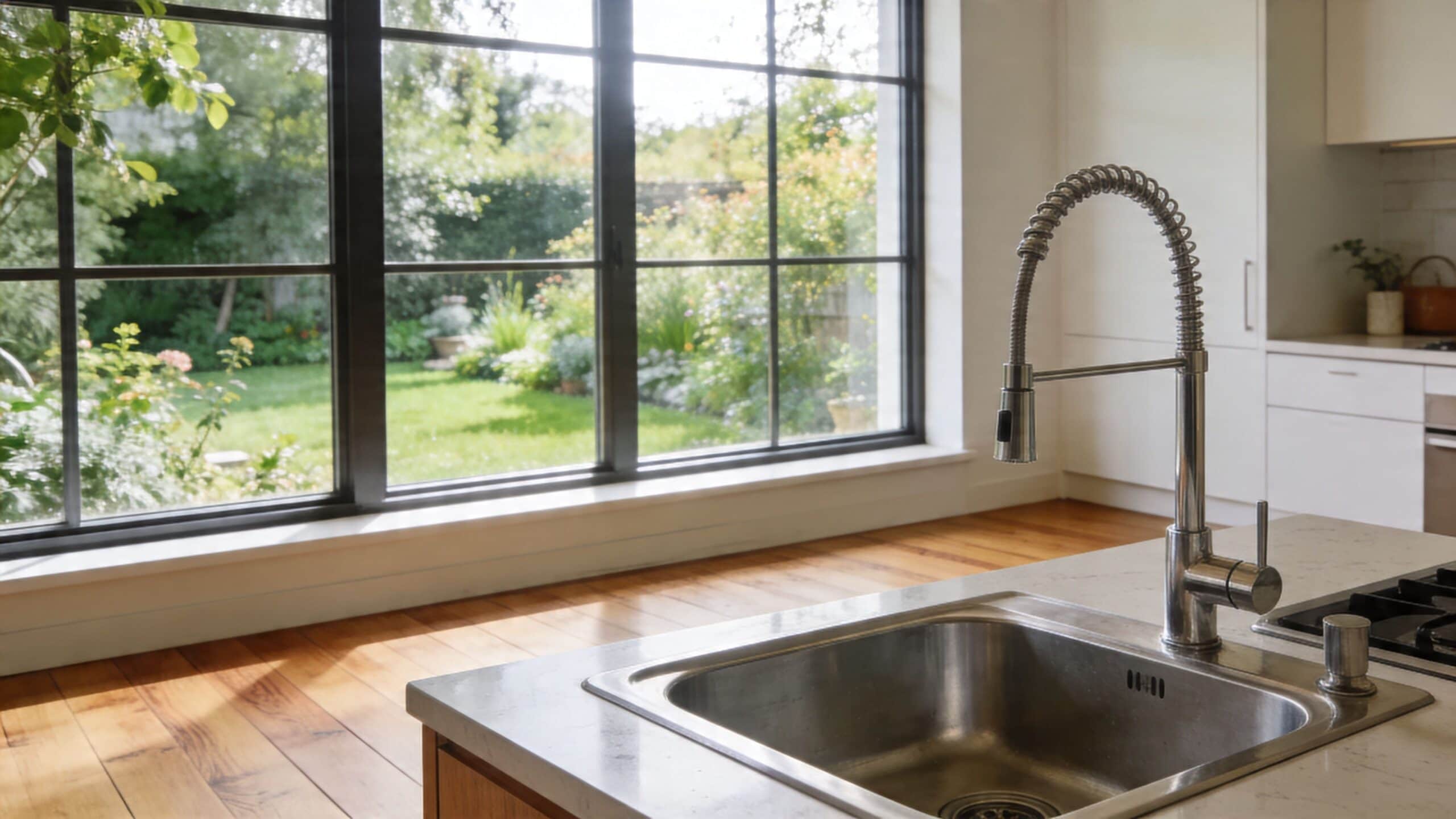
Window direction plays a more critical role than commonly believed. North-facing kitchens often cast a cooler, bluer light. South-facing kitchens usually bring stronger warmth and brightness. That changes how white, greige, taupe, and wood stains read on the doors.
Audit the room before you audit the colors
Use this quick review before narrowing any cabinet finish:
- Flooring tone: Is it warm, cool, or neutral? Pull a cabinet color that respects that base.
- Appliance finish: Stainless, black, panel-ready, and mixed metals each change what feels balanced.
- Natural light pattern: Stand in the kitchen in the morning, midday, and evening. Don’t trust a single moment of light.
- Adjoining rooms: If the kitchen opens into a family room or dining area, your cabinets should flow with those spaces.
Practical rule: If a cabinet color only looks good as an isolated sample, it’s probably the wrong color.
For smaller kitchens, lighter finishes usually do more work for you. Restb.ai’s 2025 Special Report found that neutral and warm wood-tone cabinets correlate with 15-20% faster sale times, and it also notes that for smaller kitchens under 200 square feet, lighter cabinets help visually expand the space by reflecting light. That matters in many South Jersey homes where the kitchen footprint is compact and the natural light isn’t always generous.
Don’t ignore what frames the light
Window trim, shades, and nearby wall color affect cabinet color more than homeowners expect. If you’re reworking the whole room, it helps to review ideas for best window treatments for kitchens so the light control supports the cabinet finish you choose. A heavy, warm treatment can make a soft white cabinet look darker and creamier than it did in the store.
If backsplash is still in play, make sure it’s part of the conversation early too. Tile can swing a palette warm or cool in a hurry. This guide on how to select tile backsplash is worth reviewing while you’re building the overall palette.
Use Color Theory to Create a Cohesive Palette
Color theory sounds academic, but in a kitchen it comes down to three practical questions. How much light does the color reflect? What undertone does it carry? And does it balance with everything else in the room?
That’s where LRV, or Light Reflectance Value, becomes useful. Higher LRV colors reflect more light. In a darker or smaller kitchen, that can keep cabinets from looking heavy.
Use LRV and undertones like a designer does
Designers often simplify cabinet color decisions with a few filters:
| Question | What to check | Why it matters |
|---|---|---|
| Is the kitchen small or dim? | Choose lighter colors first | They keep the room from closing in visually |
| What undertone is in the floor and counter? | Look for pink, yellow, green, or blue influence | Undertone mismatch is what makes a kitchen feel “off” |
| What’s the overall balance? | Apply a dominant, secondary, and accent split | It keeps the palette controlled |
For compact kitchens, this isn’t just taste. Maria Killam’s cabinet color guidance notes that for kitchens under 150 square feet, designers recommend light neutrals with an LRV over 70, and that this can expand perceived space by up to 20%. The same methodology also uses the 60-30-10 rule for color harmony.
A simple way to apply the 60-30-10 rule
Think of your kitchen in layers:
- 60 percent: Cabinet color. This is the visual anchor.
- 30 percent: Countertop, wall color, or backsplash field tile.
- 10 percent: Hardware, lighting, stools, decor, and smaller accents.
A homeowner might choose a soft cabinet white as the main layer, a lightly veined quartz as the second layer, then use matte black or aged brass as the accent. Someone else might use a warm wood cabinet as the main layer, a creamy counter as the second, and dark hardware to sharpen the edges.
Undertones matter more than the color name on the sample. “Greige” can lean violet, green, or taupe depending on the formula and the light.
If you want to add personality beyond paint, artwork can help without locking you into a risky cabinet choice. These ideas for murals for kitchens show how pattern and color can live in the room without turning the cabinetry into the trend piece.
For more examples of balanced neutral palettes, this look at black, white, and gray kitchens is useful because it shows how contrast works best when undertones are controlled.
Adopt the Countertop-First Selection Method
This is the decision that saves more cabinet mistakes than any other. Choose the countertop first, then finalize the cabinet color.
Most homeowners do the opposite. They pick a cabinet door in a showroom, commit to a paint color, and only later start shopping for quartz, granite, or quartzite. That sounds logical until they realize the cabinet color they loved only works with a narrow slice of slab options.

Why the order matters
Cabinet colors are flexible. Paint can be tinted. Stains can be adjusted. Door styles come in many finishes. Countertops are less forgiving.
A slab has a fixed pattern, fixed movement, and a specific undertone. Even manufactured quartz comes in selected patterns and batches rather than endless custom variations. If you choose the cabinets first, you’re trying to make a patterned suit match a shirt you already bought. The easier move is to choose the suit first, then select the shirt that works with it.
That logic lines up with designer guidance. Kitchen Cabinet Depot’s discussion of the process notes that expert designers like Maria Killam assert that cabinets should be colored after countertops are selected, because cabinets are easier to customize while countertops are installed last and offer fewer options.
How to use the countertop-first method in real life
Start with the slab or countertop sample that fits your budget, maintenance preference, and visual style. Then ask three questions:
- What is the dominant undertone? Warm beige, cool gray, creamy white, taupe, or mixed?
- How busy is the pattern? Heavy veining usually wants calmer cabinets.
- What color is already hiding in the stone? Often the best cabinet color is already in the slab, just quieter.
If your quartz has warm taupe veining, a stark blue-white cabinet may feel harsh. If your granite has cool charcoal movement, a yellow cream can look disconnected. Pulling the cabinet finish from the countertop creates the kind of harmony people usually describe as “custom,” even when the palette itself is simple.
For homeowners comparing surfaces, this overview of quartz, granite, and quartzite countertops in Cherry Hill NJ helps clarify what kind of visual variation you’re working with before you commit to cabinet paint.
A quick visual can help if you’re sorting through the sequence in your own remodel:
If the countertop has movement, keep the cabinet color quieter. If the countertop is calm, the cabinets can carry more personality.
What usually goes wrong
The common failure isn’t choosing a bad cabinet color. It’s choosing a cabinet color in isolation. That’s how homeowners end up with a white that looks pink against one quartz sample and green against another, or with a gray stain that suddenly reads purple next to the finished top.
If you want to know how to choose kitchen cabinet colors with the least regret, this is the sequence to follow. Fixed room elements first. Countertop second. Cabinet color after that.
Balance Timeless Choices with Modern Trends
Every remodel has this tension. You want a kitchen that feels current, but you don’t want to hate it in a few years or narrow your resale appeal. Cabinet color is where that tension gets expensive.
White still holds its ground for a reason. According to a 2024 Statista survey of U.S. homeowners, white was chosen by 46% of homeowners in 2024, making it the leading cabinet color preference. That’s a useful data point because it confirms what designers and agents see in the field. White and other quiet neutrals give buyers less to mentally undo.
Timeless doesn’t mean plain
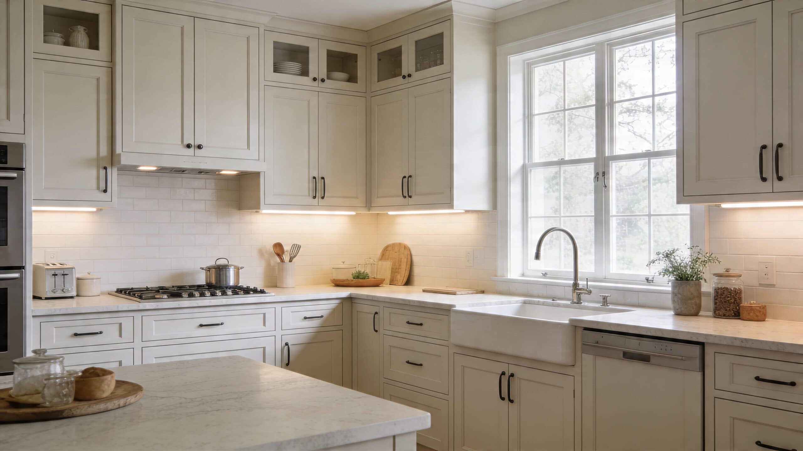
The best “safe” cabinet colors aren’t always stark white. In real kitchens, softer whites, warm neutrals, light woods, and grounded greiges often age better because they’re easier to live with day to day.
Consider the trade-offs:
- Crisp white: Clean and flexible, but can feel sterile in a cool kitchen.
- Warm white or cream: Softer and more forgiving, but needs the right countertop undertone.
- Greige or warm gray: Adaptable and current, but undertones must be checked carefully.
- Natural wood tones: Warm, practical, and increasingly popular, especially where homeowners want texture instead of more paint.
- Soft black or charcoal: Strong and refined, best used when the room has enough light and visual breathing room.
Where to use trend colors without overcommitting
Bold cabinet colors aren’t automatically a mistake. Placement matters. A navy island, dark lower cabinets, or a painted pantry wall can add personality without making the whole kitchen feel date-stamped. That approach works especially well in South Jersey homes where an open-plan first floor means the kitchen has to relate to the surrounding rooms.
A full run of trendy color is harder to pull off long term. A smaller application is easier to update later and less likely to dominate the room. That’s why trend colors usually work better as a supporting note than the main composition.
Design judgment: The more permanent the element, the less experimental its color should be.
Hardware also changes how trendy or timeless a cabinet reads. The same painted cabinet can look more farmhouse, transitional, or modern depending on the pull style and finish. If you’re deciding between polished chrome, matte black, brass, or mixed metals, this guide to kitchen cabinet hardware trends helps connect color choice to the final look.
A practical rule for resale-minded homeowners is simple. Keep the large surfaces calm. Put personality in the parts that are easier to swap.
Test Your Finalists with In-Home Sampling
No screen gets this right. Not your phone, not your laptop, not even a well-lit showroom display. Cabinet color has to be tested in your kitchen, against your materials, in your light.
That means large samples. Tiny chips lie. They don’t show enough surface area to reveal undertone, depth, or how a finish changes through the day.
Sample like a professional
If you’re down to two or three cabinet colors, test them this way:
- Use large samples: Peel-and-stick samples or painted boards work far better than a small fan-deck chip.
- Place them vertically: Cabinets are vertical surfaces. Test them upright, not flat on the counter.
- Move them around: Check each sample near the range wall, sink wall, and any darker corner.
- Pair them with actual materials: Put the sample next to flooring, backsplash candidates, and countertop pieces.
- Check day and night: Morning daylight and evening artificial light can make one color feel calm and another feel completely wrong.
An advanced way to tighten the final decision is to use large peel-and-stick samples and test finish options with foam rollers. This design guidance on cabinet color mockups notes that professionals aim for a Delta E of less than 2.0 between key elements, and that on-site mockups help achieve that level of harmony with 95% success.
What to look for during the test
Don’t ask only, “Do I like this color?” Ask better questions.
| Check | What you’re watching for |
|---|---|
| Morning light | Does the color go cold, pink, or washed out? |
| Evening light | Does it turn too yellow, heavy, or dull? |
| Next to the counter | Does the cabinet sharpen the stone or fight it? |
| Across the room | Does the kitchen feel brighter, calmer, heavier, or busier? |
One useful trick is to live with the samples for a few days. Walk past them when you’re tired, when the kitchen is messy, when the pendants are on, when the shades are down. A cabinet color has to work in regular life, not just during a focused design moment.
If you’re making these decisions at home, the idea behind a mobile cabinet showroom makes sense because cabinetry, counter samples, hardware, and tile can all be judged where they’ll live.
The color you choose after proper in-home testing is usually quieter than the one you first noticed in the showroom, and almost always better.
Finalize Your Choice with The Cabinet Coach
By the time you reach the final pick, the process should feel narrower, not harder. You’ve already filtered out colors that fight your flooring, go flat in your light, or miss the undertone in the countertop. What’s left is usually a short list of cabinet colors that all make sense, with one standing out as the most settled choice.
That’s the core value of a strong process. It removes random preference swings. You stop reacting to a pretty sample and start choosing a finish that fits the room, the house, and the way you live in it.
For South Jersey homeowners, that last step is easier when the materials are reviewed in the kitchen itself. Seeing cabinet doors, countertop samples, hardware, and tile together in Cherry Hill, Moorestown, Voorhees, and nearby Camden and Burlington County homes gives a much clearer answer than a showroom wall ever can. It also shortens the distance between “I think this works” and “I know this works.”
If you’ve been wondering how to choose kitchen cabinet colors without second-guessing every option, stick to the sequence. Audit the permanent features. Build a palette with undertones and light in mind. Choose the countertop before locking the cabinet color. Then test finalists at home until one clearly wins.
If you want help making that final decision with real samples in your actual kitchen, The Cabinet Coach brings a mobile showroom directly to South Jersey homeowners so you can compare cabinetry, countertops, hardware, and tile in the lighting and context that matter most.