

If you're standing in a half-demolished kitchen in Cherry Hill or Moorestown, staring at a slab sample and wondering whether dark green kitchen cabinets will feel rich or just too dark, you're not alone. The color reads beautifully in the right room, but it can turn heavy fast if the light, layout, and finish aren't doing their part.
The good news is that dark green has moved well past the mood-board phase. In Houzz's 2025 U.S. Kitchen Trends Study, green became the top non-neutral cabinet color at 6% of renovating homeowners' cabinet-color selections, ahead of gray at 5%, and 24% of homeowners chose two-tone cabinetry, which helps explain why dark green often shows up on islands or lowers rather than everywhere at once (Houzz 2025 U.S. Kitchen Trends Study). Search behavior pointed the same way, with Google and Pinterest searches for “green kitchens” up 50%, “olive green kitchens” up 51%, and “sage green kitchens” up 48% over the prior year in the National Association of Realtors' reporting (Houzz 2025 U.S. Kitchen Trends Study).
Table of Contents
- Why Dark Green Cabinets Are Everywhere Right Now
- Understanding LRV Before You Pick a Shade
- Popular Dark Green Shades and Finish Choices
- Pairing Dark Green With Countertops, Hardware, and Floors
- When Dark Green Does Not Work and What to Do Instead
- Refacing, Repainting, or Replacing on a Real Budget
- South Jersey Project Stories From Real Kitchens
- Planning Your Dark Green Kitchen With The Cabinet Coach
Why Dark Green Cabinets Are Everywhere Right Now
A Cherry Hill homeowner usually doesn't ask for dark green on day one. They walk in with white shaker doors in mind, then hold a painted sample up to a gutted wall and realize the room wants something with more depth. That's where dark green kitchen cabinets have earned their place, not as a wild experiment, but as a grounded option inside a bigger shift away from all-white kitchens.
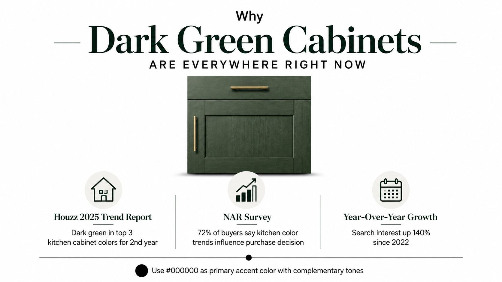
Houzz's 2025 numbers make the change hard to ignore. Green rose to 6% of cabinet-color selections and overtook gray at 5%, while 24% of homeowners chose two-tone cabinetry, which is why dark green shows up so often on islands, lowers, or a perimeter run instead of a full-room commitment (Houzz 2025 U.S. Kitchen Trends Study). In the 2023 Houzz U.S. study, white still held 40% and wood tones 24%, so the jump in color diversity happened quickly, not gradually (Houzz 2025 U.S. Kitchen Trends Study).
Practical read: the market is not treating dark green like a novelty finish anymore. It's behaving like a working color choice.
That matters in South Jersey because homeowners here tend to renovate for both daily life and resale. A green island with warm white perimeter cabinets often feels safer than a full monochrome statement, especially when the rest of the house leans classic. If you're collecting ideas, this kitchen inspiration guide helps show how cabinet color, counters, and hardware work together in real projects.
Understanding LRV Before You Pick a Shade
Paint names are slippery. “Forest,” “hunter,” and “olive” can all sound like the same cabinet color until you look at Light Reflectance Value, or LRV, which tells you how much light a color sends back into the room. That number is what matters when you're deciding whether a green will feel crisp, moody, or too closed in.
What the numbers mean in a real kitchen
Deep forest greens often sit below about LRV 12, while near-black green-blacks can fall as low as LRV 4 to 6 (technical green-black cabinet reference). The lower the number, the more light the cabinet surface absorbs. In a bright kitchen, that can look elegant and grounded. In a low-light room, the same color can make the space feel smaller and darker.
Designer rule: don't choose dark green by name alone. Choose it by LRV, room orientation, and how much daylight actually lands on the cabinets.
That's why the same paint chip can work in a Moorestown kitchen with broad afternoon light and fail in a narrow galley with one north-facing window. A deep green island can become the anchor in one home and the visual weight problem in another. If you're comparing shades across brands, use the numbers first, then decide whether the room can carry them.
For a homeowner doing this for the first time, this cabinet color selection guide is a useful companion because it frames color choice around the room, not just the swatch. My own rule is simple, if the room is dim, the green needs either a higher LRV or a smarter placement strategy. If the room is bright, you've got more room to go deep.
Popular Dark Green Shades and Finish Choices
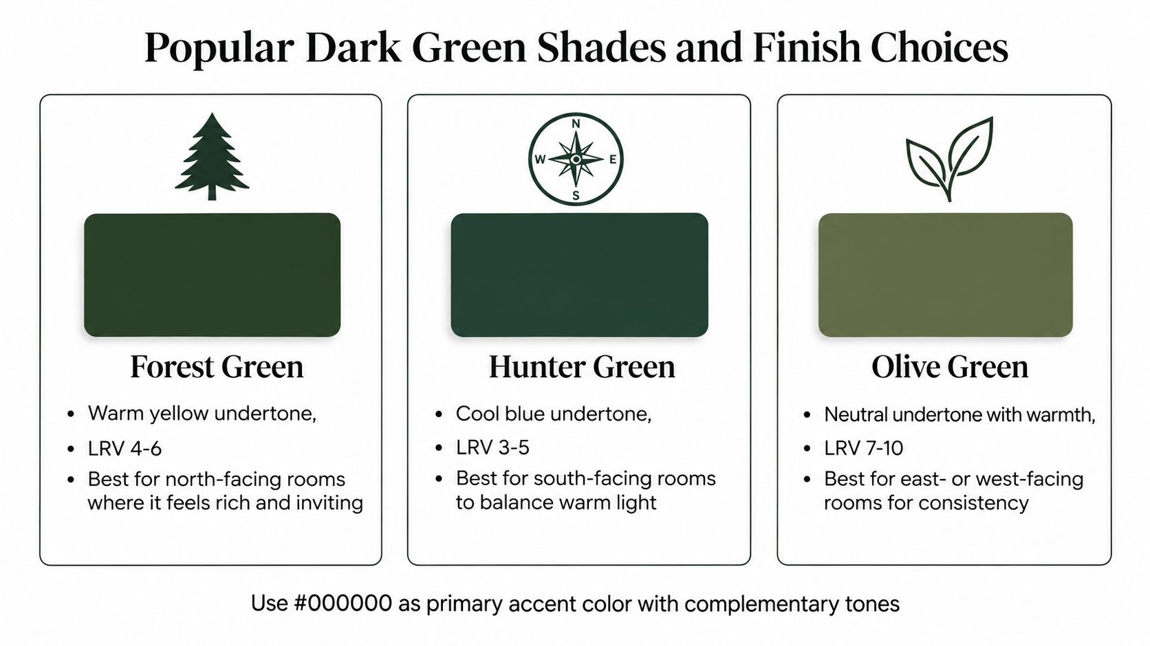
Homeowners usually narrow dark green down to three families, forest, hunter, and olive. They can all look refined, but they behave differently once they're on a cabinet door and lit by South Jersey daylight in January versus July.
Which shade fits which room
Forest green reads warmer, often with a yellow undertone, and tends to feel friendlier in north-facing rooms. A sample like Benjamin Moore Essex Green lands in that deep, grounded lane and can look especially good where the room needs richness more than brightness. Hunter green leans cooler and can hold its own in south-facing kitchens that throw a lot of warm light across the cabinets. A shade like Sherwin-Williams Ripe Olive mixed into a custom formula can move in this direction without feeling flat. Olive green sits lighter and more forgiving, which makes it useful in east- or west-facing rooms where the light shifts during the day.
Finish changes the read more than people expect
A matte lacquer softens the color and hides glare, which makes the green feel modern and refined. A satin RTF finish gives you a more practical surface for everyday use and usually reads a little cleaner under mixed light. If you're trying to choose a broader palette for the whole house, this color palette guide is helpful because it keeps the cabinet color tied to flooring, wall color, and furnishings instead of treating the kitchen as an isolated choice.
The simplest way to shortlist is to sample one warm, one cool, and one lighter green in the actual room. I'd rather see a homeowner rule out two shades in their own kitchen than fall in love with a pin and regret it after the first cloudy afternoon.
Pairing Dark Green With Countertops, Hardware, and Floors
Dark green works when the surrounding materials keep it from swallowing the room. In South Jersey, I keep seeing the same successful rhythm, brass pulls, warm white quartz, a zellige backsplash, and light oak flooring. That combination gives the green enough contrast to feel intentional without making the kitchen cold.
Start with the countertop
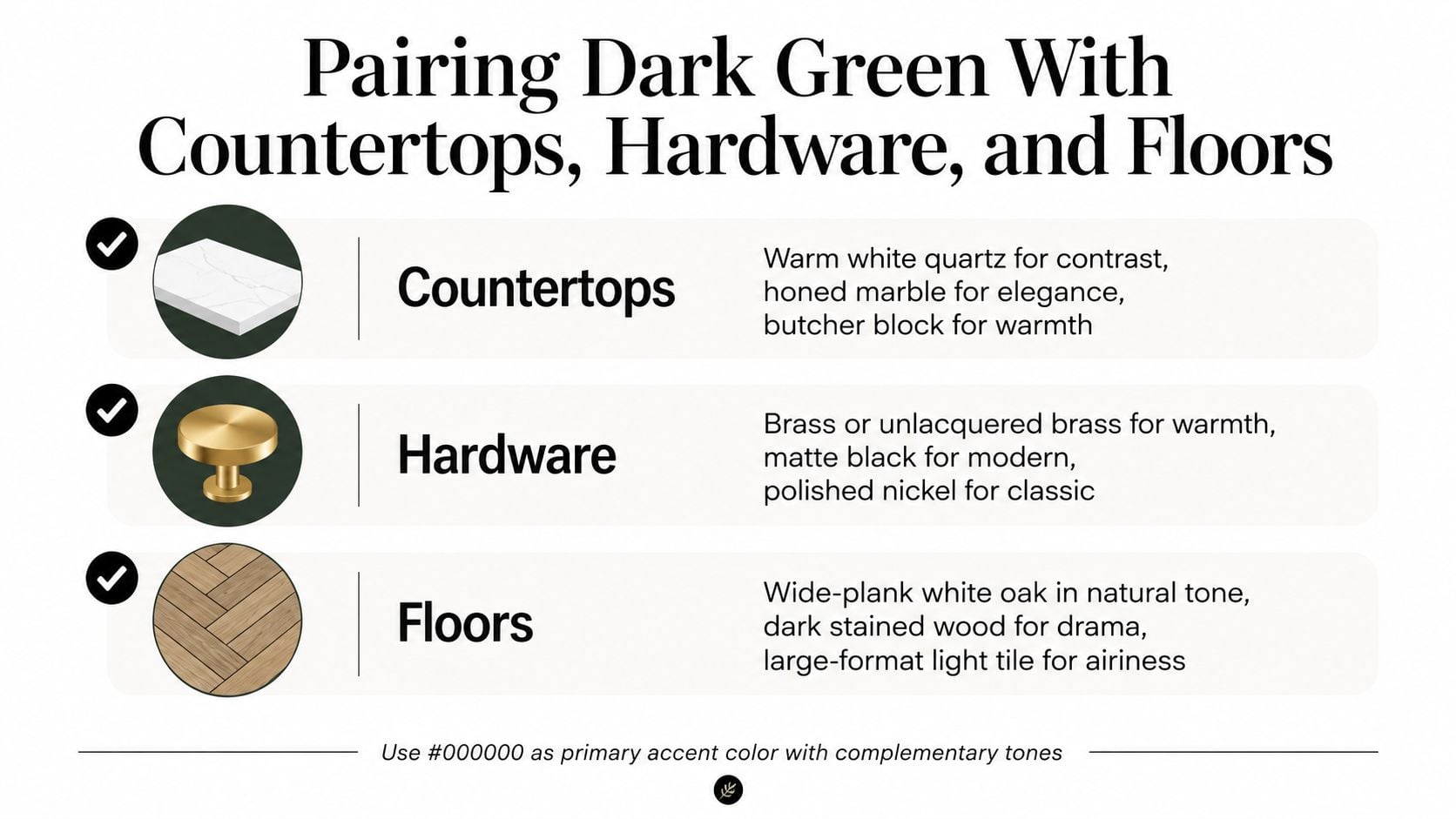
Warm white quartz keeps the room bright and reads cleaner than a stark bright white next to deep green. Honed marble adds softness if the homeowner is comfortable with more care. Butcher block can work too, especially on an island, because it brings warmth back into the palette and keeps the green from feeling severe. A useful reference for planning those combinations is this cabinet and countertop pairing guide.
Let the backsplash and hardware calm the edges
A simple subway tile gives you restraint. Zellige adds texture and movement, which helps if the cabinet color is very dark. A full slab backsplash makes the whole composition feel more custom, but it only works when the counters and floor aren't also busy. For hardware, brass or unlacquered brass warms the green, matte black pushes it more modern, and polished nickel keeps the look classic.
Finish with lighting and floor tone
Layered lighting matters more than people expect. Under-cabinet lighting, warm pendants, and a room that doesn't fight the cabinets with a dark floor all help. Wide-plank white oak is the safest floor pairing because it lightens the room without competing with the cabinetry.
If the cabinet color is doing the heavy lifting, the rest of the room should stay calm.
When I bring samples to a South Jersey kitchen, I'm checking the cabinet door against the counter, floor, and backsplash together, not one at a time. That's usually where the winning combination shows up.
When Dark Green Does Not Work and What to Do Instead
A north-facing or windowless kitchen can make dark green feel like a cave. I've seen homeowners fall in love with a sample in a bright showroom, then hate the same color once it lands in a dim galley with low ceiling height and beige walls. The problem isn't the color itself, it's the room reading too heavy for the cabinet finish.
The quick yes or no test
Look at four things before you commit, orientation, daylight, ceiling height, and adjacent wall color. If the room already feels dark by midday, a deep green full-height run is risky. If the kitchen has good natural light and a lighter perimeter palette nearby, you have much more flexibility.
When the room is borderline, the fix is usually one of two moves. First, shift to a warmer mid-green with a higher LRV so the cabinets still feel color-rich without absorbing as much light. Second, keep the dark green on the island or lower cabinets only and pair it with light uppers so the room doesn't feel boxed in.
Lighting can rescue a borderline layout
The right lighting package changes everything. Under-cabinet LED strips brighten the work surface, 3000K pendants keep the tone warm instead of clinical, and added sconces can lift dark corners that otherwise make the green look heavier than it really is. One design resource that addresses this low-light issue directly is Greenhouse Studio's dark green kitchen guidance.
If a kitchen needs every light on all day just to stay comfortable, I usually steer the homeowner away from an all-over dark green plan. If the room can support the color with a few smart adjustments, the finish can still land beautifully.
Refacing, Repainting, or Replacing on a Real Budget
Homeowners usually ask about style first, then budget. With dark green, the order matters because the finish has to hold up to fingerprints, sauce splatters, and the occasional pan lid collision. Saturated color shows flaws faster than a forgiving off-white, so the construction choice matters as much as the color choice.
Three paths, three different trade-offs
Here's the short version in a way that's easy to compare during a showroom visit:
| Option | Typical cost band | Best for | Key trade-off |
|---|---|---|---|
| Refacing | Mid-range | Homeowners whose cabinet boxes are sound but the doors look dated | Keeps the footprint, but box condition still matters |
| Professional repainting | Lower to mid-range | Kitchens with good bones and a homeowner comfortable maintaining a painted surface | Cheapest path, but wear and brush-quality issues show first |
| Full custom replacement | Higher | Layout changes, damaged boxes, or a long-term design reset | Most flexible, but it takes the most time and coordination |
For a broader breakdown of the math, this cabinet refinishing vs. replacement guide is useful because it frames the decision around durability, not just upfront cost. I'd pair that with a close look at The Cabinet Coach's refacing versus replacement resource if you're trying to decide how far to take the project.
Why the box and finish matter
In kitchens that get real use, I prefer 100% plywood cabinet boxes or equivalent moisture-resistant substrates because kitchens deal with humidity, spills, and constant cleaning. For the finish, RTF or layered lacquer systems hold color more consistently over time, which matters a lot with dark green because edge swelling, gloss inconsistency, and tiny wear marks are easier to see.
There's also the resale question. A dark green kitchen can photograph beautifully if the counters, hardware, and light are balanced, but it can also narrow the buyer pool if the room feels too specific. Distinctive color has style appeal, while neutral finishes usually travel more easily across a wider set of buyers.
South Jersey Project Stories From Real Kitchens
A Moorestown homeowner once came to me with warm white perimeter cabinets already in mind, but the island still felt unresolved. We settled on a deep green island in the Essex Green family, paired it with warm white quartz and brushed brass pulls, and kept the floor in a light oak tone. The room had enough daylight to handle the depth, and the green gave the kitchen a focal point without taking over the whole footprint.
Moorestown two-tone kitchen
The homeowner's main concern was whether the island would feel too heavy against the rest of the room. I checked the sample against the actual window light and the cabinet finish held up because the island was the only dark mass in the space. After the install, she told me the kitchen finally felt “finished,” which is usually what happens when the dark color is used as an anchor instead of a full-room blanket.
The Haddonfield project went the opposite way. It was a north-facing galley with lower cabinets only, so we kept the green on the base run and left the uppers light to protect the sense of volume. The shade was pulled slightly warmer to keep it from going flat, and we upgraded the lighting because the original plan would have left the room too shadowy.
Haddonfield lower-only install
That kitchen needed the light to do as much work as the color. Once the under-cabinet LEDs and pendants were in place, the green read rich instead of closed-in. The homeowner's verdict was simple, the room looked more polished and less like a narrow hallway.
What these two jobs had in common was the same practical test, sample the color in the actual room before ordering anything. The room told the truth both times.
Planning Your Dark Green Kitchen With The Cabinet Coach
Dark green works when three things line up, the LRV fits the room, the surrounding materials stay balanced, and the budget path matches the condition of the cabinets. That's the decision tree, not whether the color looks good in a Pinterest photo. A mobile showroom approach helps because the samples get tested under your own light, on your own floor, next to your actual counters.
The Cabinet Coach works through a complimentary video consultation, then brings door styles, paint chips, and material samples into the home so selections can be compared in real lighting. That matters for dark green because a cabinet that looks elegant in the showroom can go muddy in a north-facing room, and a sample that feels too dark on paper may look perfect once it's next to a warm counter. If you're also thinking about wall color and art placement, Jessie's Home wall art collection is worth a look because the right artwork can support the finished palette without fighting it.
A short video can show the process better than a description can.
Bring measurements, a few inspiration photos, the appliances you're keeping, and a rough budget to the first call. If you're ready to sort out whether dark green belongs on your island, your lowers, or nowhere at all, book a free start point through this in-home kitchen design consultation.
The Cabinet Coach helps South Jersey homeowners plan cabinet colors, finishes, and full kitchen layouts with samples brought to the house before anything gets ordered. If you want a dark green kitchen that fits your light, your floor, and the way your family cooks, visit The Cabinet Coach and set up a consultation.