
Choosing Your Kitchen's Perfect Palette
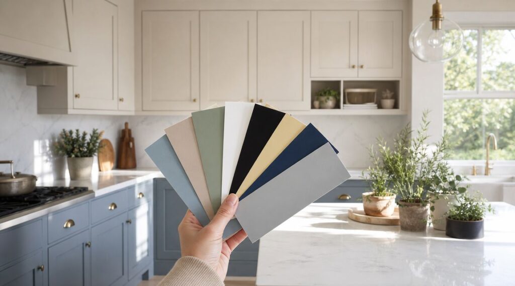
Standing in front of a wall of paint chips can feel overwhelming. Choosing the right color for your kitchen is one of the most impactful decisions in a remodel, setting the entire mood for the heart of your home. It's not just about what's trendy. It's about creating a backdrop that makes your cabinets pop, complements your countertops, and feels right in your space.
In South Jersey, that decision gets even trickier because our homes vary so much. A Haddonfield colonial with smaller divided-light windows reads color differently than a newer Mount Laurel kitchen with wide open sightlines and stronger afternoon light. Add in white oak floors, cool quartz, older granite, brushed brass, matte black, or polished nickel, and the “best” color quickly becomes specific to the room.
If you're gathering kitchen wall paint ideas for 2026, start with the color families that consistently work in real homes. These 8 options are the ones I'd keep on the table for South Jersey kitchens because they balance style, resale appeal, and day-to-day livability.
Table of Contents
- 1. Classic White and Cream
- 2. Soft Sage Green
- 3. Warm Gray Greige
- 4. Deep Navy or Charcoal Blue
- 5. Soft Black or Charcoal
- 6. Warm Terracotta or Rust Tones
- 7. Pale Yellow or Warm White Yellow
- 8. Soft Blush Pink or Mauve
- 8-Way Comparison: Best Kitchen Paint Colors
- Bring Your Vision to Life with an Expert Partner
1. Classic White and Cream
White stays at the top of the list for a reason. In the Houzz & Home study, 43% of renovated kitchens in 2018 featured white cabinets, and Benjamin Moore's kitchen guidance continues to group off-whites, neutrals, blues, grays, and greens among the most timeless kitchen choices, which is why white and cream still anchor so many practical kitchen palettes in the U.S. Benjamin Moore kitchen inspiration guidance
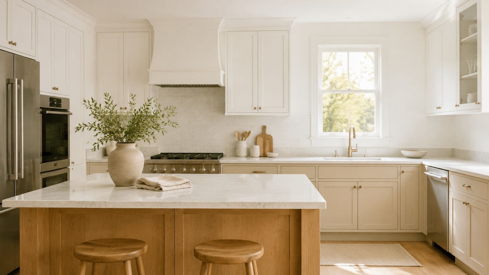
That matters in South Jersey because so many kitchens already have white or near-white cabinetry, especially in Cherry Hill transitionals, Moorestown traditional homes, and newer builds in Mount Laurel. If the cabinets are already the lightest major surface, a warm white or soft cream on the walls keeps the room cohesive instead of fighting for contrast.
Why it still works in South Jersey
In older South Jersey homes, white walls often help with inconsistent daylight. Morning light can feel cool. Late afternoon can turn creamy and golden. A soft white with a little warmth handles both better than a stark, icy white that can go flat on cloudy days.
Cream works especially well when a kitchen has warmer fixed elements that aren't changing. Think beige floor tile, honed travertine-look backsplash, older oak floors, or creamy quartz with soft veining. In those rooms, pure bright white can feel detached. Cream ties the whole space together.
Practical rule: If your counters and backsplash already read warm, don't force a blue-white wall color just because it looks crisp on a fan deck.
Best pairings
A few combinations I see work over and over:
- Soft white plus gray cabinets: Clean and transitional, especially in Cherry Hill kitchens that want a fresh look without feeling cold.
- Cream plus stained wood cabinets: A strong fit for Moorestown colonials and homes with original trim.
- Crisp white plus black hardware: Best for modern kitchens with flat-front or shaker cabinetry and simple quartz.
If you're also choosing cabinet finishes, how to choose kitchen cabinet colors is where wall color and cabinet tone need to be decided together. White walls are easy to live with. The wrong white next to the wrong cabinet undertone is not.
2. Soft Sage Green
Sage is one of the best colors to paint a kitchen when you want more personality than beige but still want the room to feel calm. It gives you color without demanding that every other finish in the kitchen perform around it.
In South Jersey, it works especially well in homes that get mixed natural light. A lot of kitchens in Haddonfield and Collingswood have windows on more than one exposure but not always full, bright light all day. Sage tends to stay grounded in those rooms instead of flashing too minty or too gray.
Where sage earns its keep
Sage is strong with white shaker cabinets, but it's even better when there's a wood island or warm shelving in the room. That mix keeps the kitchen from feeling too clean and too flat. In farmhouse or transitional spaces, sage also softens marble-look counters and bright subway tile.
I also like it in kitchens where homeowners want a nature-based palette but don't want obvious green. Good sage reads as a muted backdrop. Bad sage can go pastel fast, especially under cool LED lighting.
Test it on at least two walls and check it in morning, afternoon, and at night with under-cabinet lights on.
What to pair it with
Sage usually looks best when the supporting finishes lean warm and quiet:
- White trim and white cabinets: Keeps the room crisp.
- Natural wood island: Adds depth without making the room busy.
- Brass or brushed bronze hardware: Makes sage feel finished, not accidental.
- Matte or eggshell wall sheen: Lets the color read softer and more architectural.
If your cabinetry might be refinished instead of replaced, paint and stain cabinets is often the fork in the road. Sage can look fantastic with painted cabinets, but it can also sit beautifully next to a stained oak or walnut island if the undertones are aligned.
3. Warm Gray Greige
Greige is what I reach for when a homeowner wants neutral, but not bland. It sits between gray and beige, so it can absorb cooler finishes without looking sterile and soften warmer materials without turning yellow.
That makes it especially useful in South Jersey kitchens where finishes are mixed. A lot of remodels aren't full gut jobs. Maybe the floor stays. Maybe the counters change but the windows don't. Maybe the island is painted and the perimeter stays lighter. Greige is often the wall color that keeps all of that from looking patched together.
Why greige stays useful
For smaller kitchens, lighter, cooler, or neutral shades generally create the most open feel. Guidance for kitchens with white cabinets specifically recommends cooler whites, cooler light grays, and light greiges for a more airy effect, which is one reason this family keeps showing up in practical remodels guidance on paint colors with white cabinets.
In homes around Voorhees, Cinnaminson, and Mount Laurel, I see greige work well where the kitchen opens into family rooms painted warmer neutrals. Plain gray can feel abrupt in that setup. A warm greige transitions better.
When it works best
Greige is a strong choice if your kitchen has any of these conditions:
- White quartz with soft veining: Greige prevents the room from looking too clinical.
- Mixed metals: It doesn't fight with brass, black, or stainless.
- Warm wood flooring: It bridges wood and painted cabinets well.
- Open-concept layout: It blends with adjacent living spaces better than sharp white or blue-gray.
A common mistake is choosing a greige that's too muddy. Another is picking one that's too close in tone to the cabinets, so the walls and cabinetry blur together. If you're exploring that softer gray family on cabinetry too, light grey painted kitchen ideas can help show how close is too close.
4. Deep Navy or Charcoal Blue
Navy is one of the few darker kitchen colors that can still feel classic. Done well, it adds depth, sharpens white cabinetry, and gives a kitchen more presence without making it feel trendy in a short-lived way.
For resale-minded homeowners, darker kitchen tones aren't just a style move. Zillow's 2025 analysis found buyers were willing to pay $1,597 more for homes with a dark olive green kitchen, and darker green, blue, and gray tones outperformed white and lighter shades in preference testing Zillow paint color resale analysis via PR Newswire. Navy benefits from that same broader shift toward richer, more intentional color.
Best use in local kitchens
I like deep navy most in kitchens with one of two setups. The first is a bright kitchen with solid natural light, where navy gives the room needed contrast. The second is a larger open-plan kitchen where all-light finishes would otherwise feel washed out.
In Cherry Hill and Moorestown, navy often works best on full walls when the cabinetry is white, off-white, or light oak. In tighter kitchens, it can also work on one strong wall, especially near a dining nook or coffee station.
What can go wrong
The usual problem isn't the color. It's the lighting. Navy needs real support from recessed lights, pendants, and under-cabinet lighting. Without that, it can deaden corners and make upper cabinets feel heavier.
A few pairings make navy easier to pull off:
- Crisp white trim: Keeps edges clear.
- Warm brass or matte black hardware: Adds contrast.
- Light counters: Prevents the palette from sinking visually.
- Controlled use in open concept spaces: Nearby rooms should relate, even if they aren't the same color.
If you're considering navy beyond the walls, kitchen cabinet paint color ideas can help you decide whether the color belongs on the walls, the island, or the cabinetry itself.
5. Soft Black or Charcoal
On a gray January afternoon in Cherry Hill, a soft black kitchen can feel rich and grounded. In the wrong room, it feels flat by 4 p.m. That difference usually comes down to South Jersey light, ceiling height, and how the hard finishes bounce light back into the space.
For most local kitchens, I steer away from a true jet black on all four walls. A charcoal with a brown, taupe, or smoky undertone is easier to live with, especially in Moorestown colonials, Haddonfield foursquares, and newer Medford open plans where natural light shifts a lot through the day. It gives the room depth without turning every shadow into a dark corner.
How to make charcoal feel polished
Charcoal works best when the rest of the kitchen has a clear supporting role. White quartz, marble-look counters, zellige or glazed subway tile, and lighter floors keep the walls from absorbing all the visual weight. If the cabinets are painted, I like this color most with warm white, mushroom, or light greige rather than another dark tone.
It also helps to be selective about placement. In many South Jersey kitchens, soft black performs better on the main wall, breakfast nook wall, or a kitchen that opens to a family room, instead of wrapping a small enclosed space top to bottom.
Here's a visual example of the mood this palette can create:
A charcoal wall color needs support. If the room has weak overhead lighting and no under-cabinet lighting, fix that first.
Best supporting materials
These combinations usually keep dark walls from feeling heavy:
- White or cream perimeter cabinets: Clear contrast that suits both transitional and modern kitchens.
- Brass, polished nickel, or reflective hardware: Bounces light around and keeps the palette crisp.
- Warm wood accents: Oak stools, walnut shelving, or a wood island stop the room from feeling cold.
- Matte wall finish: Gives charcoal a fuller, more refined look than a shiny surface.
Cabinet pairings matter more here than with lighter wall colors. Black white and gray kitchen combinations show why the balance matters. If the walls, cabinets, counters, and backsplash all sit in the same dark range, the kitchen feels smaller. Give the eye a few lighter surfaces to land on, and charcoal reads intentional instead of heavy.
6. Warm Terracotta or Rust Tones
Terracotta is for homeowners who want warmth you can feel when you walk into the room. It isn't a default neutral, and that's the point. In the right kitchen, it gives old houses character and newer houses a little more soul.
This family works especially well in South Jersey homes with warmer architecture. Think brick exteriors, older wood floors, handmade-look tile, or kitchens that connect to sunrooms and breakfast spaces with western light. In those settings, rust and terracotta look grounded rather than theme-driven.
Where warm earth tones shine
Terracotta tends to perform best when it has something natural to connect to. That might be walnut stools, oak cabinetry, clay-look tile, soapstone-style counters, or unlacquered brass. In Barrington or Haddonfield homes with more traditional detailing, it can feel collected and warm instead of trendy.
It's also a smart answer for homeowners who are tired of gray but don't want green or blue. Earthy colors can make a kitchen feel comfortable fast.
How to stop it from feeling heavy
The mistake with terracotta is pushing it too orange or too saturated. Kitchens need restraint. A muted rust with some brown in it is easier to live with than a high-energy clay color that dominates every surface.
Use these checks before committing:
- Pair it with warm white or cream cabinetry: This keeps the room balanced.
- Choose quieter counters: Cream, taupe, warm gray, and soft stone patterns work best.
- Use metal finishes that belong with warmth: Copper, bronze, and aged brass make more sense than icy chrome.
- Reserve bold tile for one area: Don't stack a strong wall color with a loud backsplash unless the kitchen is large and very well lit.
In western-facing kitchens in towns like Medford or Mount Laurel, terracotta can glow beautifully late in the day. In cooler, north-leaning kitchens, sample carefully so it doesn't go muddy.
7. Pale Yellow or Warm White Yellow
Pale yellow gets dismissed because people remember the wrong version of it. Most homeowners picture a bright, buttery kitchen from decades ago. That's not what works now. The better version is barely yellow. It reads as a warm off-white first and a soft cheerful tone second.
That makes it useful in family kitchens that need to feel bright without feeling stark. If a South Jersey kitchen lacks direct sun for much of the day, a pale yellow undertone can add warmth that flat white paint won't.
Why this works better than bright yellow
Soft yellow works when it stays muted. In practice, that means it needs some gray, beige, or creamy restraint in it. Bright yellow bounces too much color around the room and can distort nearby finishes, especially white cabinets and cool countertops.
I like this palette in farmhouse kitchens, cottage-inspired renovations, and traditional homes where the goal is welcoming rather than sleek. In Haddonfield or Moorestown homes with classic trim and warmer woods, it can feel very natural.
Designer note: A warm white-yellow should make the room feel gentler, not louder.
Best uses in family kitchens
Pale yellow tends to do its best work in these situations:
- Breakfast-area kitchens: It softens the transition between kitchen and dining nook.
- Homes with white shaker cabinetry: The walls add warmth without changing the cabinet look.
- Spaces with brushed brass or warm nickel hardware: The finishes feel connected.
- Kitchens with cooler counters: The slight warmth balances stone that otherwise reads cold.
If you're unsure, use it on fewer walls first. In open-concept spaces, one or two kitchen walls in a warm white-yellow can be enough to shift the mood without committing the entire first floor to it.
8. Soft Blush Pink or Mauve
Blush in a kitchen sounds risky until you see the right version of it. A muted blush or mauve can act almost like a warm neutral, especially when the rest of the room is built around stone, plastery whites, brass, and soft grays.
This is not the safest color on the list. It is, however, more usable than people expect. In design-forward homes in Cherry Hill, Haddonfield, or newer custom kitchens in Mount Laurel, it can look refined when the undertones are dusty and subdued.
Who this color is actually for
Blush isn't for a kitchen with a lot of unrelated finishes. It needs intention. If the counters are busy, the backsplash is high contrast, and the hardware is all over the place, blush won't save the room. It will expose the lack of cohesion.
It works best for homeowners who already like softer European-style palettes, warmer neutrals, and quieter luxury materials. It can also be a smart accent color for a pantry wall, banquette area, or coffee station if full-room commitment feels like too much.
How to make it feel intentional
Recent design commentary has leaned toward restrained pairings such as warm off-white plus beige, or muted green or blue with a calm neutral, instead of single-color trend kitchens. That same coordinated approach is what makes blush usable now. It needs calm supporting finishes and a cabinet-and-wall plan, not a novelty treatment design commentary on restrained kitchen pairings.
A few combinations that keep blush elegant:
- Blush walls plus white or creamy cabinets: Clean and soft.
- Mauve undertone plus marble or quartz: Gives the color something polished to sit beside.
- Contemporary hardware: Matte black, brass, or polished nickel all work if the rest of the palette is tight.
- Use as an accent if needed: A single wall can deliver enough warmth and personality.
The key is choosing a color that reads dusty, not sugary. When blush goes too pink, the kitchen loses credibility fast.
8-Way Comparison: Best Kitchen Paint Colors
A side-by-side comparison helps once homeowners narrow the field. In South Jersey kitchens, the right wall color is rarely about the paint chip alone. Cherry Hill colonials, Moorestown historic homes, Haddonfield kitchens with mixed old and new finishes, and newer Medford open-concept layouts all throw different light across the room. The wall color has to work with that light, your cabinet finish, your counters, and the hardware package you plan to live with every day.
| Style | Implementation Complexity 🔄 | Resource Requirements & Durability ⚡ | Expected Outcomes ⭐ | Ideal Use Cases 📊 | Key Advantages / Tips 💡 |
|---|---|---|---|---|---|
| Classic White and Cream | Low. Straightforward prep and paint, but touch-ups show fast | Low to moderate. Common paint lines work well. Satin or washable matte usually holds up best | Bright, timeless, helps smaller kitchens feel more open, dependable for resale | Small or dim kitchens, traditional and transitional homes, rentals and investment properties | Choose the undertone after checking cabinets and counters together. Warm whites usually sit better with the oak, beige tile, and cream trims common in older South Jersey homes |
| Soft Sage Green | Medium. Requires testing so it does not turn muddy or too gray | Moderate. Quality paint matters, especially in rooms with uneven natural light | Calm, fresh, flexible, adds color without taking over the room | Farmhouse, casual transitional, and updated traditional kitchens | Works especially well with white oak, brass, and warm quartz. In north-facing kitchens, pick a sage with enough warmth to stay alive by late afternoon |
| Warm Gray (Greige) | Medium. Undertones need careful testing against fixed finishes | Low to moderate. Easy to source and practical for everyday wear | Refined neutral that works with many cabinet colors and floor tones | Modern, transitional, and busy family kitchens that need flexibility | A good greige can tie together stainless appliances, mixed wood tones, and stone counters. It is often the safest choice when a South Jersey remodel keeps existing flooring |
| Deep Navy or Charcoal Blue | Medium to high. Contrast, sheen, and lighting all need planning | Moderate. Often needs extra coats and better coverage paint | Strong, grounded, dramatic, especially effective as a feature color | Islands, dining-adjacent kitchen walls, bright kitchens, larger renovations | Best with strong daylight or layered lighting. Pair with white or light mushroom cabinets, pale counters, and brass or polished nickel hardware for balance |
| Soft Black or Charcoal (Moody Modern) | High. Color placement and lighting have to be handled carefully | High. Better paint and careful prep make a visible difference | Polished, architectural look with real depth and contrast. Can increase perceived value in the right kitchen | Large kitchens, open-concept homes, statement walls, high-finish remodels | Use softened blacks instead of flat true black. This color looks strongest with light countertops, under-cabinet lighting, and a controlled finish palette from The Cabinet Coach selections |
| Warm Terracotta or Rust Tones | Medium. Coordination matters because the color has a strong point of view | Moderate. Best results come with warm companion materials | Earthy, welcoming, full of character, forgiving around everyday wear | Spanish-influenced homes, eclectic kitchens, rooms with warm wood or brick nearby | Terracotta can look excellent in South Jersey homes with older red oak floors or brick accents, but it needs quieter counters and a restrained backsplash |
| Pale Yellow or Warm White-Yellow | Low to medium. The shade has to stay soft, not sharp | Moderate. Higher-quality paint helps the color age better | Sunny, comfortable, warm without making the room feel dark | Cottage, farmhouse, breakfast-area kitchens, family homes | This works best in kitchens that need warmth on gray winter mornings. Keep the yellow muted, then pair it with creamy cabinets, honed counters, and simple hardware |
| Soft Blush Pink or Mauve | Medium to high. Material pairing has to be exact | Moderate. Paint quality and finish selection matter | Distinctive, current, memorable, but less forgiving than standard neutrals | Design-conscious homes, butler's pantries, coffee bars, selective full-kitchen applications | Best used with warm white cabinetry, marble-look quartz, and tight metal choices. In older South Jersey homes, this color usually performs better in smaller zones than across a full busy kitchen |
One pattern shows up often in local projects. The safer colors, white, cream, sage, and greige, do the most work in kitchens with mixed conditions, especially where homeowners are keeping existing floors or counters. The bolder shades, navy, charcoal, terracotta, yellow, and blush, pay off when the cabinet color, countertop movement, backsplash, and hardware have all been chosen as one package.
That is usually the deciding factor. A paint color can look excellent on its own and still fail once it sits next to a busy granite, orange-toned floor, or cool LED lighting. The best results come from testing the wall color against the exact cabinet and surface palette going into the room.
Bring Your Vision to Life with an Expert Partner
The best color to paint a kitchen is the one that works with the room you have. That includes your cabinet color, countertop pattern, backsplash finish, floor tone, window exposure, and how hard the kitchen gets used on a normal weekday. A color that looks beautiful in a bright inspiration photo can fall apart in a South Jersey kitchen with mixed light, older flooring, or fixed finishes that aren't changing.
That's why I always advise homeowners to stop judging wall color in isolation. A kitchen isn't a blank box. It's a layered space with reflective surfaces, shadows under cabinetry, warm and cool materials, and sightlines into other rooms. White may still be the mainstream cabinet baseline, but current preference data also shows people are open to more range. Statista's 2025 U.S. survey found about one-third of respondents said they chose or would choose white kitchen cabinets, which supports a practical middle ground where off-whites, warm neutrals, and muted greens or grays can still feel mainstream without feeling overly safe Statista kitchen cabinet color preferences.
The other piece homeowners often miss is durability in appearance. A kitchen wall color has to survive splatter, fingerprints, steam, and touch-ups. Benjamin Moore's kitchen paint guidance still centers many popular choices around low-risk neutrals such as Simply White, Chantilly Lace, Gray Owl, Whisper, and Limewash, which reflects how many homeowners prioritize colors that stay livable under everyday use instead of chasing one-season trends Benjamin Moore kitchen paint colors. That's usually the right instinct.
For South Jersey homes, the strongest choices are usually the ones that fit the architecture and lighting first, then layer in personality. A Moorestown traditional kitchen may want creamy warmth. A Cherry Hill transitional kitchen may need sage or greige to soften white cabinetry. A Mount Laurel new build might handle navy or charcoal because the room has better scale and stronger lighting.
If you want help making those choices as a full design decision instead of a paint-store guess, The Cabinet Coach is one relevant local option. Their mobile showroom model and design process are built around coordinating cabinetry, countertops, hardware, tile, and finish selections together, which is exactly how kitchen color decisions should be made if you want the final room to feel intentional and lasting. Start with the palette, but finish with the full room in mind.
If you're planning a kitchen remodel in Cherry Hill, Moorestown, Haddonfield, Mount Laurel, or nearby South Jersey communities, The Cabinet Coach can help you sort through cabinet, countertop, hardware, tile, and paint decisions in one coordinated process.