

You're standing in your Cherry Hill kitchen with a tape measure in one hand and a phone full of Pinterest screenshots in the other. The cabinets are dated, the room feels flat, and every two-tone kitchen you save looks better than the one you currently have. The question isn't whether contrasting cabinets can look good. It's whether your chosen combination will still look intentional after the novelty wears off.
My answer is yes, if you treat two-tone cabinetry as a layout and proportion decision, not a color experiment. The right split can make a kitchen feel brighter, better organized, and more personal. The wrong split can create visual noise, clash with your flooring, and make a future buyer see your taste before they see the room.
The practical framework is straightforward. Choose the stronger tone first, create enough contrast between the finishes, place the darker color where it supports the room's function, and connect both finishes through a countertop, backsplash, floor, or hardware. Then test the entire combination in your actual South Jersey light before ordering anything.
Table of Contents
- Why Two-Tone Kitchens Are Everywhere Right Now
- A Short History of the Two-Tone Kitchen
- The Design Rules That Make Two-Tone Cabinets Work
- Popular Two-Tone Pairings Ranked by Resale Risk
- Where to Place the Second Color in the Kitchen
- Materials, Finishes, and Hardware That Hold Up
- Planning Your Remodel From First Call to Final Install
Why Two-Tone Kitchens Are Everywhere Right Now
The all-white kitchen had a long run because it was easy to coordinate. White walls, white cabinets, pale counters, and simple hardware created a clean backdrop. The problem is that a completely uniform kitchen can also feel visually shallow, especially when the cabinetry occupies most of the room.
Two-tone kitchen cabinets solve that problem by dividing the visual workload. One finish can keep the upper portion of the room open while another gives the lower portion weight and personality. You can also use the split to distinguish a working perimeter from a furniture-like island, pantry wall, or breakfast area.
Recent renovation behavior supports treating the format as more than a niche Pinterest preference. The 2026 U.S. Houzz Kitchen Trends Study surveyed 1,780 renovating homeowners, and nearly one in four households chose contrasting colors for upper and lower cabinets, according to cabinetry industry coverage of the Houzz findings. That same coverage reports that wood-toned cabinetry has overtaken white as the most popular cabinet finish for the first time in nearly a decade.
What the shift means for your remodel
The important point isn't just that more people are mixing colors. Homeowners are moving toward layered kitchens, where painted finishes, wood grain, counters, tile, and hardware work together instead of one cabinet color carrying the entire room.
That shift gives you more freedom, but it also creates more ways to make a mistake. A white perimeter with navy lowers can feel crisp and familiar. A warm painted upper with a natural wood base can feel relaxed and durable. Two unrelated mid-tone colors may look like a sample error.
My rule: If the color split doesn't improve the room's proportion, storage zones, or visual balance, skip it.
Before choosing samples, answer four questions:
- What needs visual relief? A heavy pantry wall may need a lighter treatment, while a long base run may benefit from a deeper finish.
- Where should the eye land? The second tone should reinforce an architectural feature, not compete with every surface.
- What must survive resale? If you may list the home within the next several years, favor combinations that look edited rather than highly personal.
- What does the room's light do? A color that looks soft in a showroom can appear colder, darker, or more saturated under your own windows and fixtures.
That's the difference between choosing a trend and using a design system.
A Short History of the Two-Tone Kitchen
After World War II, the American kitchen became a place to express optimism through color. In the late 1940s, painted steel cabinets appeared in bold finishes, and later design-history summaries describe two-toned kitchens as having “ruled the late 1940s” while homeowners used color to signal a hopeful new era. The period's cabinetry wasn't trying to imitate a single natural material. It used painted surfaces to make a practical room feel energetic and new.

Why the pattern disappeared
Kitchen design later moved through long periods of visual uniformity. Oak cabinetry, matching door runs, and eventually widespread white shaker kitchens favored consistency over contrast. That approach made specifications simpler and gave homeowners a dependable neutral, but it also removed some of the room's architectural hierarchy.
The return of split finishes is better understood as a revival of an adaptable design language. The materials have changed, but the underlying idea is familiar. Use color to break up a large cabinet mass, distinguish zones, and give the kitchen a stronger sense of identity.
Today's version commonly places lighter uppers above darker lowers, or keeps a neutral perimeter while giving an island a contrasting finish. Some homeowners combine painted cabinetry with wood. Others use two related paint colors. The format adapts because it doesn't depend on one particular door style or decade-specific material.
Does the history make it safer for resale?
It helps, but history alone doesn't make every combination durable. The useful lesson is that two-tone cabinetry has appeared, disappeared, and returned across different design eras. That makes it a recurring style cycle rather than an invention limited to one moment.
For a homeowner, the distinction matters. A short-lived fad usually depends on a narrow color, shape, or decorative detail. Two-tone cabinetry depends on contrast and organization, which can be refreshed through different palettes. Warm white and walnut can read traditional. Soft green and oak can read current. Black and pale wood can feel modern without requiring an unusual cabinet profile.
A durable two-tone kitchen keeps the structure and moderates the color.
Choose a classic door style, keep the number of finishes controlled, and let the contrast clarify the room. The historical precedent won't protect a poor pairing, but it does show that the basic strategy has staying power.
The Design Rules That Make Two-Tone Cabinets Work
Color selection gets easier when you stop asking which shades are attractive in isolation. The better question is whether the two finishes create enough separation, share compatible undertones, and support the kitchen's physical layout.
Start with luminance, not the paint name
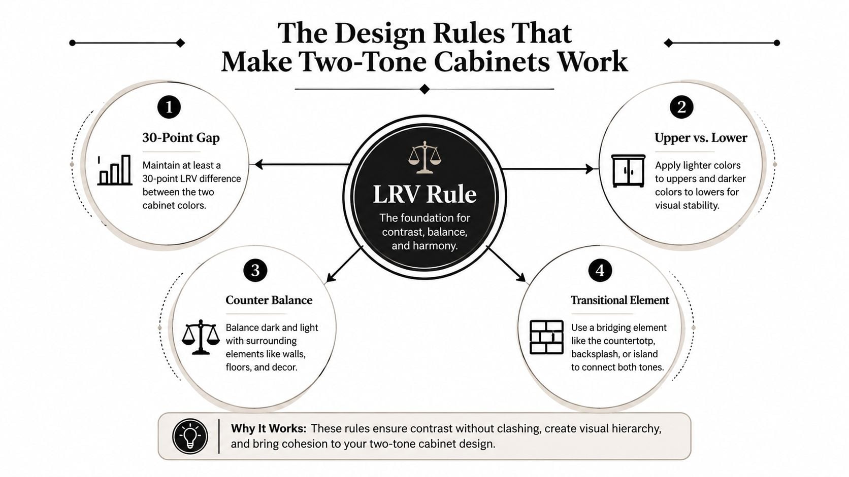
Light reflectance value, or LRV, describes how much light a color reflects. A cabinet-color workflow source recommends aiming for at least a 30-point LRV gap between the two cabinet colors, as explained in this guide to two-tone cabinet color combinations. A warm white around LRV 84 paired with navy around LRV 4 creates an unmistakable split. Two mid-tones only a few points apart may look like mismatched samples.
This rule works because the eye needs a clear hierarchy. Lighter uppers reflect more ambient light and help the room feel open. Darker lowers visually anchor the kitchen and are more forgiving near the floor, where shoes, pets, cleaning tools, and daily contact leave their mark.
Match undertones before you match style
A warm white belongs with warm wood, beige, creamy stone, or hardware that doesn't look icy beside it. A cooler white can support navy, blue-gray, charcoal, or cooler metal finishes. Undertone conflicts often appear only after the cabinets meet the countertop and backsplash.
Choose one hero tone first. That might be the walnut base, the navy lower run, or a muted green island. Then select the supporting tone from the same undertone family instead of choosing a second favorite color independently.
Use this guide to choosing kitchen cabinet colors when you need to compare samples against the room's existing surfaces.
Add one bridge element
The countertop, backsplash, flooring, or hardware should connect the finishes. You don't need every surface to repeat both cabinet colors, but you do need a material that makes the combination feel deliberate.
Consider a warm white upper with navy lowers, a light quartz counter, and brushed nickel hardware. The white cabinet reflects light, the navy supplies weight, and the counter creates a quiet transition between the two. Brushed nickel supports the cooler navy without introducing a third dominant color.
Practical rule: Two cabinet tones plus one quiet bridge usually look edited. Two cabinet tones plus several competing accents usually look unfinished.
Evaluate samples in morning and evening light. Hold the cabinet doors beside the counter, floor, backsplash, and hardware. If the pairing works only when the samples are separated on a white table, it isn't ready for your kitchen.
Popular Two-Tone Pairings Ranked by Resale Risk
Resale durability doesn't mean making every decision bland. It means choosing a combination that future buyers can understand quickly and live with easily. Current coverage of the Houzz findings points toward wood, muted colors, and layered finishes, rather than a return to completely uniform white kitchens. That makes subtle contrast a stronger long-term bet than an aggressively themed palette.
| Pairing | Visual Impact | Resale Risk | Best For |
|---|---|---|---|
| White and navy | Crisp, high contrast, structured | Low to moderate | Traditional, coastal, and transitional homes |
| Natural wood and sage | Warm, relaxed, organic | Low to moderate | Homeowners wanting current color with broad appeal |
| Black and warm white | Dramatic, architectural, polished | Moderate | Well-lit kitchens with restrained finishes |
| Gray and cream | Quiet, adaptable, understated | Low | Resale-focused remodels and transitional interiors |
| Two wood tones | Layered, natural, furniture-like | Low to moderate when undertones align | Kitchens seeking warmth without a bold paint color |
The safest strong statement
White and navy remains my preferred high-contrast choice for resale. It's recognizable, readable in listing photography, and easy to soften with neutral counters and simple hardware. Keep the navy on the lowers or a defined cabinet run rather than spreading it across every vertical surface.
Natural wood and sage earns a similarly favorable grade, especially when the green is muted rather than jewel-toned. The combination reflects the broader movement toward warm neutrals, low-chroma greens and blues, and wood mixes described in recent trend coverage. The wood should remain the grounding material, while the sage acts as a controlled accent.
The combinations I'd handle carefully
Black and warm white looks excellent when the room has enough light and the supporting materials stay restrained. Black lowers can feel refined, but black uppers, black hardware, dark counters, and dark flooring can quickly make the kitchen feel compressed.
Gray and cream is less dramatic but highly dependable. The key is choosing a gray with an undertone that belongs beside the cream. Avoid a blue-gray beside a yellowed cream unless the countertop deliberately bridges them.
Two wood tones can be excellent, but this pairing has no place for casual sampling. Compare grain direction, warmth, and visual weight. Pale oak with medium walnut can feel intentional. Two similar brown stains can look like a failed attempt to match.
For the broader resale picture, coordinate the cabinets with the floor instead of treating flooring as an afterthought. A guide to the best flooring for home resale can help you evaluate how the floor's tone will support the cabinet combination.
Use this collection of kitchen cabinet paint color ideas for inspiration, but bring actual doors and finish samples into the decision. Inspiration images show mood. Samples reveal compatibility.
Where to Place the Second Color in the Kitchen
Most homeowners begin with “Which colors should I use?” I start with “Which cabinets should carry the contrast?” Placement determines whether two-tone cabinetry improves the room or just adds another visual interruption.
I'm going to disagree with the default advice here: the island is often the wrong first place for the bold tone. Designers use contrasting islands constantly because islands resemble furniture, but that move can isolate the accent from the rest of the kitchen. In a compact room, a strong island color may become the first and only thing you see, while the perimeter still feels unresolved.
Use the perimeter to correct proportion
For many South Jersey kitchens, the more effective split is light uppers with darker base cabinets along the perimeter. The lighter upper cabinets preserve openness around windows and sightlines. The darker lower run grounds the room where cabinets meet flooring and appliances.
This approach also makes the cabinetry work harder spatially. The upper finish recedes or reflects light, while the lower finish establishes a stable horizontal band. You're using color to encode function, not merely decorating the boxes.
Three placements worth considering
- Perimeter uppers and base runs: Choose this when the kitchen has a long cabinet wall or needs a clear upper-to-lower break. Keep the counter and backsplash calm so the horizontal division stays legible.
- Full-height pantry wall and counter-height cabinetry: Give the tall bank a single finish to make it read as architecture. Use the second tone below the counter to prevent the room from becoming a wall of one uninterrupted color.
- Perimeter plus hood moment: Repeat the secondary tone on the hood surround, a nearby tall cabinet, or a short feature run. This creates a visual relationship without turning the island into a disconnected centerpiece.
The island can still carry the second tone, but I'd use it when the perimeter already has a clear identity and the island reads as a separate piece. A wood island against painted perimeter cabinets is usually more forgiving than a saturated painted island surrounded by unrelated finishes.
Before approving the split, review the cabinet, counter, backsplash, and floor together. This resource on countertop and cabinet combinations is useful for testing the supporting surfaces before the cabinet color locks the entire room into place.
Materials, Finishes, and Hardware That Hold Up
Color gets attention, but construction determines how the kitchen behaves. Start with the cabinet box and door, then choose the finish, and only after that finalize hardware. Reversing that order often leads homeowners to fall in love with a handle or paint sample that doesn't suit the cabinet construction or daily use.
Select the construction for the workload
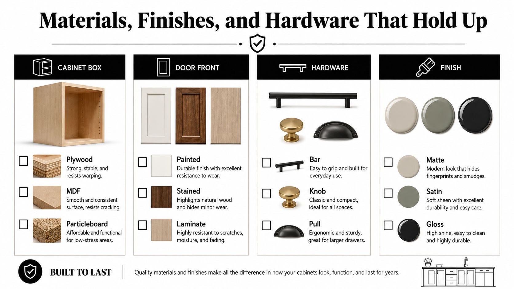
Plywood cabinet boxes offer a strong, stable option for homeowners who prioritize substantial construction. MDF works well for painted door fronts because its smooth surface supports an even finish. Particleboard can be appropriate in selected applications, but you should evaluate the specification, edge treatment, moisture exposure, and warranty rather than assuming every box performs the same way.
The door material affects the final appearance. Painted finishes deliver clean color separation. Stained wood shows grain and creates natural variation. Thermofoil and other laminates can provide consistent coverage, while wood veneer offers grain character without requiring every component to be solid wood.
For painted-cabinet maintenance and surface preparation, this resource on how to transform your kitchen cabinets provides useful background. Your installer should still explain the exact product, preparation process, and care instructions for the selected finish.
Put durability where contact happens
Darker lower cabinets hide everyday scuffs more effectively than pale finishes, especially at the floor line. That doesn't make them maintenance-free. Choose a finish that can be cleaned without aggressive scrubbing, and confirm how the manufacturer handles touch-ups.
Satin and low-sheen finishes generally offer a practical balance between cleanability and glare control. High-gloss surfaces can make a strong modern statement but may draw attention to fingerprints and reflections. Natural wood disguises minor variation through grain, while matte dark colors can show contact marks in a different way.
Let hardware connect the tones
Hardware should bridge the cabinet colors, not compete with them. Brushed nickel can connect cool painted tones. A warm metal can support cream, walnut, oak, or other warm finishes. Black hardware creates a sharper graphic line, so use it only when the room already has enough contrast to carry it.
Bring hardware samples to the in-home appointment. A pull that looks balanced on a small door can feel heavy across a full drawer bank.
For the South Jersey process, use the video consultation to discuss priorities, door style, and broad palette. Use the mobile showroom visit to compare physical doors, counters, tile, and hardware in context. Wait for the site measure before finalizing cabinet widths, filler details, appliance clearances, and installation conditions. The paint and stain cabinet guide can help you frame those finish questions before the samples arrive.
Planning Your Remodel From First Call to Final Install
A reliable remodel starts before anyone orders cabinets. Gather room photos, rough measurements, appliance details, inspiration images, must-haves, and deal-breakers for the initial conversation. You don't need a finished design. You need enough information to identify the right cabinet layout and the level of contrast your room can support.

The process should then move from a complimentary video consultation to an in-home discovery visit. The mobile showroom makes the second step useful because you can compare cabinet doors, countertops, hardware, and tile under the actual light in your kitchen, rather than trusting a screen or showroom wall.
For broader preparation, these kitchen remodel planning tips can help you organize the decisions that affect adjacent surfaces and scheduling. A preliminary estimate follows the discovery work, then the design is refined, products are finalized, and construction coordination begins. Review the expected sequence with this kitchen renovation timeline before approving the order.
Use this checklist for your first call:
- Cabinet split: Decide whether the contrast belongs on lowers, a tall bank, the perimeter, or an island.
- Hero tone: Bring one finish you already love, then select the supporting tone around it.
- Bridge material: Identify the countertop, backsplash, or hardware that will connect both colors.
- Resale position: Choose subtle, moderate, or dramatic contrast based on how long you expect to stay.
- Site conditions: Have appliance locations, plumbing constraints, windows, and flooring details ready for review.
The Cabinet Coach brings a mobile cabinet showroom to homeowners around Cherry Hill, Camden County, and Burlington County, with design guidance, product selections, preliminary estimates, and project coordination handled through a connected process.
If you're planning two-tone kitchen cabinets in Cherry Hill or nearby South Jersey communities, visit The Cabinet Coach to schedule a complimentary video consultation. Bring your inspiration photos and rough measurements, and the team can help you test the right cabinet split, materials, and bridge finishes before you commit.