
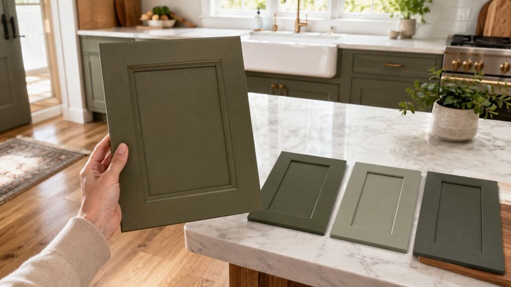
You've found the green. It looked calm and expensive on Pinterest, perfect under showroom lighting, and just warm enough beside the hardware you saved. Then the cabinet door arrives at your Cherry Hill kitchen, next to honey-toned oak and a north-facing window, and the same “sage” looks chalky in the morning and swampy by evening.
That result doesn't mean green was the wrong choice. It means the specific green kitchen cabinet color wasn't chosen for the room's light, fixed finishes, and cabinet placement. Green is an optical behavior, not a reliable paint-chip label. The right shade can make a kitchen feel settled and architectural. The wrong undertone can make clean countertops look dirty and warm wood look orange.
Table of Contents
- Why the Right Green Is Harder to Choose Than It Looks
- Reading Your Room Before You Browse Any Swatches
- Decoding Green Undertones and Why They Clash
- Matching Greens to Countertops, Floors, and Backsplash
- Choosing a Shade by Light Reflectance Value
- Sample Testing the Green Before You Commit
- Paint Type, Finish, and Hardware That Make Green Last
Why the Right Green Is Harder to Choose Than It Looks
A homeowner I'd expect to meet in South Jersey starts with a saved image. She wants a soft sage for a Cherry Hill split-level, with existing oak flooring and a kitchen that gets limited northern daylight. On the screen, the color is muted and restful. On her actual cabinet door, it loses its warmth, turns gray near the window, and picks up a yellow cast beside the oak.
That's the mistake I see most often. Homeowners choose a name such as sage, olive, or forest as if the name controls the result. It doesn't. The room controls the result through orientation, light intensity, surrounding colors, sheen, and the visual weight of the cabinetry.
A south-facing kitchen can support more color strength because daylight gives the green energy. A north-facing kitchen usually needs a more restrained, balanced version so the cabinets don't read cold or muddy. Warm floors can pull a yellow-green toward an unpleasant cast, while cool stone can make a blue-green look much darker than expected.
The practical rule: choose green by how it behaves beside your permanent finishes, not by how attractive it looks in isolation.
Before collecting dozens of samples, reduce the field. Evaluate the daylight, identify the undertones in your countertop and floor, and decide whether the cabinets should recede or become the room's focal point. Homeowners who want broader guidance on choosing the best paint colors should use that process as a starting point, but kitchen cabinetry demands an even stricter test because large vertical surfaces amplify color.
Too many options also create analysis paralysis, especially when every sample seems plausible. A useful explanation of that remodeling problem appears in this guide to understanding analysis paralysis. The cure isn't more browsing. It's better constraints.
Green has earned those constraints because it's no longer a fringe choice. The 2025 NKBA Kitchen Trends Report reported green as the top kitchen color for the second consecutive year, selected by 76% of respondents, ahead of blue at 63% and brown at 56%. The same report also described a strong rise in searches for green kitchens, but popularity doesn't make every green suitable for every South Jersey home.
Reading Your Room Before You Browse Any Swatches
Start with the room, not the paint fan deck. A green cabinet color that succeeds in a bright Moorestown open-concept kitchen can fail in a compact Voorhees galley with one window and a dark backsplash.
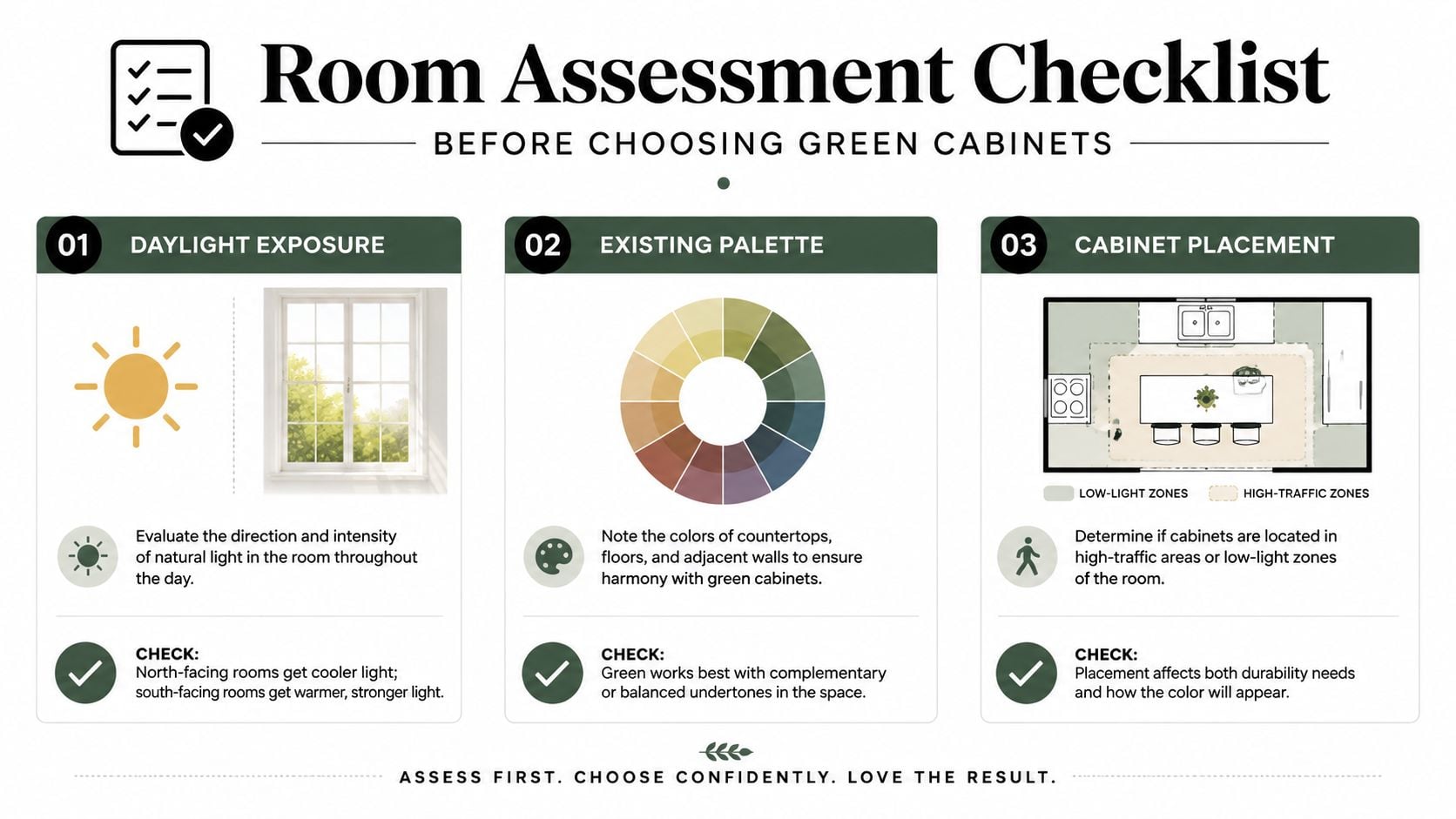
Audit the daylight first
Stand where the cabinet run will be installed and observe the room across the day. Note whether the windows face north, south, east, or west, when direct sun reaches the cabinet wall, and whether neighboring homes or mature trees block it.
- North-facing light: It tends to be cooler and flatter. Start with muted sage, olive, or gray-green rather than a blue emerald.
- South-facing light: It gives you more freedom to use richer color because the room receives stronger warmth and brightness.
- East-facing light: Expect a fresher morning and a quieter afternoon. Test the green before assuming it will remain consistent.
- West-facing light: Watch the late-day warmth. Yellow-greens can become overly warm beside oak or beige stone.
A split-level in Cherry Hill with limited western exposure needs a different strategy from a sun-filled room with windows on several walls. Take photographs at morning, midday, and evening, but trust the physical samples more than the camera.
Record the fixed palette
Cabinets are replaceable. Flooring, backsplash, and countertops are often not. Write down the dominant cast of each surface: warm beige, pink beige, cool gray, blue-white, cream, brown, or near-black.
Room proportions matter too. Tall cabinets in a narrow kitchen carry more visual weight than a small island, while a low ceiling can feel heavier when the cabinetry is both dark and saturated. If you're working with limited floor area, these small kitchen space strategies can help you judge whether a stronger green will define the room or close it in.
Mark cabinet placement
A green on a sunlit island behaves differently from the same green on a wall of pantry cabinets. Mark high-traffic areas, shadowed corners, and locations beneath upper cabinets. Your initial constraint should be simple: south-facing rooms can tolerate more chroma, while north-facing rooms usually reward muted greens.
Decoding Green Undertones and Why They Clash
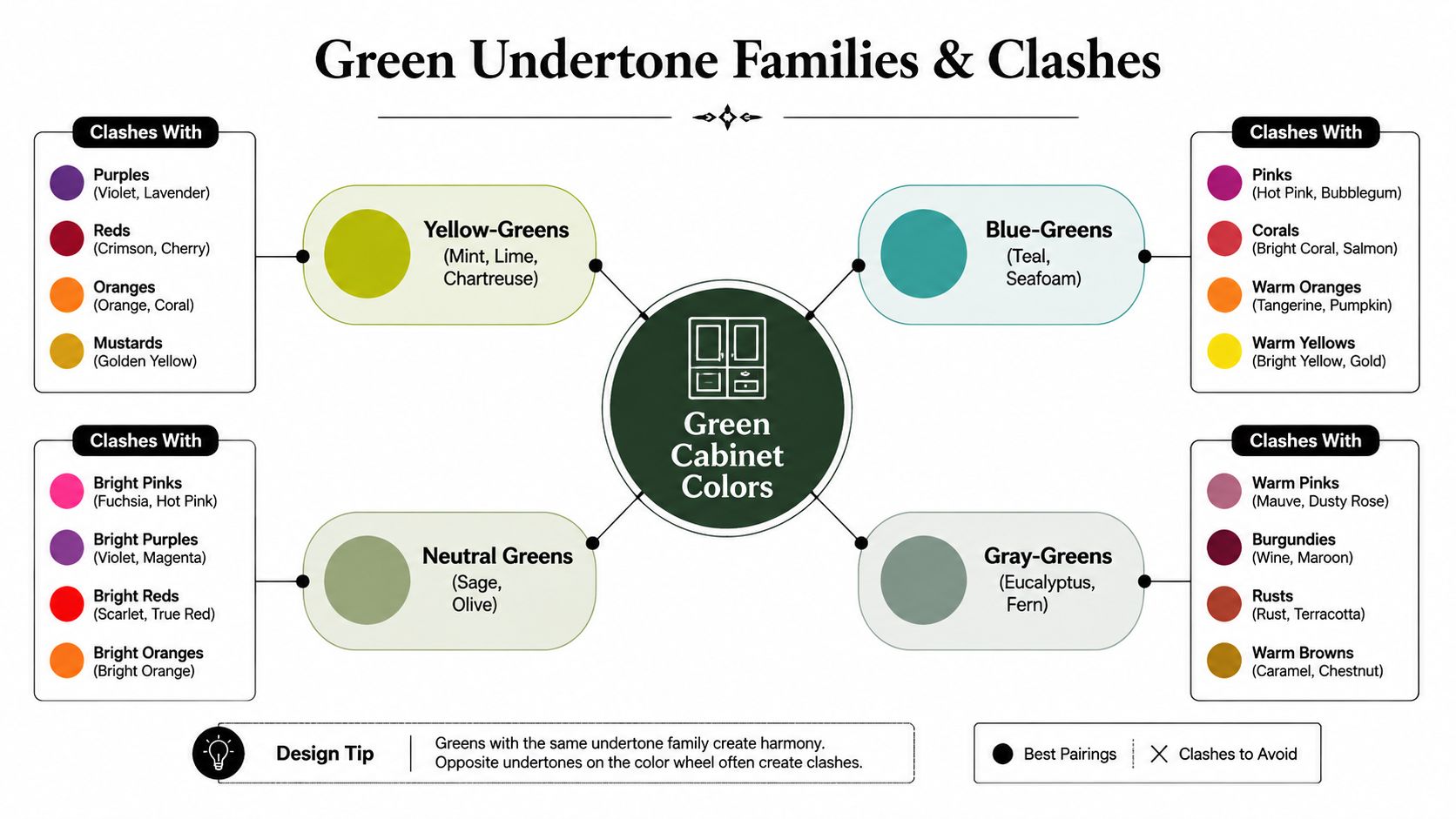
“Green” describes a broad family, not one predictable color. Two samples can have the same apparent depth but behave completely differently because one contains yellow, another blue, and a third enough gray or brown to act almost like a neutral.
Yellow-greens need disciplined surroundings
Mint, lime, and chartreuse carry yellow energy. They can feel lively in a bright, clean kitchen, but warm oak, cream quartz, and beige stone may push them toward a jaundiced appearance. I'd use them only when the surrounding palette is intentionally crisp and the room has enough daylight to prevent the color from becoming acidic.
Blue-greens are dramatic but unforgiving
Emerald, teal, and eucalyptus with a blue bias can look polished beside bright white quartz, stainless steel, or restrained gray flooring. Against cool marble, however, a deep blue-green can lose visible color and read nearly black, especially in the evening.
The risk is contrast without coordination. A blue-green cabinet can make a warm backsplash appear dated because the two surfaces seem to belong to different temperature systems.
Gray-greens are the dependable everyday choice
Sage, celadon, and eucalyptus-gray contain enough gray to soften the green. They usually sit comfortably beside white, light wood, soft gray, and many natural stones. For a family kitchen that needs to look composed through changing light, I'd begin here.
Muted color also gives hardware and countertops room to participate. The cabinet doesn't have to win every visual argument.
Brown-greens bring warmth and depth
Olive, moss, and forest greens connect naturally with oak, walnut, aged brass, and warm neutral tile. Their danger is muddiness. In a dim room, a brown-green can lose its green identity and look heavy, particularly when the backsplash and countertop are also dark.
Use physical comparisons rather than trusting labels. The guidance on choosing kitchen cabinet colors is useful for narrowing the field, but the final decision still belongs on the actual site.
Reject any sample that only works under one light source. A cabinet finish has to survive morning daylight, cloudy conditions, and the kitchen's evening lighting.
Matching Greens to Countertops, Floors, and Backsplash
Once you identify undertones, stop comparing green samples to one another. Compare each candidate to the materials that will stay in the kitchen. The countertop and floor usually have more influence than the wall paint because they occupy larger, more permanent visual fields.
Warm butcher block is particularly revealing. It generally benefits from a gray-green or olive that acknowledges the wood's warmth without adding more yellow. Crisp white quartz creates a cleaner stage for emerald or blue-green, while honed black granite can support forest or olive if the room has enough illumination.
Classic white subway tile is flexible, but grout changes the effect. A warm white tile with beige grout supports muted olive and sage. A bright white tile with cool gray grout makes a blue-green feel sharper and more deliberate.
| Green family | Best countertop pairings | Best flooring pairings | Watch out for |
|---|---|---|---|
| Sage and gray-green | White quartz, soft gray stone, light composite surfaces | White oak, natural oak, pale porcelain | Very cool marble can drain warmth |
| Olive and moss | Butcher block, cream quartz, warm beige stone | Honey oak, walnut, warm large-format porcelain | Yellow tile and heavily orange oak |
| Emerald and blue-green | Crisp white quartz, restrained gray quartz, stainless steel | Cool engineered wood, neutral porcelain | Cool marble in low light, busy warm tile |
| Forest and green-black | Light quartz, pale stone, controlled white tile | Medium or dark wood when lighting is strong | Dark countertops and shadowed cabinet runs |
Sage is the safest starting point for a mixed palette, but “safe” doesn't mean bland. A well-balanced sage can look architectural when paired with substantial hardware and a countertop with quiet movement. Olive is more forgiving with older South Jersey oak, though it needs enough light to avoid looking brown.
Emerald is a statement. I'd reserve it for a room with a clear supporting palette rather than trying to force it into a kitchen with warm beige travertine, orange oak, and several competing tile patterns. Forest works best when the surrounding finishes are lighter and the lighting plan is deliberate.
For a more detailed material-pairing process, use this guide to countertop and cabinet combinations. The shortcut is practical: identify the two or three fixed surfaces you can't easily change, then compare only greens that share their temperature.
Choosing a Shade by Light Reflectance Value
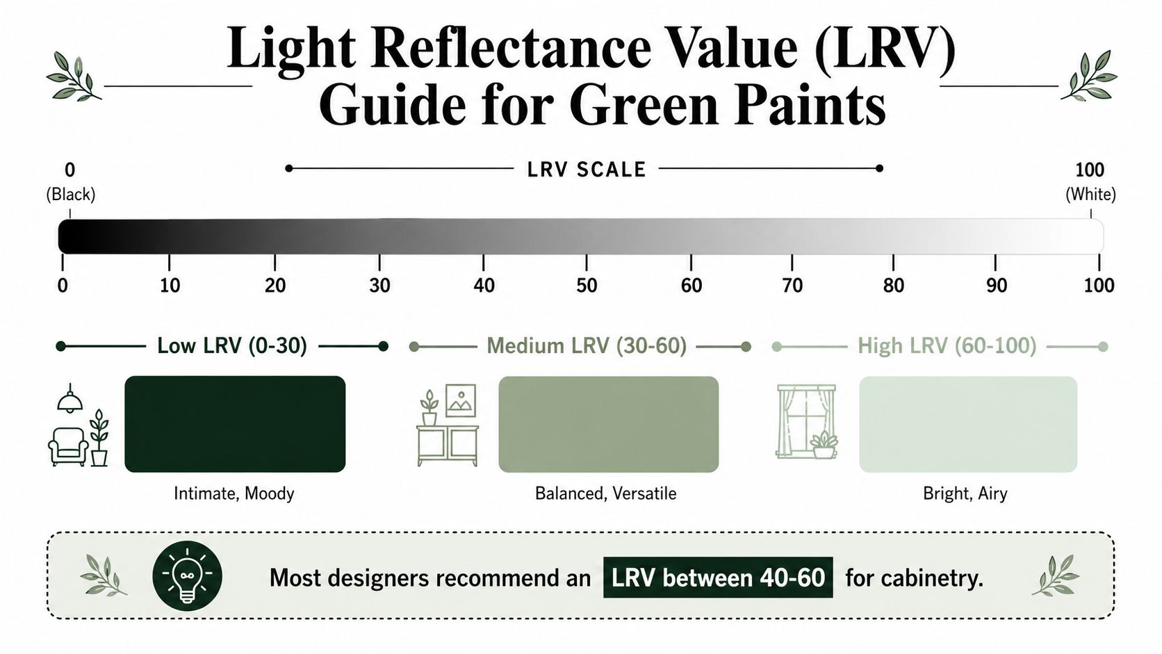
Light Reflectance Value, or LRV, describes how much light a color reflects back into the room on a scale from 0 to 100. Higher values reflect more light. Lower values absorb more, which makes the cabinet appear deeper and visually heavier.
That number matters more than the word forest, sage, or olive on a sample card. Deep forest greens often sit below LRV 12, while green-blacks can fall around LRV 4 to 6, according to The Cabinet Coach's dark-green cabinet guidance. In average lighting, those shades can read almost black.
Use LRV as a screening tool
Ask for the LRV of every serious candidate. Don't use it as an automatic pass or fail, but use it to eliminate shades that clearly fight the room.
- Lower LRV greens: Appropriate for bright rooms or deliberate moody designs, provided the lighting supports them.
- Mid-range greens: More adaptable for everyday kitchens, especially when the room has mixed daylight.
- Higher LRV greens: Useful when the priority is openness, though very pale greens can expose undertones and look washed out.
A Cherry Hill split-level with north-facing windows illustrates the difference. A forest sample may become charcoal in the cabinet recesses and flatten the wall of cabinetry. A lighter, muted sage can retain visible color and keep the room from feeling compressed.
The solution isn't always choosing the lighter color. Under-cabinet LED strips, warm 3000K task lighting, and stronger ambient light can help a dark green retain dimension. Without that support, low-LRV cabinetry in a dim room usually becomes a block of darkness.
Test optical behavior, not just the number
Mount a full-size sample on an actual door and leave it in place for at least 72 hours. Compare it during morning, midday, and evening conditions, then look at it with the kitchen lights on. Place it beside the countertop and backsplash, not against an empty wall.
A green that looks forest on a chip but charcoal on the door is telling you the room lacks enough reflected light. Believe the door.
Sample Testing the Green Before You Commit
Sample testing should happen before you order cabinetry, not after the first door is installed. Small chips hide how a color behaves across a broad, vertical surface, and cabinet profiles create shadows that a flat card can't reproduce.
Buy or borrow full-size doors in your two strongest candidates. Mount them on the actual cabinet boxes, or hold them at the exact height and location where the finished doors will sit. Leave each sample in place for at least 72 hours, and don't judge it from one convenient moment.
Run the three-light test
View the doors in the morning, around midday, and in the evening. Turn on the kitchen's actual LED fixtures and under-cabinet lights after dark. If you're choosing a dark green, this nighttime check is essential because artificial light can remove the color's visible green and leave a near-black surface.
Use a plain white sheet of paper beside the sample. The paper gives your eye a stable reference. If the cabinet suddenly looks yellow, blue, or dirty by comparison, you've identified an undertone that needs to be tested against the fixed materials.
Then perform the gray check. Step back and view the door from the kitchen entrance. If the green disappears and becomes gray, the sample may be too desaturated for the room, or the room may be too cool for that finish.
Test the entire material group
Place the sample beside the backsplash, countertop offcut, flooring sample, and hardware finish. Don't judge the cabinet alone. A green that looks ordinary beside white paper may become exactly right beside warm oak and aged brass.
For a working family kitchen, specify a finish that can be cleaned without aggressive scrubbing and ask how the manufacturer handles touch-ups. The sheen should support the door's condition. Matte and satin finishes conceal small surface irregularities, while higher sheen finishes clean easily but reveal waves, dents, and uneven prep.
Paint Type, Finish, and Hardware That Make Green Last
Color gets attention, but the coating system determines whether the kitchen still looks intentional after daily cooking, cleaning, and handling. A green cabinet that chips around the pulls or yellows near the range isn't a successful renovation, no matter how good the original sample looked.
Choose the coating system before the color
Factory-finished cabinets offer controlled application and consistent curing. Field-applied paint can work well when the preparation and spraying are handled properly, but the result depends heavily on the existing cabinet material, site conditions, ventilation, and installer technique.
Catalyzed conversion varnish is a durable cabinet coating designed for demanding use. Lacquer can produce a smooth finish, but homeowners should ask exactly which product is being used, how it cures, and how repairs will be managed. “Sprayed” doesn't automatically mean durable.
Before approving a proposal, ask these questions:
- Preparation: Will the doors be removed, cleaned, scuff-sanded, primed, and sprayed in a controlled environment?
- Coating: Is the finish a cabinet-grade system, and is it compatible with the existing substrate?
- Curing: How long should the doors remain undisturbed before normal use?
- Repair: Can the installer provide a touch-up process for future chips and wear?
- Warranty: What does the warranty cover, and does it exclude moisture, heat, or cleaning products?
A practical resource on how to pick paint for your cabinets can help you understand the decision before you compare bids. For a broader cabinet-specific discussion, review paint and stain cabinet options.
Match sheen to the kitchen's workload
Satin is my usual starting point for painted cabinetry. It gives the green enough depth without reflecting every ripple in the door, and it's generally easier to live with than a flat finish in a busy kitchen.
Matte can look refined, especially on a muted sage or olive, but it may show handling marks and can be harder to clean if the coating system isn't excellent. Semi-gloss wipes down readily, yet it highlights dents, sanding defects, and uneven door construction. Don't choose sheen from a small painted board. View it on a full door.
The finish also changes color perception. A higher sheen can make a deep green appear more active because it reflects points of light. A softer sheen absorbs more light and can make the same green feel quieter, but also darker.
Use hardware to correct the temperature
Hardware is where a green kitchen either becomes refined or starts to look accidental.
- Brushed brass: It warms sage, gray-green, and olive without demanding attention. This is a strong choice with oak floors and cream stone.
- Polished nickel: It cools the composition and works well with blue-green cabinetry, white quartz, and restrained gray surfaces.
- Matte black: It gives forest and deep olive a crisp outline, particularly when window frames, lighting, or appliances already introduce black.
- Unlacquered brass: It adds evolving warmth and works best when the kitchen already has compatible warm metals or wood.
Avoid matching every metal automatically. A green cabinet can handle mixed finishes when one metal clearly leads and the others play supporting roles. The mistake is adding brass to a yellow-green kitchen already surrounded by warm oak and beige tile. The room can become visually over-heated.
Apply the advice to South Jersey housing stock
Older Cherry Hill, Haddonfield, and Moorestown homes often contain warm oak flooring or trim. In a 1970s split-level with original oak, I'd usually start with a muted olive or brown-balanced green, then test it against the exact floor. A bright mint tends to exaggerate the oak's warmth, while a blue emerald can make the floor look more orange.
A 1990s center-hall colonial often gives you more room to work. If the kitchen has painted walls, moderate daylight, and quieter flooring, sage or gray-green can bridge traditional architecture and a cleaner modern finish without fighting the home's proportions.
Newer open-concept builds in Voorhees, Mount Laurel, and Evesham frequently include cooler engineered surfaces and larger connected living spaces. That setting can support emerald or blue-green as a deliberate focal point, especially when the countertop is crisp and the lighting is layered. The color needs a clear relationship to the adjacent room, because open sightlines expose mismatches that a closed kitchen can conceal.
Know when site review pays for itself
You can narrow colors yourself when the room has one clear flooring tone, simple countertops, and dependable daylight. A mobile showroom consultation earns its place when the kitchen has mixed fixed finishes, shadowed cabinet walls, or two samples that both seem reasonable but behave differently at home.
The Cabinet Coach brings cabinetry, countertops, hardware, and tile selections to South Jersey homeowners, with a complimentary video consultation followed by discovery, site visits, sample review, and project planning. Seeing full-size materials against the actual Cherry Hill, Moorestown, or Voorhees room is more useful than comparing isolated swatches under showroom lights.

Start with the room's light direction, then identify the undertone of the countertop and floor. From there, compare full-size doors, check the LRV, and choose the finish and hardware as part of the same decision. That process will give you a green kitchen that looks intentional in your home, not merely attractive in someone else's photograph.
If you're planning a South Jersey kitchen renovation, The Cabinet Coach can bring cabinet, countertop, hardware, and tile samples to your home for a coordinated review. Schedule the complimentary video consultation before ordering samples, and use the site conditions to narrow your green cabinet choice with a designer.